Atmospheric Perspective Calculator
Based on the article: Distant objects appear lighter, less detailed, and bluer due to air between viewer and subject. This creates depth in your landscape.
Color:
Value:
Color:
Value:
Color:
Value:
As objects move farther away:
- The color becomes cooler (more blue)
- The value lightens (becomes brighter)
- Details become less sharp
This is why your mountains should be lighter and bluer in the background to create depth.
When you sit down to draw a landscape, it’s not about copying what you see. It’s about making the viewer feel like they’re standing there-feeling the breeze, hearing the distant birds, sensing the weight of the sky. Most beginners think it’s about details: every leaf, every rock, every ripple in the water. But that’s where they go wrong. The real rules of drawing a landscape aren’t about precision. They’re about control, balance, and illusion.
Start with the Big Shapes, Not the Details
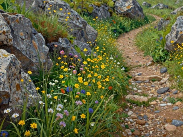
Before you sketch a single tree or outline a hill, ask yourself: what are the three largest shapes in this scene? Maybe it’s the mountain range in the back, the field in the middle, and the river cutting through. These are your foundational forms. Paint or draw them as simple silhouettes first. Don’t worry about texture yet. If you start with details, you’ll lose the sense of space. Artists like John Constable and Thomas Moran didn’t begin with branches-they began with masses of light and shadow.
Here’s a quick test: squint your eyes. What do you see? The bright areas become white, the dark areas turn black, and everything else fades into gray. That’s your value structure. If you can’t make out the main shapes when squinting, your composition isn’t working. Use this trick every time you start a new landscape.
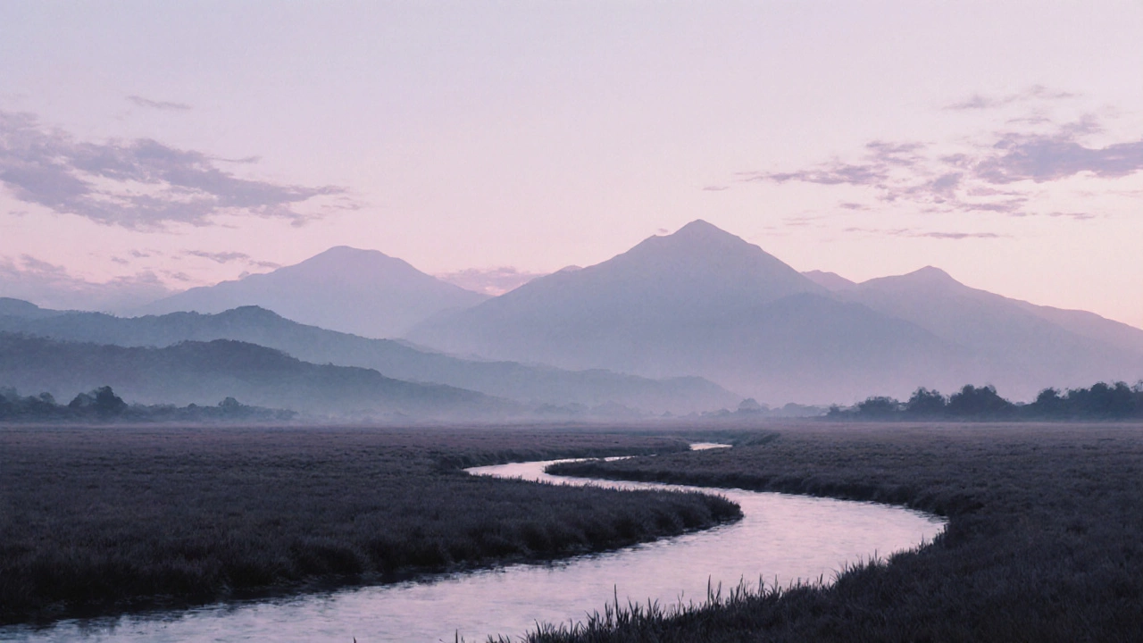
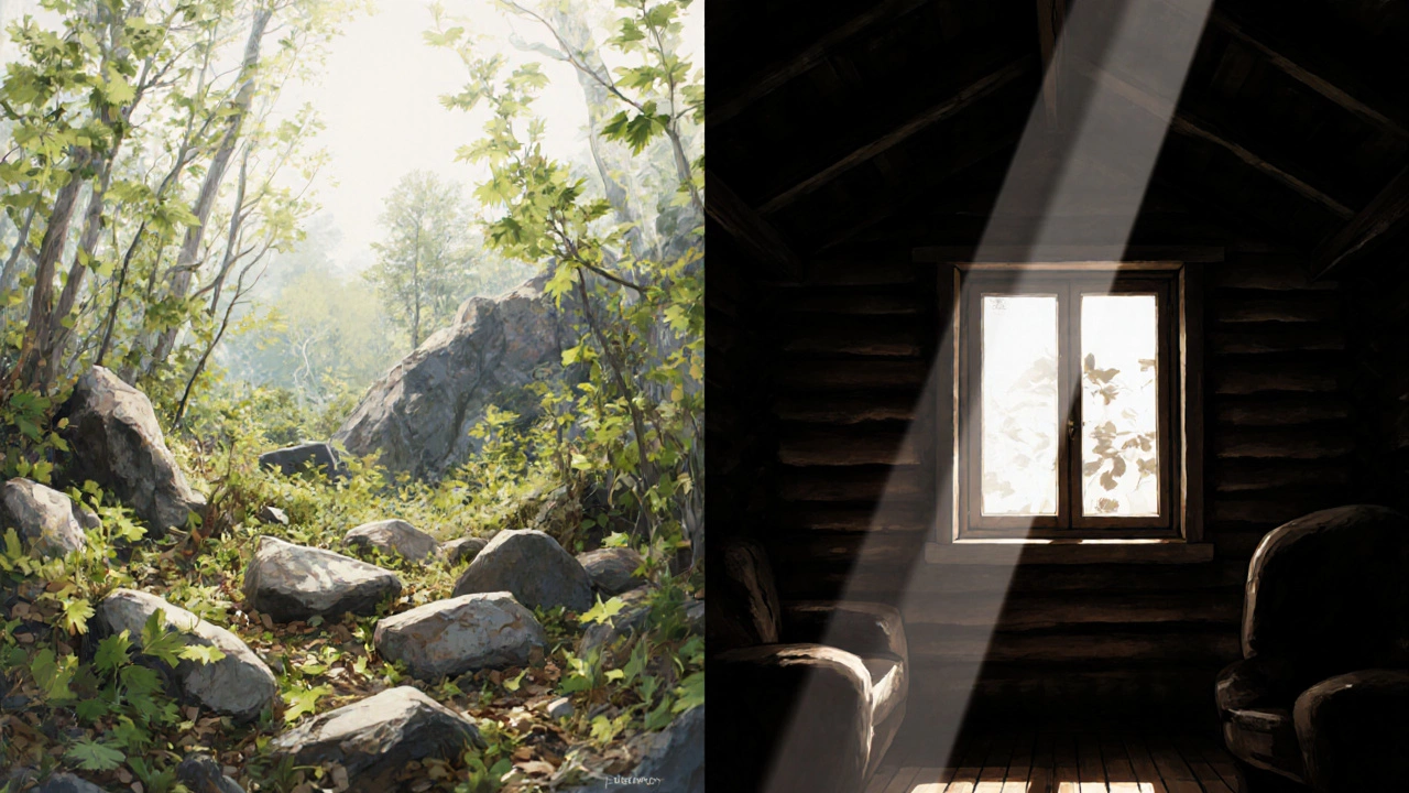
Use Atmospheric Perspective to Create Depth
One of the most powerful rules in landscape drawing is atmospheric perspective. It’s the idea that distant objects look lighter, less detailed, and bluer because of the air between you and them. This isn’t just a painting trick-it’s how your eyes actually work.
Take a mountain range. The closest peak? Sharp edges, dark greens and browns, visible rocks and trees. The one behind it? Softer edges, lighter color, maybe a touch of blue-gray. The farthest one? Almost a wash of color, barely there. If all your mountains look the same, your painting will feel flat. That’s why many beginners struggle with depth-they treat every element as equally important.
In watercolor, you layer washes to achieve this. In pencil or charcoal, you reduce contrast and detail as things recede. In oil, you mix in a little blue or gray as you move back in space. No matter the medium, the rule stays the same: distance softens. Ignore this, and your landscape looks like a collage stuck on paper.
Establish a Clear Focal Point
A landscape without a focal point feels aimless. It’s like a room with no furniture-you don’t know where to look. Your eye needs a place to rest. That could be a lone tree, a cabin window, a winding path, or even a break in the clouds.
But here’s the catch: the focal point shouldn’t be the brightest or most detailed thing. It should be the most *intentional*. Place it along one of the intersecting lines of the rule of thirds-not dead center. If you put your main subject right in the middle, it feels static. Off-center creates tension, movement, life.
Look at paintings by Andrew Wyeth. His focal points are often small: a single chair, a patch of sunlight on a wall. Yet they pull you in because everything else in the painting supports them. The surrounding shapes lead your eye toward it. That’s the secret: guide, don’t shout.
Use Leading Lines to Direct the Eye
Lines don’t just show shapes-they show direction. A road, a river, a row of trees, even the curve of a hillside can act as a visual path that pulls the viewer into the painting. These are leading lines, and they’re essential for creating movement.
Think of your landscape as a stage. Leading lines are the stage directions. A winding path that disappears into the distance makes the viewer want to walk it. A diagonal river cuts across the canvas and creates energy. A row of fence posts receding into the horizon gives you perspective without a ruler.
Avoid parallel lines that run straight across the frame. They cut the painting in half and kill depth. Instead, let lines converge. Let them twist. Let them hint at something beyond the edge. That’s what makes a landscape feel endless.
Value Is More Important Than Color
Color gets all the attention, but value-the lightness or darkness of a color-is what holds a landscape together. A red tree in shadow can look more real than a green tree in full sun if the value is right.
Try this exercise: draw a landscape in grayscale. No color. Just black, white, and shades of gray. If it still looks convincing, you’ve nailed the structure. If it looks flat or confusing, the problem isn’t color-it’s value.
Most landscapes have three main value zones: lights, midtones, and darks. The sky is usually the lightest. The foreground might be the darkest. The middle ground? Midtones. Keep these zones distinct. If your darks are too light, the painting feels washed out. If your lights are too dark, it feels heavy. Balance is everything.
Don’t Forget the Sky-It’s Not Just Background
The sky is the largest shape in most landscapes. Yet too many artists treat it like an afterthought. A flat blue wash doesn’t cut it. The sky has weight, movement, and emotion. Clouds aren’t just white blobs-they’re volumes. They catch light on top, shadow underneath. They roll, they gather, they break apart.
Observe real skies. Notice how the color changes near the horizon-warmer, often yellow or pink. Notice how clouds cast shadows on each other. Even on a clear day, the sky isn’t one color. It’s a gradient, a breath of air. If your sky looks like a painted ceiling, your whole landscape will feel artificial.
Use the sky to set the mood. A stormy sky with dark, rolling clouds changes everything. A soft dawn with pastel streaks makes the scene feel quiet, hopeful. The sky isn’t just above the land-it’s part of it.
Texture Should Serve the Scene, Not Steal It
Texture is tempting. You want to draw every blade of grass, every crack in the rock, every bark pattern on a tree. But too much texture overwhelms the eye. It turns your landscape into a busy mess.
Instead, suggest texture. Use short strokes for grass. Dabbing for foliage. A few rough lines for stone. Let the viewer’s brain fill in the rest. Your job isn’t to show everything-it’s to trigger recognition.
Look at watercolor landscapes by Winslow Homer. He didn’t paint every wave. He painted the *idea* of waves. That’s why they feel alive. You don’t need to draw every detail to make it real. You need to draw the right details.
Practice with Limited Palettes
One of the fastest ways to improve your landscapes is to limit your colors. Start with just three: a warm, a cool, and a neutral. For example: burnt sienna, ultramarine blue, and white. That’s it.
With a restricted palette, you learn to mix values, not just colors. You learn how to create depth without relying on bright hues. You stop thinking in terms of "this is green" and start thinking in terms of "this is a dark cool green next to a light warm green."
Many professional landscape painters use this method. It forces you to focus on the real rules: shape, value, and edge. Color becomes a tool, not a distraction.
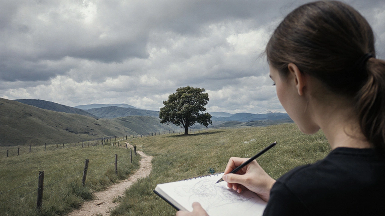
Draw from Life, Not Just Photos
Photos lie. They flatten depth. They over-saturate color. They freeze motion. They cut off the edges of the scene. If you only draw from photos, your landscapes will feel stiff and lifeless.
Go outside. Sit with your sketchbook. Draw what’s in front of you-even if it’s just for ten minutes. Notice how light changes. How shadows shift. How the wind moves the grass. You’ll start seeing patterns you never noticed before.
You don’t need to finish a painting. Just observe. Sketch a single tree. Capture the way the light hits a rock. Record the curve of a distant ridge. These quick studies build your visual memory. And that’s what turns a good drawing into a great one.
Final Rule: Break the Rules-But Only After You Know Them
These aren’t laws written in stone. They’re tools. Once you understand why they work, you can bend them. A flat sky can work if you’re going for a surreal mood. A centered tree can feel powerful if everything else is chaotic. But you can’t break a rule unless you first understand it.
Study the old masters. Then study the modern ones. See how they used-or ignored-these principles. Then go out and draw. Not to be perfect. To be honest. To feel the land beneath you, not just copy it on paper.
Do I need to use perspective grids to draw landscapes?
No, you don’t need grids. Most landscape artists work by eye. Perspective grids are useful for architectural scenes, but natural landscapes rarely have straight lines. Instead, learn to see how objects shrink and fade as they move away from you. That’s atmospheric perspective, and it’s more natural for land, sky, and water.
What’s the best medium for beginners learning landscape drawing?
Pencil or charcoal are great starters because they let you erase and adjust easily. Watercolor is also excellent-it forces you to work fast and focus on values instead of details. Avoid oil paint at first; it dries slowly and can be frustrating when you’re still learning composition and structure.
How do I make my landscapes look less flat?
Use atmospheric perspective: distant objects should be lighter, cooler, and less detailed. Also, vary your values-make sure you have strong darks, midtones, and lights. If everything is the same brightness, your painting will look two-dimensional. Add overlapping shapes too-like trees in front of hills-to create depth.
Can I draw a landscape without any trees or water?
Absolutely. Landscapes aren’t defined by specific elements-they’re defined by space, light, and mood. A desert, a field, a cliffside, or even a city skyline at dawn are all valid landscapes. Focus on the relationships between shapes and values, not on checking off a list of "landscape features."
Why does my landscape look amateurish even when I copy a photo?
Because photos flatten reality. They lose the subtle shifts in light, the way air affects color over distance, and the feeling of space. Copying a photo means copying its flaws. Instead, use photos as references, not templates. Go outside, observe, and draw what you *feel*, not just what you see.