Complementary Color Mixer
Complementary Color Calculator
Explore how complementary colors interact in oil painting. Select a base color, see its complement, and adjust the ratio to create natural mutes without using black.
Base Color
#e63946 - Warm Red
Complementary Color
#2a9d8f - Cool Green
Resulting Muted Color
#d73e45 - Muted Red with Green
Remember:
1. Use just a hint of the complement to mute a color (not too much)
2. For shadows: add 10-20% of the complement to the base color
3. For midtones: use 5-10% of the complement
4. Never use black - it kills vibrancy! Complements keep colors alive.
When you mix complementary colors in oil painting, something magical happens. They don’t just sit next to each other-they push each other to life. Red next to green makes the red feel hotter. Blue beside orange makes the blue feel deeper. This isn’t just theory. It’s how painters like Van Gogh, Rembrandt, and Sargent made their colors scream without ever using brighter pigments.
What Exactly Are Complementary Colors?
Complementary colors are pairs that sit directly across from each other on the color wheel. In oil painting, the standard wheel is built from the three primary colors: red, yellow, and blue. Mix those in equal parts, and you get the secondaries: orange (red + yellow), green (yellow + blue), and purple (blue + red). The complements are simple:
- Red and Green
- Yellow and Purple
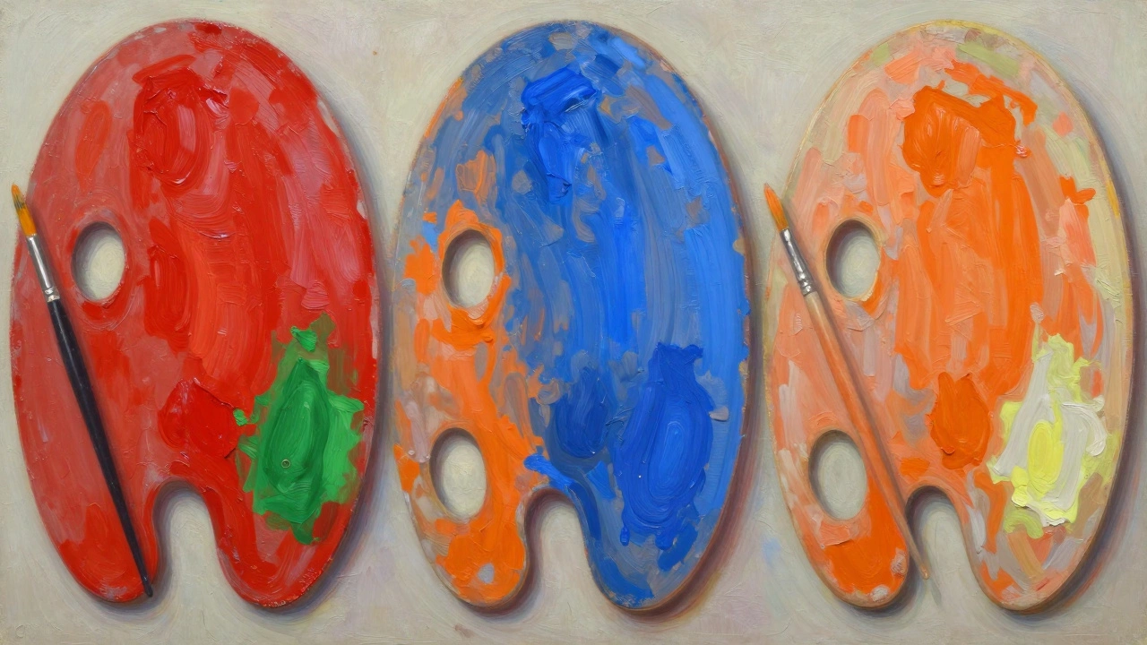
- Blue and Orange
These pairs cancel each other out when mixed. If you stir a bit of green into red, it turns muddy brown. That’s not a mistake-it’s a tool. Artists use this to mute colors naturally, without grabbing black paint. Black kills vibrancy. Complementary colors soften it while keeping the tone alive.
Why Oil Painters Rely on Them
Oil paint dries slowly. That’s a gift. It lets you blend, glaze, and adjust over days. Complementary colors work best in this medium because you can layer them. Put a thin glaze of orange over a dried blue sky? The blue becomes richer, more atmospheric. Paint a red rose with a hint of green in the shadows? The petals glow like they’re lit from within.
Think about Rembrandt’s portraits. His shadows aren’t gray. They’re often made of burnt sienna mixed with a touch of ultramarine. That’s blue and orange-complements-working together to create depth without flatness. You don’t need to add black to darken a color. You just need its opposite.
How to Use Them Without Making Your Painting Look Like a Neon Sign
Using complements doesn’t mean slapping bright red next to bright green and calling it done. That’s how beginners make paintings look cheap. The trick is temperature and saturation.
Not all reds are the same. Cadmium red is warm. Alizarin crimson is cool. Green isn’t just one thing either. Viridian is cool and bluish. Yellow ochre mixed with phthalo blue makes a warm, earthy green. Pair a cool red with a warm green, and you get harmony. Pair two hot colors? You get visual noise.
Here’s what works in practice:
- Use one color as the dominant tone. Make it 70% of the area.
- Use the complement as an accent-no more than 20-30%.
- Mute the accent by adding a touch of its opposite. A little red in green makes it less harsh.
- Let the complement live in shadows, reflections, or edges. A blue-orange contrast in a sunset’s reflection? That’s how you make water look real.
Look at Winslow Homer’s seascapes. The waves aren’t just blue. They’re blue with streaks of orange from the sky’s reflection. The sand isn’t beige-it’s yellow with hints of violet. He didn’t paint what he saw. He painted what he felt.
Common Mistakes and How to Fix Them
Most people think complementary colors mean “bright and opposite.” That’s the trap. Here’s what goes wrong-and how to fix it:
- Mistake: Using pure, unmixed complements side by side. Fix: Add a pinch of the opposite color to each. A drop of red in your green makes it feel more natural.
- Mistake: Using complements only in the foreground. Fix: Let them echo in the background. A red hat? Add a touch of green in the distant trees. It ties the whole painting together.
- Mistake: Thinking you need to use all three pairs. Fix: Pick one. Master it. Van Gogh mostly used blue and orange. That’s all he needed.
Another error? Mixing complements on the palette before applying them. That’s fine if you want gray. But if you want vibrancy, apply them side by side. Let the viewer’s eye mix them. That’s optical mixing-the same trick Impressionists used.
Real Examples from Master Painters
Study these three paintings, and you’ll see how complements work in action:
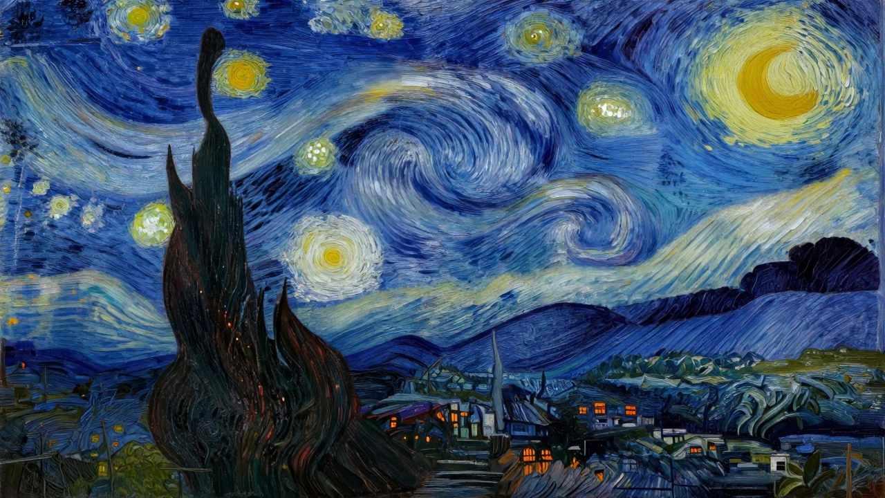
- Vincent van Gogh’s “The Starry Night”: The deep blue sky is broken by swirling orange-yellow stars. The village below uses muted purples and yellows. No black. Just blue and orange, pushed and pulled.
- John Singer Sargent’s “Carnation, Lily, Lily, Rose”: The pink flowers glow against a greenish twilight. The green isn’t pure-it’s mixed with a touch of red. That’s why it doesn’t clash.
- Rembrandt’s “Self-Portrait with Two Circles”: His coat is a rich brown, but look at the shadow under his arm. It’s not gray. It’s a blend of burnt umber and a whisper of blue. Orange and blue, working in shadow.
They didn’t use fancy pigments. They used what they had-and understood how to make them sing.
Practical Exercise: Try This Today
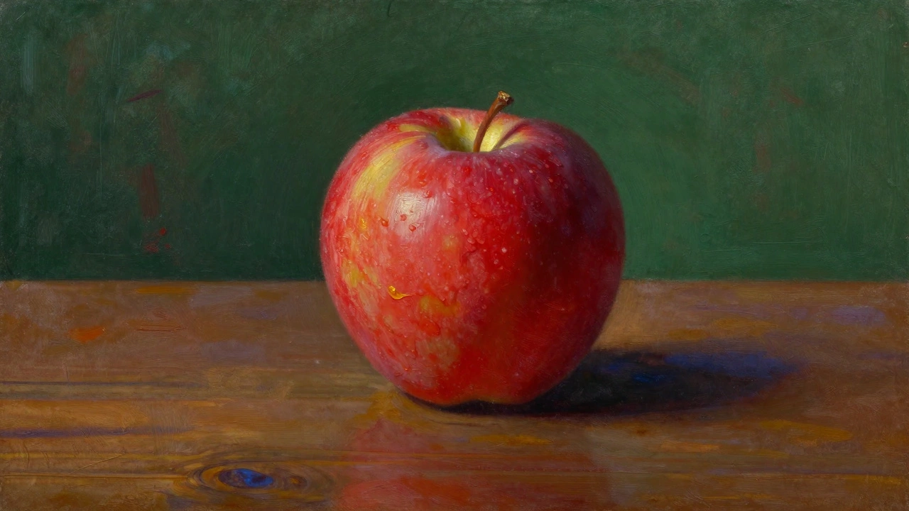
Grab your oil paints. Pick one subject-a bowl of fruit, a single flower, a mug on a table. Now do this:
- Paint the main object using only one color family-say, reds and pinks.
- Paint the background using only its complement-greens.
- Don’t mix them on the palette. Let them sit next to each other.
- Wait 10 minutes. Step back. Notice how the red looks brighter, the green feels deeper.
- Now, add a tiny touch of red to your green. Add a touch of green to your red. See how the contrast softens but doesn’t die?
Do this three times with different pairs. Blue and orange. Yellow and purple. You’ll start seeing the world differently. Shadows aren’t gray. They’re the color’s opposite, quietly present.
Final Thought: It’s Not About Rules. It’s About Control.
Complementary colors aren’t a rulebook. They’re a language. Once you understand how they push and pull, you stop fighting your paint. You start guiding it. You can make a sunset feel warm without using yellow. You can make a shadow feel alive without black. You don’t need more paint. You just need to know how to use what you already have.
Oil painting is slow. So is learning color. But when it clicks-when you see how a hint of orange makes blue feel like midnight-you’ll never look at a canvas the same way again.
What are the three complementary color pairs in oil painting?
The three standard complementary pairs in oil painting are red and green, yellow and purple, and blue and orange. These are based on the traditional RYB (red-yellow-blue) color wheel used by painters. Each pair, when placed next to each other, enhances the intensity of the other. When mixed, they create neutral tones like gray or brown, which artists use to mute colors naturally.
Why shouldn’t I use black to darken colors in oil painting?
Black flattens color and kills its vibrancy. Instead of using black, painters use the complementary color to darken or mute a hue. For example, to darken red, add a touch of green. To darken yellow, add a bit of purple. This keeps the color feeling alive and connected to the rest of the palette. It’s how masters like Rembrandt and Sargent achieved rich, deep shadows without losing the sense of light.
Can I use complementary colors in landscapes?
Absolutely. Landscapes thrive on complementary contrast. The sky is often blue, so the ground or distant hills can carry hints of orange or warm yellow. Shadows on grass aren’t green-they’re often green with a touch of red to make them feel deeper. Even clouds can have subtle purple tones when lit by warm sunset light. These contrasts create realism without needing perfect detail.
Do I need to use all three complementary pairs in one painting?
No. Most successful paintings use just one or two complementary pairs. Van Gogh focused almost entirely on blue and orange. Monet used yellow and purple in his water lilies. Choosing one pair gives your painting unity. Trying to use all three often makes the work feel chaotic. Pick the pair that best supports your subject and mood.
How do I mix a muted complementary color without losing its character?
Add a tiny amount of the complement to the base color-not enough to turn it gray, just enough to soften it. For example, if you’re painting a red apple, add a dab of green to the shadow side. Or, mix your green with a bit of red before applying it. This keeps the color grounded and natural. The key is subtlety: think of it as whispering the opposite color, not shouting it.
