Key Takeaways
- The rule of thirds divides the canvas into a 3×3 grid, guiding eye placement and balance.
- Positioning the subject’s eyes near the top‑left or top‑right intersection creates immediate visual impact.
- Combine the rule with complementary tools like the golden ratio, leading lines, and lighting for richer portraits.
- A quick checklist helps you verify composition before the first brushstroke.
- Avoid common missteps such as forced symmetry or neglecting the background.
When you hear artists talk about the Rule of Thirds is a compositional guideline that splits an image into nine equal parts using two equally spaced horizontal lines and two equally spaced vertical lines, they’re really describing a visual shortcut for placing key elements where the eye naturally rests. In portrait painting, this shortcut can mean the difference between a stiff studio study and a lively, engaging likeness. Below, we’ll unpack how the grid works, why placing the eyes at an intersection feels right, and how to blend the rule with other compositional helpers without turning your canvas into a rigid template.
Understanding the Rule of Thirds
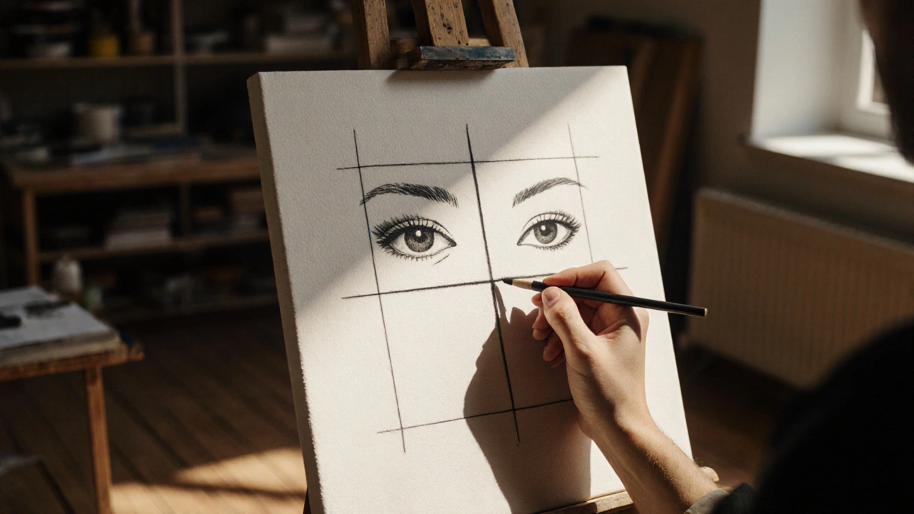
The rule of thirds dates back to early photographic manuals, but painters adopted it long before cameras existed. By drawing two horizontal and two vertical lines across the canvas, you create four intersection points-sometimes called "power points." These points are natural magnets for the viewer’s gaze. When the subject’s most expressive feature-typically the eyes-sits on one of these points, the portrait instantly feels balanced yet dynamic.
Why does this work? Human vision doesn’t scan a flat surface uniformly. We tend to look first at the top‑left corner, then move across the image. Placing important details in the top‑left or top‑right intersection taps into that habit, inviting the viewer to linger.
Applying the Rule to Portrait Painting
Here’s a step‑by‑step guide you can sketch on your canvas before you start painting:
- Lightly draw the 3×3 grid with a thin charcoal line or a hidden pencil mark.
- Identify the most expressive part of your subject-usually the eyes.
- Align the eyes with the upper‑left or upper‑right intersection. If you’re painting a profile, the eye often lands on the top‑center line, but still near a vertical line.
- Place the nose and mouth along the central vertical line, slightly below the eye level. This keeps the facial features in harmony with the grid.
- Consider the shoulders and torso. Position the shoulders so they follow the lower horizontal lines, creating a subtle "Z" shape that guides the eye from the eyes down to the body.
When you step back, the composition should feel anchored yet free. The eyes draw attention, while the rest of the body follows the implied lines of the grid.
Common Mistakes and How to Fix Them
Even seasoned artists can fall into traps:
- Over‑rigidity: Treating the grid as a strict rule leads to formulaic portraits. If the subject’s natural eye line doesn’t match an intersection, adjust the grid instead of forcing the feature.
- Ignoring the background: A busy backdrop can compete with the subject. Keep background elements simple or align them with the opposite intersections to balance visual weight.
- Center‑heavy composition: Placing the face dead center feels static. Shift the head slightly off‑center to inject energy.
To correct these, pause after your first sketch. Ask yourself: “Is the eye placement creating tension or harmony? Does the background support or distract?” Small tweaks often solve the issue without repainting the whole canvas.
Complementary Composition Tools
While the rule of thirds is a powerful starter, pairing it with other guidelines enriches the portrait.
Golden Ratio is a mathematical proportion (approximately 1:1.618) that appears frequently in nature and classic art, often visualized as a spiral or a series of rectangles. In portrait painting, you can overlay a golden spiral so the curve follows the contour of the face, enhancing organic flow.
Leading Lines are visual cues-such as a gaze direction, a neck curve, or a background element-that draw the viewer’s eye toward the main subject. Use a subject’s line of sight, a scarf, or a window frame to guide the eye to the eyes placed at a power point.
Lighting is the arrangement of light and shadow on the subject, shaping form, mood, and depth. Balance key light on the side where the eyes sit, and use rim light to accentuate the silhouette, keeping the light source consistent with the grid’s implied direction.
Don’t forget Color Harmony is the strategic use of complementary, analogous, or triadic color schemes to create visual unity. A limited palette that echoes the background can keep attention on the face, while a splash of contrasting color near the opposite intersection adds visual interest.
Rule of Thirds vs. Golden Ratio in Portraits
| Aspect | Rule of Thirds | Golden Ratio |
|---|---|---|
| Grid Pattern | 3×3 grid creating four power points | Spiral or rectangle sequence based on 1:1.618 proportion |
| Typical Use | Quick placement of eyes, shoulders, and background elements | Organic flow of facial contours and hairlines |
| Pros | Easy to apply, works well for beginners, strong visual impact | Creates natural rhythm, aligns with human perception of beauty |
| Cons | Can feel mechanical if overused | More complex to calculate, may require adjustments for varying head shapes |
Many artists start with the rule of thirds to lock in the primary focus, then layer the golden ratio to fine‑tune the surrounding details. The combination yields a portrait that feels both dynamic and harmonious.
Step‑by‑Step Portrait Composition Checklist
- Sketch the 3×3 grid lightly on the canvas.
- Place the eyes on the top‑left or top‑right intersection.
- Align the nose and mouth along the central vertical line, slightly below the eyes.
- Check shoulder placement against the lower horizontal lines.
- Overlay a golden spiral if you want additional flow; adjust the head position if needed.
- Introduce leading lines (gaze direction, background elements) that point to the eyes.
- Set up key lighting to highlight the face where the eyes sit.
- Choose a muted background color that complements the subject’s skin tone.
- Step back and ask: “Do the eyes command attention? Does the whole scene feel balanced yet alive?”
- Make final tweaks-shift the grid, soften background details, or adjust light intensity.
Following this list reduces trial‑and‑error time and helps you finish a portrait that feels intentional from the first glance.
Pro Tips from Master Portraitists
Look at how the greats used the rule:
- Rembrandt often placed the subject’s eye just inside the upper‑left power point, then used a dramatic rim light to separate the face from the dark background.
- John Singer Sargent combined the grid with fluid brushwork; his portraits feel spontaneous because he let the background slide into the opposite intersection, creating tension.
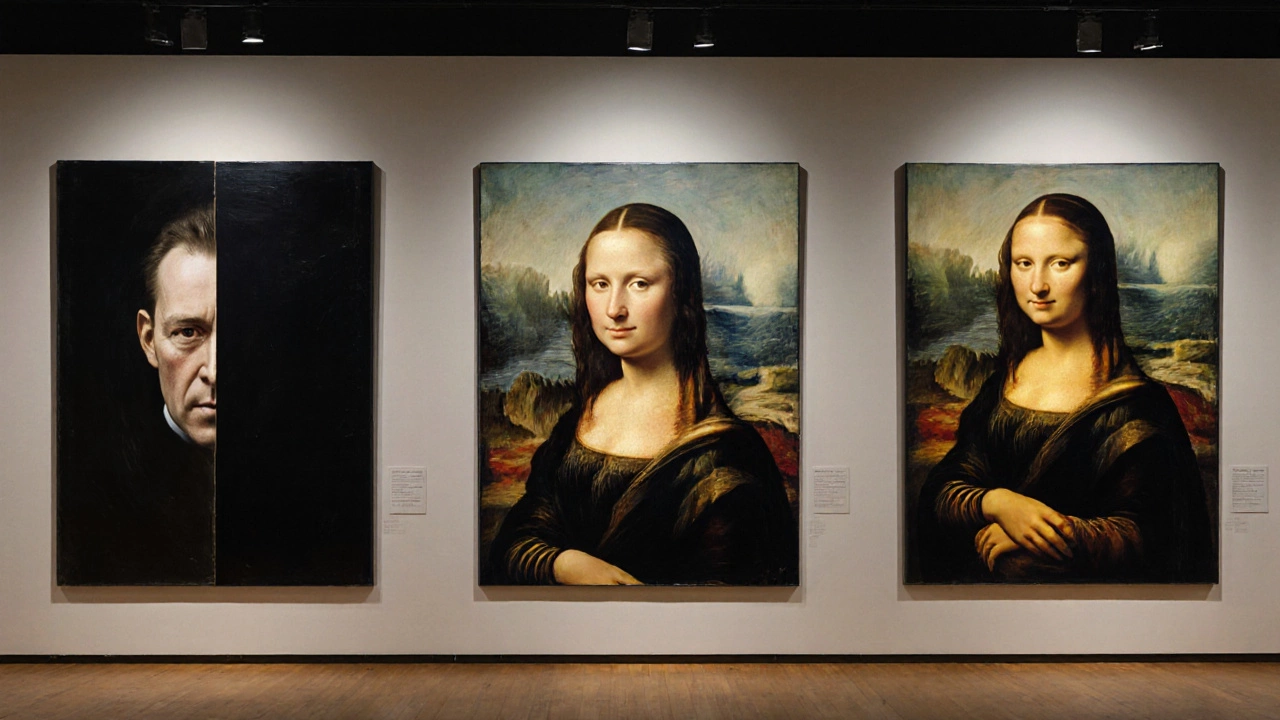
- Leonardo da Vinci employed the golden ratio alongside the rule of thirds in his famous “Mona Lisa,” aligning the eyes with a power point while the subtle smile follows a golden spiral.
Studying these examples shows that the rule is a launchpad, not a cage. Feel free to bend it when the subject’s personality calls for a different approach.
Putting It All Together
Next time you set up a portrait, start with the simple 3×3 grid, place the eyes on a power point, then layer in golden ratio curves, leading lines, and thoughtful lighting. Use the checklist to verify each element. By treating the rule of thirds as a flexible guide rather than a strict law, you’ll create portraits that feel alive, balanced, and uniquely yours.
What exactly is the rule of thirds in portrait painting?
The rule of thirds divides the canvas into nine equal rectangles using two horizontal and two vertical lines. The four intersections-called power points-are natural spots for placing the eyes or other focal features, creating a balanced yet dynamic composition.
Do I have to follow the grid exactly?
No. The grid is a guideline. If the subject’s natural eye line doesn’t line up, you can shift the grid or place the eyes slightly off‑grid. The goal is to use the principle to guide the eye, not to imprison the composition.
How does the golden ratio differ from the rule of thirds?
The golden ratio relies on a 1:1.618 proportion, often visualized as a spiral. It creates a more organic flow that follows natural curves, whereas the rule of thirds uses straight lines and intersections for quick placement. Artists frequently combine both for richer results.
Can lighting affect how the rule of thirds works?
Yes. Light that highlights the eye positioned on a power point reinforces its importance. Conversely, harsh shadows on the opposite side can draw the eye away, breaking the intended balance. Matching key light with the grid’s focal area enhances the composition.
What are common pitfalls when using the rule of thirds?
Typical errors include forcing the subject’s eyes into an intersection when the pose doesn’t allow it, ignoring background clutter that competes for attention, and centering the portrait, which nullifies the grid’s benefit. Regularly stepping back and reassessing the balance helps avoid these issues.