Portrait Painting Color Palette Selector
Recommended Palette
Base Mix
Instructions: Mix equal parts Burnt Sienna, Yellow Ochre, and Raw Umber. Add titanium white to reach mid-tone.
Highlight Mix
Instructions: Use titanium white with a touch of your base's warm/cool component for lifelike highlights.
Swatch Chart
Ever stared at a blank canvas and wondered which hue will make a portrait truly come alive? Choosing the right color isn’t just about picking a shade you like; it’s a blend of science, observation, and personal style. This guide walks you through the essential decisions, from basic color theory to the exact pigments that give skin its natural glow.
Understanding the Basics of Color in Portrait Painting
Color theory is a system of rules and relationships that explains how colors interact, harmonize, and affect visual perception. Mastering these rules helps you avoid muddy mixes and create depth with just a few pigments.
Three core attributes shape every hue:
- Hue - the name of the color (red, blue, yellow, etc.).
- Value - how light or dark a color appears. In portrait work, value drives the illusion of three‑dimensional form.
- Saturation - the intensity or purity of a hue. Too much saturation can make skin look unrealistic, while controlled desaturation adds realism.
When you combine hues, you create secondary and tertiary colors that can be warm (red‑based) or cool (blue‑based). Understanding which side of the spectrum you’re working on will guide the rest of your palette decisions.
Building a Reliable Skin‑Tone Palette
Skin tone refers to the natural coloration of human flesh and is a complex mix of warm, cool, and neutral pigments. Rather than trying to paint skin with a single “flesh” color, successful artists assemble a small, versatile palette that can be adjusted for lighting, ethnicity, and mood.
Start with these seven core pigments (oil or acrylic, depending on your medium):
- Burnt Sienna - warm orange‑brown, provides the base for sunlit skin.
- Raw Umber - cool brown, tones down the warmth and adds shadows.
- Yellow Ochre - muted yellow, essential for mid‑tone highlights.
- Cadmium Red Light - small amount adds blush and vitality.
- Alizarin Crimson - deep cool red for undertones and shadows.
- Viridian or Phthalo Green - a touch creates the subtle greenish undertones seen in veins.
- Titanium White - for bright highlights and to lift values.
Mix the pigments on a palette knife or a mixing surface, adjusting the ratio until you achieve a neutral base that matches the subject's overall complexion. From that base, you can add or subtract warmth and coolness as needed.
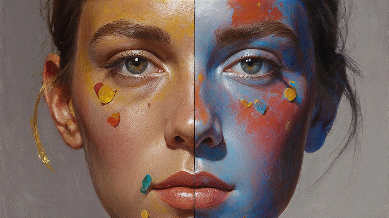
Warm vs. Cool Strategies: When to Choose Which
Warm colors are hues that contain red or orange undertones, such as cadmium red, burnt sienna, and yellow ochre. They convey heat, intimacy, and a forward‑moving energy.
Cool colors contain blue or green undertones, like ultramarine, phthalo blue, and raw umber. They suggest distance, calm, and can make a face appear more recessed.
The choice between warm and cool palettes hinges on three factors:
- Lighting conditions - Golden hour sunlight produces warm casts; overcast daylight favors cool, neutral tones.
- Subject’s complexion - Warm‑skinned subjects (e.g., Mediterranean, South Asian) respond best to a warm base; cooler‑skinned subjects (e.g., Northern European) benefit from more blue‑based mixes.
- Emotional intent - Warm palettes can evoke affection or drama; cool palettes are often used for introspection or melancholy.
Below is a quick visual comparison of the two approaches:
| Attribute | Warm Palette | Cool Palette |
|---|---|---|
| Base Hue | Burnt Sienna + Yellow Ochre | Raw Umber + Phthalo Blue |
| Typical Highlights | Titanium White + Cadmium Red Light | Titanium White + Alizarin Crimson |
| Shadow Tone | Burnt Umber + Touch of Green | Raw Umber + Small Amount of Blue |
| Emotional Effect | Warmth, intimacy, energy | Calm, distance, introspection |
Choosing the Right Base and Mixing Techniques
Before you even lift a brush, decide on a base color - a neutral mixture that sits at the midpoint of your value scale. A good base lets you push lighter or darker without re‑mixing the entire palette.
Here’s a step‑by‑step method that works for most mediums:
- Mix equal parts Burnt Sienna, Yellow Ochre, and Raw Umber to form a neutral brown.
- Add a few drops of Titanium White to lift the value to a mid‑tone.
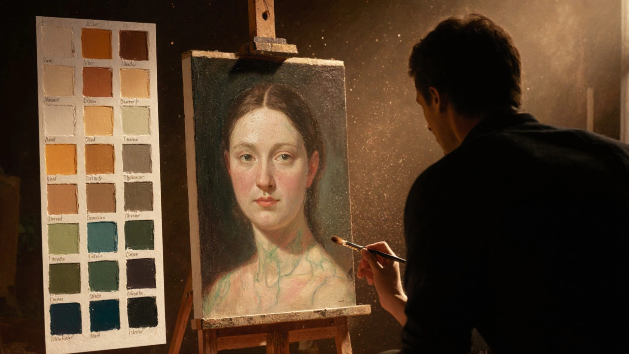
- Test the mix on a white paper or canvas; compare it to a reference photo of the sitter under the same lighting.
- If the test appears too warm, introduce a tiny amount of Phthalo Blue or Green. If too cool, add a pinch of Cadmium Red Light.
- Label this mixture as your "base skin tone" and use it as the foundation for all subsequent layers.
Remember, the goal is not to achieve an exact replica of the reference photo but to create a harmonious set of values that read correctly from a distance.
Common Pitfalls and Pro Tips
Even seasoned painters stumble over a few recurring mistakes. Spotting them early saves time and frustration.
- Pigment Overload - Adding too many colors leads to a muddy result. Stick to 5‑7 pigments per skin‑tone palette.
- Ignoring Local Color - Skin is never uniform; the cheek, the nose bridge, and the jawline each have subtle hue shifts. Adjust your mix locally rather than applying the base everywhere.
- Flat Value Transitions - Humans are three‑dimensional. Use gentle gradations of value to suggest roundness, especially around the brow ridge and chin.
- Over‑Whiteing - Too much white creates a plastic look. Use a tiny amount of white to lift highlights, then blend with a complementary warm or cool hue to retain richness.
- Neglecting complementary colors - they create contrast that makes skin appear more vibrant. For a warm base, a dash of cool ultramarine in the shadows adds depth; for a cool base, a hint of orange (cadmium orange) in the highlights brightens the complexion.
Pro tip: Keep a small swatch chart on the side of your canvas. Paint a series of 1‑inch squares ranging from the lightest highlight to the deepest shadow using the same pigments you’ll employ on the portrait. This visual roadmap keeps you from drifting into undesired color zones.
Quick Reference Checklist for Portrait Color Selection
- Identify lighting (warm golden hour vs. cool overcast).
- Determine subject’s natural undertone (warm, neutral, cool).
- Choose a base palette: warm (Burnt Sienna, Yellow Ochre) or cool (Raw Umber, Phthalo Blue).
- Mix a neutral mid‑tone base using 5‑7 core pigments.
- Create a swatch chart covering highlights, mid‑tones, and shadows.
- Apply local color adjustments as you render facial features.
- Use complementary accents sparingly to boost vibrancy.
Frequently Asked Questions
Can I paint realistic skin with only three pigments?
It’s possible for a stylized portrait, but most realistic works need at least five to seven pigments to capture the subtle warm‑cool interplay. Three pigments will quickly become muddy when you try to achieve both highlights and deep shadows.
Should I use more white for highlights or a lighter hue?
A pure white can make highlights look plastic. Instead, lift the base color with a small amount of its own warm or cool counterpart-like adding a touch of Cadmium Red Light to a warm base or a dash of Ultramarine to a cool base. This keeps the highlight lively and integrated.
How do I handle different ethnic skin tones?
Start with the same neutral base, then shift the hue balance. Darker tones often require more raw umber and a bit of burnt sienna, while lighter tones benefit from extra yellow ochre and a sprinkle of cadmium red. Always reference a photograph under the same lighting to fine‑tune the mix.
Is it okay to mix oil and acrylic pigments?
No. Oil and acrylic binders are chemically incompatible. Stick to one medium per painting to avoid cracking or adhesion issues. However, you can use acrylic underpainting and then apply oil glazes on top once the acrylic is fully dry.
What’s the best way to test my skin‑tone mixes before applying them?
Apply a small swatch on a white card, then hold it next to a reference photo under the same lighting. Observe the values and undertones; adjust by adding tiny drops of warm or cool pigments until the swatch mirrors the reference.
Choosing the right color for portrait painting isn’t a one‑size‑fits‑all answer. It’s a process of observation, a handful of well‑chosen pigments, and a clear plan for warm vs. cool strategies. With the guidelines above, you’ll be able to craft skin tones that feel alive, capture mood, and keep your palette manageable-all without drowning in endless tubes of paint.