Watercolor Pillars Planner
New Painting Project
Loading...
...
Loading...
...
Loading...
...
Loading...
...
Recommended Workflow
- ...
- ...
- ...
- ...
There is a specific moment when a beginner looks at a masterful watercolor painting is a transparent medium that relies on the interaction between pigment, water, and paper to create luminous effects. and feels a sense of defeat. The colors seem to glow from within. The edges are soft yet precise. The white highlights look intentional, not like mistakes where you forgot to paint. You try to replicate it, but your result looks muddy, flat, or chaotic. Why? Because you are treating watercolor like gouache or acrylics. You are trying to cover up errors instead of working with the medium’s unique nature.
To bridge that gap, you need to understand the four foundational pillars that hold the entire discipline together. These aren't just random tips; they are the physical laws of how this medium behaves. If you ignore one, the structure collapses. If you master them, you gain control over chaos. Let's break down transparency, flow, light, and restraint-the non-negotiable rules of the trade.
Pillar 1: Embracing Radical Transparency
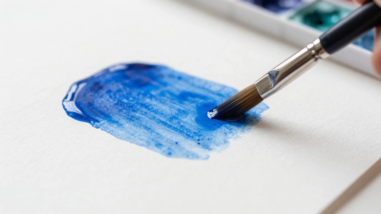
The first pillar is the most defining characteristic of the medium: transparency is the quality of allowing light to pass through pigment layers, creating depth and luminosity rather than opacity. Unlike oil or acrylic paint, which sit on top of the canvas and reflect light directly back to your eye, watercolor pigments sink into the fibers of the paper. Light travels through the clear pigment layer, hits the white paper underneath, and bounces back. This reflection is what gives watercolors their signature "glow."
When you start mixing paints on your palette to get a dark color, you are often killing this glow. Muddy colors happen when you mix too many opaque pigments or overwork a single spot. To maintain transparency, you must trust the layering process. Instead of trying to mix the perfect dark brown on your palette, lay down a wash of burnt sienna. Let it dry. Then, glaze a thin layer of ultramarine blue over it. The resulting purple-brown will have a depth that no palette-mixed mud can achieve.
- Avoid Overworking: Once the paper fibers are raised and filled with pigment, adding more paint only creates a dull, scummy surface. Leave the area alone once it dries.
- Choose Transparent Pigments: Some pigments, like cadmium red or titanium white (if you use it), are naturally opaque. Stick to earth tones, phthalo blues, and quinacridones for maximum clarity.
- Glazing is Key: Apply thin, watery layers over dry previous layers. Each layer adds intensity without sacrificing the light passing through.
Think of transparency as honesty. You cannot hide mistakes in watercolor. If you make an error, you either accept it as part of the composition or lift it out carefully. There is no painting over it. This forces you to be decisive and clean in your application.
Pillar 2: Controlling the Flow of Water
If transparency is the soul of watercolor, water is its blood. The second pillar is understanding water dynamics is the manipulation of water volume and timing to control pigment diffusion, edge hardness, and blending capabilities. Many beginners fear water because it moves unpredictably. But water follows physics. It flows downhill. It seeks balance. It evaporates.
You need to master two primary states: wet-on-dry and wet-on-wet. Wet-on-dry involves applying wet paint to dry paper. This gives you hard, crisp edges. It is essential for details, architecture, and defined shapes. Wet-on-wet involves wetting the paper first, then dropping pigment onto it. The paint blooms and diffuses softly. This is how you create skies, foliage, and atmospheric backgrounds.
The trick isn't just knowing these terms; it's managing the ratio of water to pigment. A "wash" should be fluid enough to spread evenly but concentrated enough to leave a visible mark. Too much water, and the paint becomes invisible. Too little, and it drags across the paper, leaving streaks. Practice lifting your brush and watching how the puddle settles. Does it pool in low spots? That means your paper isn't tilted correctly. Water needs a path to escape, or it will create ugly backruns-cauliflower-shaped stains that ruin smooth gradients.
| Technique | Paper State | Edge Quality | Best Use Case |
|---|---|---|---|
| Wet-on-Dry | Dry | Hard, Crisp | Details, Lines, Architecture |
| Wet-on-Wet | Damp/Wet | Soft, Diffused | Skies, Clouds, Backgrounds |
| Glazing | Dry (Previous Layer) | Transparent Overlay | Deepening Color, Shadows |
Timing is everything. In wet-on-wet, you have a window of perhaps thirty seconds before the water starts to absorb into the paper. If you wait too long, the new pigment won't blend; it will sit on top and create a hard edge unexpectedly. Learn to read the sheen of the paper. When the glossy wet look turns matte, the water has been absorbed, and the "wet" phase is over.

Pillar 3: Painting with Light, Not Dark
This is the hardest mental shift for artists coming from other mediums. In oil painting, you can add white to lighten a color. In watercolor, there is no white paint (unless you cheat with gouache, which defeats the purpose). Your white comes from the paper itself. Therefore, the third pillar is light value management is the strategic preservation of unpainted paper areas to represent the brightest highlights in a composition.
You must plan your painting from light to dark. Before you touch the paper with a brush, identify where the light source is. Where are the highlights? Mask those areas off mentally, or physically using masking fluid if necessary. As you apply your washes, you are essentially carving out the shadows. The mid-tones come next, and finally, the darkest accents.
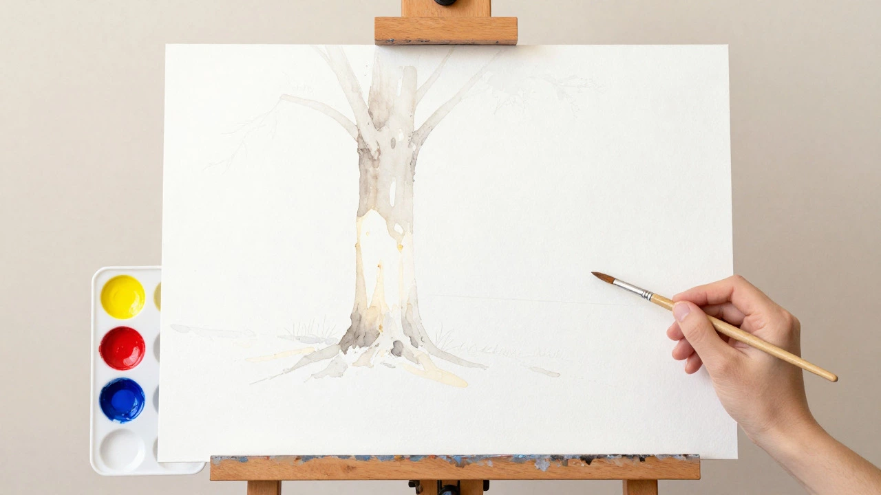
If you paint a tree trunk, you don't paint the whole trunk brown. You paint the shadow side dark brown, the mid-tone lighter brown, and leave the highlight side completely white. If you accidentally cover the highlight, you have to scrape it out or bleach it, both of which damage the paper grain. Planning ahead saves you from this headache.
Value studies are crucial here. Sketch your composition in black and white first. Ensure you have a full range of values: bright whites, light grays, mid-grays, dark grays, and deep blacks. If your sketch is all mid-tones, your painting will look gray and lifeless regardless of how vibrant your colors are. Contrast creates energy. Without distinct light and dark areas, the eye has nowhere to rest.
Pillar 4: The Art of Restraint
The final pillar is psychological: restraint is the disciplined practice of limiting brushstrokes and layers to preserve the freshness and spontaneity of the medium. Watercolor rewards simplicity. It punishes fussiness. Every time you touch the paper, you risk muddying the color or ruining the texture. The best watercolor paintings often look effortless because the artist resisted the urge to fix things.
Ask yourself: "Is this stroke necessary?" If you are painting a leaf, do you need to outline every vein? Probably not. A suggestion of shape and a variation in tone is enough. The viewer's brain fills in the rest. This is called "loose" painting. Tight, detailed painting requires immense skill and confidence, but loose painting requires wisdom.
Restraint also applies to your color palette. Beginners often buy sets with forty-eight colors. Pros often work with six or seven. Limiting your palette forces you to learn how to mix colors effectively. It prevents the painting from becoming a rainbow mess where no color harmonizes with another. Try limiting yourself to three primaries: a warm yellow, a cool red, and a cool blue. See how many colors you can create from just those three. You’ll find that your paintings become more cohesive and unified.
Finally, know when to stop. Most paintings are ruined in the last ten minutes. You think, "It needs just one more detail," and you add a tiny line that distracts from the main focal point. Step back. Look at the painting from across the room. If it reads clearly, put the brush down. Walk away. Come back tomorrow. You’ll likely see that it was finished hours ago.
Putting the Pillars Together
These four pillars do not work in isolation. They interact constantly. Transparency allows light to show through. Flow determines how that light spreads. Light values define the form. Restraint keeps the composition clean. When you start a new piece, run through this checklist:
- Plan the Lights: Identify where the white paper will remain visible.
- Apply Wet Washes: Use wet-on-wet for soft backgrounds, keeping the water moving.
- Layer Transparently: Build up mid-tones and shadows with glazes, letting each layer dry.
- Add Details Sparingly: Use wet-on-dry for crisp lines, but only where absolutely needed.
- Stop Early: Resist the urge to overwork the piece.
Mastering watercolor is not about having steady hands. It is about understanding the behavior of water and pigment on paper. It is about accepting that you cannot control everything, but you can guide the process. By respecting these four pillars, you move from fighting the medium to dancing with it. The results will be fresher, brighter, and more alive.
What happens if I mix too many colors on my palette?
Mixing too many colors, especially more than three, tends to create muddy, dull tones. This violates the principle of transparency. Instead of mixing complex colors on the palette, try layering transparent washes on the paper. For example, layer blue over yellow to create green that retains vibrancy.
How do I prevent backruns in watercolor?
Backruns occur when wet paint touches semi-dry paint, causing the pigment to push outward and leave a hard, stained edge. To prevent this, ensure the paper is either fully dry or uniformly wet before applying new paint. Tilt your paper slightly to allow excess water to drain away from the area you are working on.
Can I use white paint in watercolor?
Traditionally, pure watercolor does not use white paint. The white of the paper serves as the lightest value. Using white gouache or acrylic breaks the transparency rule and can make the painting look flat. However, for small corrections or special effects, some artists use white sparingly, but it is generally discouraged for maintaining the medium's integrity.
What is the difference between wet-on-wet and wet-on-dry?
Wet-on-wet involves applying paint to damp paper, resulting in soft, blended edges and unpredictable blooms. It is ideal for backgrounds and atmospheric effects. Wet-on-dry involves applying paint to dry paper, creating sharp, controlled edges. It is used for details, lines, and defined shapes.
Why do my watercolors look gray and dull?
Dull watercolors usually result from overmixing colors on the palette, using opaque pigments, or lacking sufficient contrast in values. Ensure you have a range from bright white to deep black in your value study. Also, try glazing transparent layers instead of mixing all colors together beforehand.