Jun 23, 2025
How to Transform Your Drawings Into Digital Art: Easy Steps for Beginners
When working with painting composition the way visual elements are arranged to guide the viewer’s eye and create balance artistic composition, you’re setting the stage for everything that follows. A solid composition decides where the eye lands first, how it moves across the canvas, and where the story ends. In short, painting composition includes focal point placement, visual flow, and a sense of unity, so every brushstroke works toward a single goal.
Most artists start with the rule of thirds, the golden ratio, or diagonal lines to give a piece a natural rhythm. These guidelines aren’t strict laws; they’re tools that help you achieve balance and tension without overthinking each detail. When you place a key element on a intersecting line, the viewer instinctively pauses there, creating a focal point that feels earned. Pair that with proper weight distribution – heavy colors or large shapes on one side balanced by lighter tones on the opposite – and you get a composition that feels both dynamic and stable.
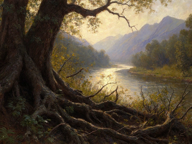
Balance isn’t just about symmetry. Asymmetric balance uses contrasting elements – a bright orange figure next to a muted blue sky – to keep the eye moving. This approach works especially well in landscape painting, where a towering tree can offset a distant horizon, or in portrait work where a strong shadow balances a lit face. The key idea is that every element, whether color, shape, or texture, should answer the question: "What does it add to the overall design?"
Another vital piece is the use of negative space. Empty areas aren’t wasted; they give the eye room to breathe and highlight the main subjects. When you leave a quiet patch of sky or a plain background, you create contrast that makes the colors and forms in the foreground pop. Think of it as a musical rest – the silence makes the notes stand out.
When you bring color into the mix, the rules shift a bit. color theory the study of how colors interact and affect mood colour theory becomes your partner in guiding composition. Warm colors like red and yellow tend to advance toward the viewer, while cool blues recede. By placing warm tones near your focal point and cool tones in the background, you create depth without adding extra layers. Complementary colors – such as blue and orange – generate visual tension that pulls the eye toward the area where they meet, reinforcing the composition’s flow.
Beyond basic hue choices, saturation and value play a role too. A highly saturated splash can serve as an anchor, while a muted wash can soften surrounding elements. When you adjust value contrast – light versus dark – you can direct attention, carve out space, and emphasize the three‑dimensional feel of your scene. In practice, start with a limited palette, then add an accent color that ties the whole piece together. This method keeps the composition cohesive and prevents color chaos.
Perspective is the third pillar that gives your composition a sense of space. perspective the technique of representing three‑dimensional depth on a flat surface depth perspective influences how objects shrink, overlap, and line up toward a vanishing point. Linear perspective creates a clear path for the eye, leading from foreground to background. Atmospheric perspective – using lighter, cooler colors for distant objects – adds another layer of realism and helps separate layers in a landscape.
Even a simple one‑point perspective can turn a static still‑life into a scene that feels lived‑in. By aligning the strongest lines of your composition with the perspective grid, you make the viewer feel like they could step into the canvas. This technique also works in abstract painting, where implied depth can be suggested through overlapping shapes and graduated tones.
All these elements – rules, balance, color theory, and perspective – intersect to form a strong painting composition. The articles below cover everything from how to make a landscape more interesting, to the best color choices for portrait painting, and even the hardest modern art styles to master. Whether you’re a beginner figuring out where to place your first shape, or a seasoned artist fine‑tuning the subtle dance of light and dark, the collection gives you practical tips, real‑world examples, and step‑by‑step guidance. Dive in and discover how each piece of the puzzle fits together, so you can create paintings that not only look good but also tell a compelling story.
The rule of thirds is a simple yet powerful composition technique in oil painting that helps artists place subjects for maximum visual impact. Learn how to apply it to landscapes, portraits, and still lifes-and when to break it for artistic effect.
Learn how the rule of thirds shapes portrait painting, from eye placement to combining with golden ratio, lighting, and color. Follow a step‑by‑step checklist and avoid common compositional pitfalls.