Art Photography & Print Resolution Calculator
Configure Your Project
Results
Quick Setup Checklist
- Use a Tripod Essential
- Shoot in RAW format Essential
- Set Aperture to f/8 or f/11 Sharpness
- Position lights at 45-degree angles Lighting
- Keep ISO low (100-200) Quality
There is nothing worse than spending weeks on a painting, only to have it look muddy and washed out when you finally print it. You know the feeling. The colors are slightly off, the texture looks flat, or there’s a weird glare right in the middle of your signature. It happens because taking a picture of art isn’t like snapping a photo of your dog or a sunset. Your camera sees light differently than your eyes do, and printers interpret digital files with ruthless precision.
If you want your prints to match the original work, you need to treat the documentation process like part of the creation itself. This isn’t just about pointing and shooting; it is about controlling light, managing color, and choosing the right tool for the job. Whether you are working with thick oil impasto or delicate watercolor washes, getting this step right makes the difference between a souvenir and a gallery-quality reproduction.
Scan or Shoot? Choosing the Right Tool
The first decision you face is whether to use a flatbed scanner or a camera. For decades, scanners were the gold standard, but technology has shifted. Today, high-resolution cameras often produce better results for textured works, while scanners remain king for perfectly flat pieces like drawings or prints.
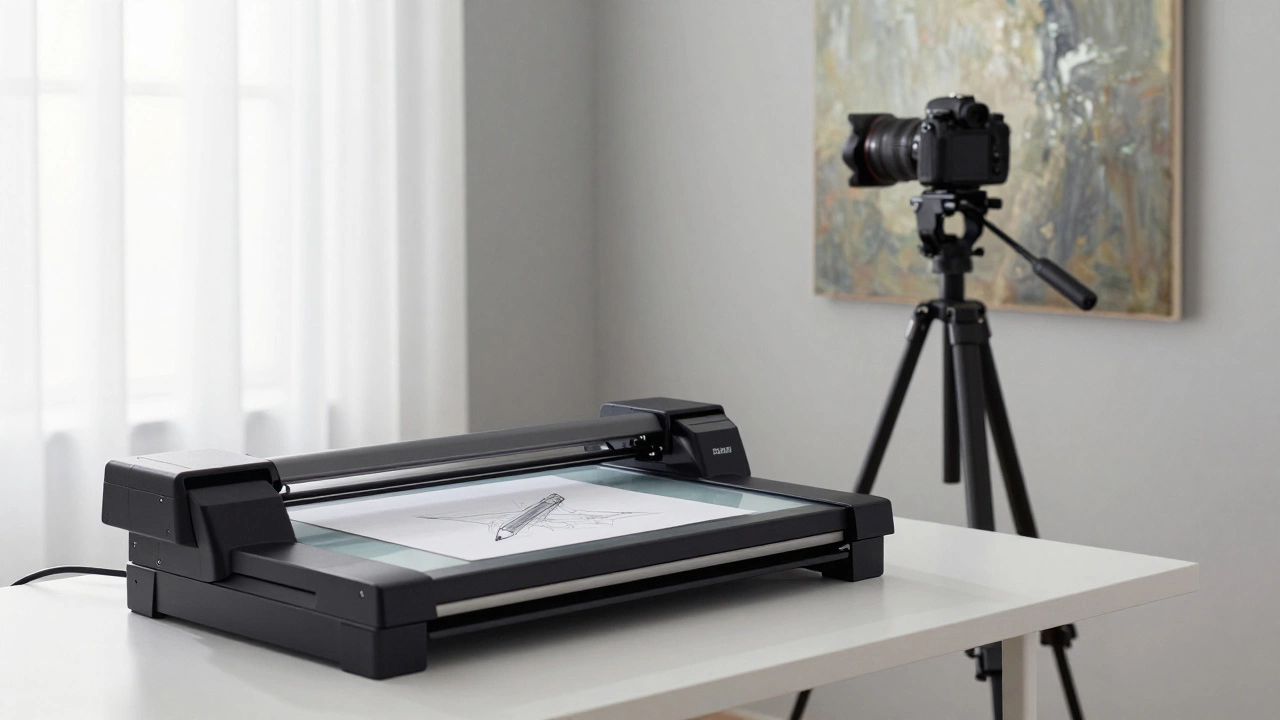
Flatbed Scanners are devices that capture images by moving a sensor across a glass surface. They provide consistent, shadow-free lighting and excellent resolution for flat media. If you have a pencil sketch, an ink drawing, or a thin watercolor paper, a scanner is usually your best bet. It captures every tiny detail without distortion. However, scanners have limits. Most consumer scanners cap out at 1200 dpi (dots per inch), which is plenty for small prints but might lack the dynamic range needed for large-scale reproductions. Also, if your artwork has any texture-like heavy brushstrokes or collage elements-a scanner will cast harsh shadows under those raised areas, ruining the image.
Cameras, on the other hand, offer flexibility. With a good lens and controlled lighting, a camera can capture the subtle variations in light and shadow that give a painting its depth. Modern DSLRs and mirrorless cameras easily exceed the resolution needs of most commercial printers. If your work has texture, or if it is too large to fit on a scanner bed, a camera is the only viable option.
| Feature | Flatbed Scanner | Digital Camera |
|---|---|---|
| Best For | Flat drawings, sketches, thin papers | Paintings with texture, large canvases, 3D objects |
| Lighting Control | Automatic, even, shadow-free | Manual setup required to avoid glare |
| Resolution | Up to 1200 dpi (standard) | Depends on megapixels (e.g., 24MP+) |
| Texture Handling | Poor (creates shadows under raised areas) | Good (captures depth and dimension) |
| Color Accuracy | High, but limited dynamic range | Very high with RAW format and calibration |
Setting Up the Perfect Lighting
Lighting is the single most important factor in art photography. Bad lighting creates reflections, uneven exposure, and color casts that are nearly impossible to fix in post-processing. You want soft, diffused, and even light. Direct sunlight is your enemy here-it creates hot spots and harsh shadows.
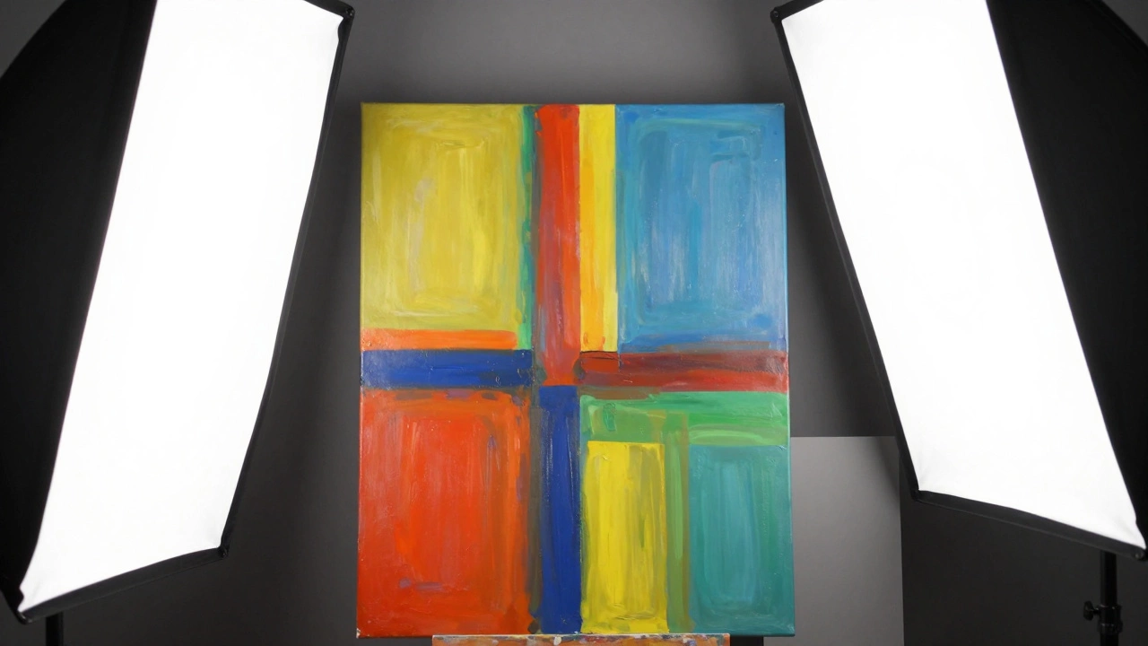
If you are using a camera, set up two light sources. These should be positioned at 45-degree angles to the artwork, one on the left and one on the right. This mimics natural studio lighting and minimizes glare. Use softboxes or diffuse the light through white sheets if you are using standard lamps. The goal is to eliminate any specular highlights-those shiny white spots where the light reflects directly off the canvas or varnish.
Check your own reflection. Stand back and look at the artwork. If you see yourself or the window behind you reflected in the piece, your lights are not positioned correctly. Adjust them until the surface looks matte and uniform. Consistency is key. Both lights should be the same type and intensity to avoid color temperature mismatches. One warm bulb and one cool LED will create a confusing mix of orange and blue tones that no amount of editing can fully correct.
Camera Settings for Maximum Detail
Your camera settings need to prioritize sharpness and color fidelity over convenience. Auto-mode is out. You need full manual control.
- Shoot in RAW: JPEGs compress data and bake in color settings. RAW files contain all the information captured by the sensor, giving you the flexibility to adjust white balance and exposure later without losing quality.
- Use a Tripod: Handholding the camera introduces shake, especially in lower light. A tripod ensures stability and allows you to use a slower shutter speed if needed, keeping the ISO low to reduce noise.
- Aperture Priority or Manual Mode: Set your aperture to f/8 or f/11. This is the "sweet spot" for most lenses, providing maximum sharpness across the entire frame. Avoid wide apertures like f/2.8, which can leave the edges of your artwork slightly out of focus.
- White Balance: Do not rely on auto white balance. It often guesses wrong with artistic colors. Instead, use a gray card. Place a neutral gray card next to your artwork, take a test shot, and set your custom white balance based on that. This ensures that reds stay red and blues stay blue, rather than shifting toward yellow or green.
- ISO: Keep it as low as possible, ideally ISO 100 or 200. Higher ISOs introduce grain, which can be mistaken for canvas texture or lost in printing.
Positioning and Framing
Geometry matters more than you think. If your camera is not perfectly parallel to the artwork, you will get keystoning-the image will look trapezoidal instead of rectangular. This distorts proportions and makes the final print look skewed.
Align your camera lens so it is directly perpendicular to the center of the artwork. Use the grid lines on your camera screen to ensure the edges of the canvas are parallel to the frame. Leave some breathing room around the edges of the artwork in the frame. This gives you space to crop later without cutting into the actual piece. If you are photographing a framed piece, decide early if you want the frame included. If yes, ensure the entire frame is evenly lit and visible. If no, plan to crop tightly to the edge of the canvas.
Take multiple shots. Move slightly, change the angle by a degree, and check the result. Sometimes a slight shift eliminates a hidden reflection. Review the images on your computer screen, not the small camera LCD, to zoom in and check for sharpness and distractions.
Post-Processing: Correcting Without Altering
The goal of editing is correction, not enhancement. You want the digital file to be an accurate representation of the physical object, not a reinterpretation of it.
- Crop and Straighten: Remove any background clutter and ensure the artwork is perfectly square. Use the perspective correction tools in software like Adobe Lightroom or Photoshop to fix any minor keystoning.
- Adjust White Balance: Even with a gray card, fine-tuning may be needed. Look at neutral areas in the painting-whites, grays, blacks-and ensure they are truly neutral, not tinted.
- Exposure and Contrast: Adjust these subtly. You want to preserve the details in the highlights and shadows. If the whites are blown out or the blacks are crushed, pull them back. The histogram is your friend here; aim for a balanced distribution without clipping at either end.
- Sharpening: Apply sharpening sparingly. Over-sharpening creates halos around edges and makes the image look artificial. Use masking to target only the edges and textures, avoiding smooth areas like skies or skin tones.
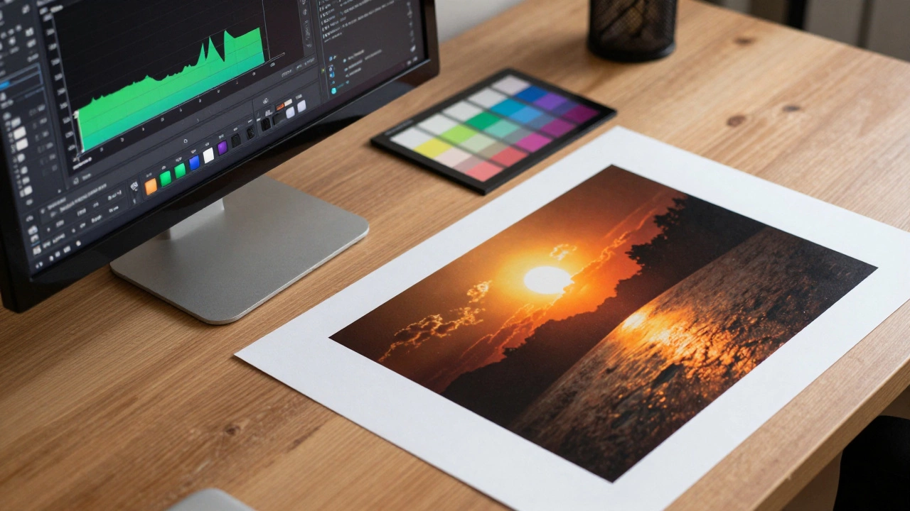
- Color Calibration: If you have a calibrated monitor, trust what you see. If not, compare the digital image to the original artwork side-by-side. Does the red look the same? If not, adjust the hue and saturation individually for specific channels.
Avoid adding filters, vignettes, or artistic effects. These belong in creative photography, not in archival documentation. The printer expects a clean, accurate source file.
Preparing Files for Print
Once your image is edited, you need to format it correctly for the printer. Resolution and color space are critical here.
Most professional printers require a resolution of 300 dpi at the final print size. If you are making a 20x30 inch print, your image dimensions should be 6000x9000 pixels. If your image is smaller, do not simply stretch it; it will look pixelated. Instead, use high-quality resampling algorithms in Photoshop to upscale gently, though starting with a higher-resolution source is always better.
Color space is another common pitfall. Screens use RGB (Red, Green, Blue) light, while printers use CMYK (Cyan, Magenta, Yellow, Key/Black) ink. When you send an RGB file to a printer, their software converts it automatically, but this conversion can shift colors unpredictably. For best results, convert your file to the specific color profile requested by your printer. Many online print services accept sRGB, which is a standard web color space, but high-end fine art printers may ask for Adobe RGB or a custom ICC profile. Always check the printer’s specifications before exporting.
Save your final file as a high-quality TIFF or PSD. These formats are lossless, meaning they don’t degrade quality like JPEGs do. JPEG compression artifacts can show up as strange patterns in solid color areas when printed large. If file size is an issue, a high-quality JPEG (maximum setting) is acceptable, but TIFF is preferred for archival purposes.
Troubleshooting Common Issues
Even with the best setup, things can go wrong. Here are a few common problems and how to fix them.
Glare and Reflections: If you still see hot spots, try polarizing filters on your lights and camera lens. Cross-polarization is a pro technique that eliminates almost all reflections from glossy surfaces. Alternatively, tilt the artwork slightly away from the lights, but remember to correct the perspective in post-processing.
Uneven Lighting: If one side of the painting is darker, check your light distances. Both lights must be equidistant from the center of the artwork. Use a light meter if you have one, or judge by eye until the brightness appears uniform.
Color Casts: If the whole image looks too warm or too cool, revisit your white balance. Ambient light in the room can interfere. Close the curtains and turn off overhead lights to isolate your setup. Only your two dedicated lights should be on.
Soft Focus: If the image isn’t sharp, check your focus point. Use manual focus and zoom in on the live view to ensure the brushstrokes or lines are crisp. Breathing while pressing the shutter can also cause blur; use a remote shutter release or the camera’s timer.
Do I need expensive equipment to photograph my art?
Not necessarily. While professional gear helps, a modern smartphone with a good camera can produce decent results for small prints if you control the lighting well. The biggest investment should be in lighting, not the camera body. Two affordable continuous LED lights with diffusion can outperform an expensive camera in bad lighting.
Can I use my phone to photograph art for large prints?
It depends on the print size. For small prints (up to 8x10 inches), a high-end smartphone might suffice. For larger prints, the resolution and dynamic range of a smartphone are usually insufficient, leading to pixelation or noise. A dedicated camera with a high-megapixel sensor is recommended for anything larger than 11x14 inches.
What is the best resolution for art prints?
The standard is 300 dots per inch (dpi) at the final print size. For example, a 20x30 inch print requires an image that is 6000x9000 pixels. Some printers may accept 240 dpi for very large formats, but 300 dpi ensures the highest quality and detail retention.
Should I remove the frame before photographing?
If you plan to sell unframed prints, photograph the artwork without the frame. This allows buyers to imagine their own framing options. If the frame is integral to the piece, include it, but ensure it is evenly lit and doesn't distract from the art. Cropping out the frame later is easier than trying to add one digitally.
How do I avoid color shifts between my screen and the print?
Calibrate your monitor regularly using a hardware calibrator. Work in a neutral lighting environment, and always request a proof from your printer before committing to a large run. Understanding the difference between RGB (screen) and CMYK (print) color spaces is crucial for managing expectations.