Figural Landscape Decision Maker
Answer the following questions to determine if including people in your landscape painting enhances or detracts from the work.
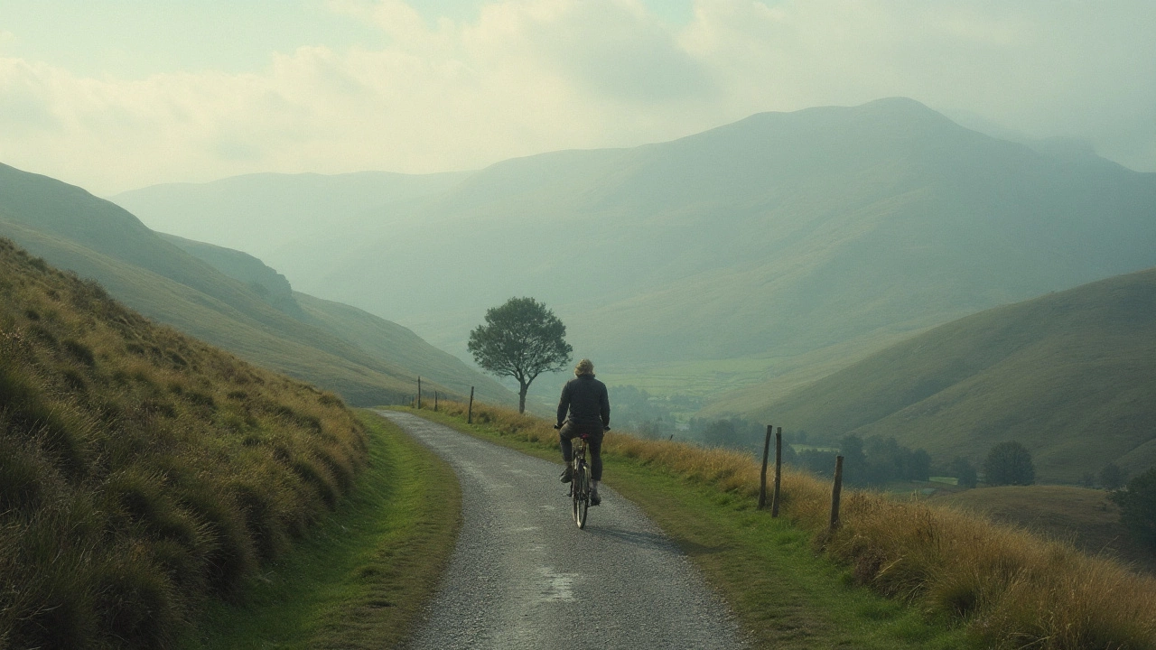
1. Composition
Does the figure complement rather than overpower the natural elements?
2. Perspective
Does the figure follow the same perspective rules as the landscape (e.g., atmospheric haze, diminishing size)?
3. Narrative
Does the figure support or enhance the mood and story of the scene?
Landscape painting is a visual art genre that focuses on natural scenery-mountains, rivers, forests, or open skies-often emphasizing light, atmosphere, and scale. Historically, it has been prized for its ability to evoke mood and place without the distraction of human activity. Yet artists have long asked: can a landscape painting include people and still fulfill its purpose? The answer is yes, and the decision hinges on several interrelated elements.
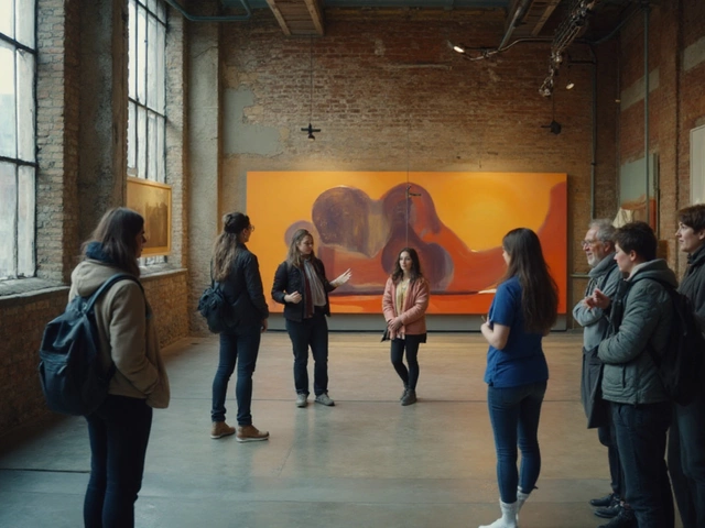
Why Add Figures? The Role of people in Scenery
Introducing human figures creates a sense of narrative, scale, and emotional connection. A lone fisherman on a misty lake immediately tells a story of solitude, while a bustling market set against rolling hills hints at prosperity. Figures act as visual anchors that guide the viewer's eye, turning an otherwise static vista into a lived experience.
Historical Perspectives: From Classical to Contemporary
Classical masters such as Claude Lorrain (1600-1682) painted idyllic landscapes that often featured mythological shepherds, blending nature with narrative. In the 19th century, Camille Corot used tiny figures to suggest activity without dominating the scene. The Romantic era embraced dramatic skies and heroic figures, while Impressionists like Claude Monet occasionally added workers to convey the impact of industrialization. Contemporary artists such as David Hockney juxtapose vivid human forms with stylized terrain, proving the blend is still alive.
Key Elements That Make Figures Work
Three core concepts determine whether people enhance or disrupt a landscape:
- Composition: Placement, proportion, and balance must serve the overall design. A figure should occupy a visual weight that complements, not overpowers, natural features.
- Perspective: Accurate or stylized perspective ensures figures sit naturally within depth cues like atmospheric haze or diminishing size.
- Narrative: The story implied by the figure should align with the mood of the environment-peaceful, dramatic, or mysterious.
Composition Strategies for Figural Landscapes
Here are practical ways to integrate people without sacrificing the integrity of the view:
- Use the Rule of Thirds: Position a solitary figure at an intersection point to create tension and draw the eye.
- Employ lead‑in lines-paths, rivers, or fence rows-that naturally guide the viewer toward the figure.
- Contrast size: a tiny figure against a massive mountain emphasizes grandeur; a larger figure nearby can function as a focal point.
- Balance color temperature: warm clothing against cool shadows can make a person pop while still harmonizing with the palette.
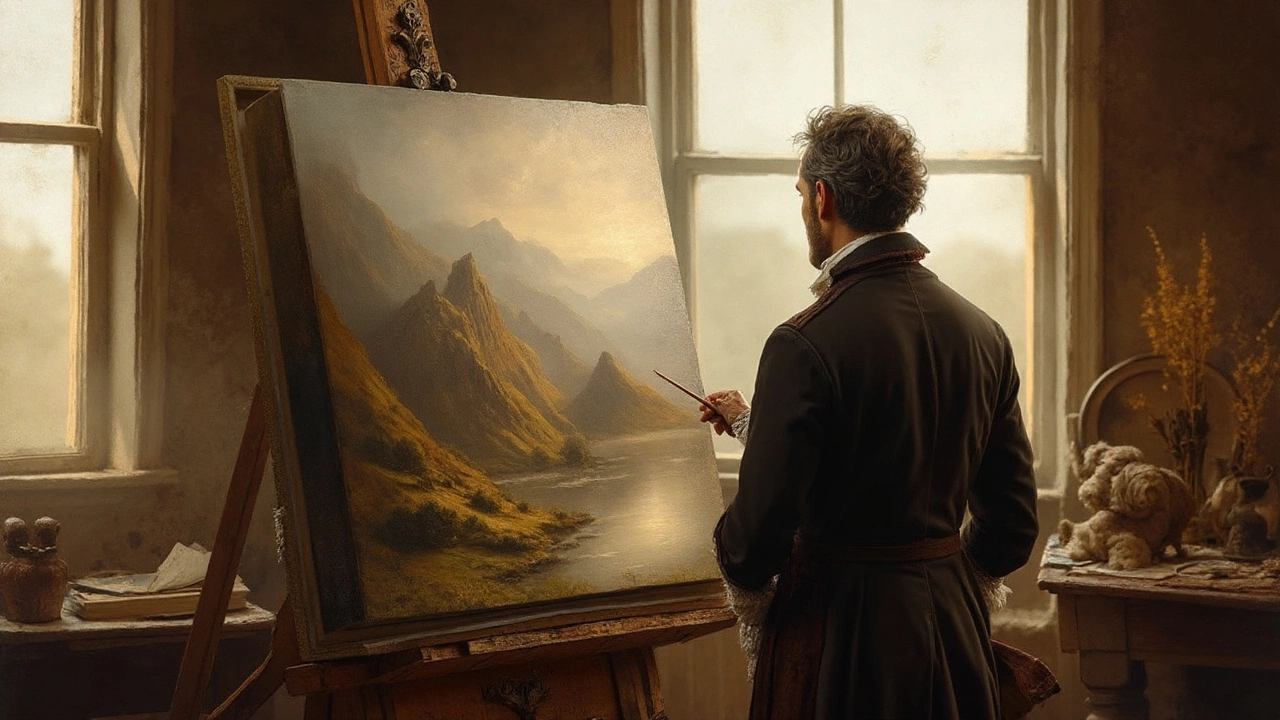
Perspective and Scale: Making Figures Feel Real
When the eye perceives depth, the figure must obey the same rules. Atmospheric perspective-where distant objects become lighter and bluer-applies equally to people. If a figure is set in the far distance, apply reduced contrast and softer edges. For foreground figures, emphasize sharp details and richer pigments.
Genre Blending: Landscape Meets Figure Painting
Art historians often categorize works that combine scenery and human activity under the umbrella of genre painting. This hybrid genre allows painters to explore social commentary, myth, or daily life while retaining the visual power of the natural world. The blend can shift the work’s primary classification: a painting dominated by terrain stays a landscape; one where the figure dominates may lean toward genre painting.
Comparison: Pure Landscape vs. Figural Landscape
| Attribute | Pure Landscape | Figural Landscape |
|---|---|---|
| Primary Focus | Nature’s forms and light | Nature + human narrative |
| Scale Cue | Relative size of trees, rocks | Figure provides explicit scale |
| Emotional Tone | Often contemplative or sublime | Can shift to intimate, dramatic, or storytelling |
| Historical Usage | Prominent in Romantic and Hudson River schools | Common in Baroque, Rococo, and Modernist works |
| Viewer Engagement | Static, meditative | Dynamic, invites narrative speculation |
Common Pitfalls and How to Avoid Them
Even seasoned painters stumble when merging figures and scenery. Below are typical errors and quick fixes:
- Overly Detailed Figures: If the figure’s detail exceeds that of the background, it will dominate the composition. Match the level of brushwork and texture.
- Incorrect Lighting: A figure lit from a direction opposite the sun creates inconsistency. Align light sources.
- Scale Mismatch: A realistically sized person against a miniature mountain looks off. Use atmospheric cues to adjust.
- Cluttered Foreground: Too many people can choke the view. Limit figures to one or two focal points.
Practical Tips for Artists Starting Out
If you’re experimenting with adding people to landscapes, follow these steps:
- Sketch the terrain first; lock in horizon line and major forms.
- Determine the narrative you want to convey-travel, labor, leisure.
- Place a silhouette or gesture study of the figure to test composition.
- Adjust color temperature of the figure to harmonize with ambient light.
- Render atmospheric perspective on the figure as you would on trees or hills.
- Step back frequently; ask whether the figure adds or distracts from the mood.
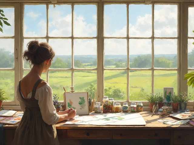
Modern Applications: Digital Tools and Mixed Media
Digital painters benefit from layers, allowing them to experiment with placement without committing. Photo‑bashing-using a photographic figure as a base-can speed up the process, but artists should repaint to integrate brushwork. Mixed media, such as collage of cut‑out silhouettes on oil canvas, can create striking contemporary figural landscapes.
Related Concepts and Next Steps
Exploring figural landscapes opens doors to adjacent topics:
- Iconography: Symbolic meanings of gestures, clothing, or props. \n
- Visual storytelling: How sequential elements guide narrative flow.
- Atmospheric perspective: Techniques for depth that apply to both terrain and figures.
- Study of specific art movements like Romanticism or Realism for context.
Future reads could cover "How to Paint Light on Human Skin in Outdoor Settings" or "Narrative Devices in Landscape Art".
Conclusion
Including people in a landscape painting is not only permissible-it can enrich the work by adding scale, story, and emotional depth. Success depends on thoughtful composition, consistent perspective, and a clear narrative intention. Whether you work in oils, watercolors, or digital media, the principles remain the same: let the figure and the land speak to each other, not compete.
Frequently Asked Questions
Should every landscape painting include people?
No. The decision is artistic. Pure landscapes excel at evoking mood through nature alone, while figures add narrative when the artist wants a story or scale reference.
How many figures are too many?
Typically one or two focal figures keep the composition balanced. More can work if they form a cohesive group that supports the scene’s action.
What historical periods favored figural landscapes?
The Baroque, Rococo, Romantic, and Realist periods frequently blended human activity with expansive scenery to convey drama, daily life, or moral themes.
How do I choose lighting for a figure in an outdoor scene?
Identify the primary light source-sunrise, midday, or sunset-and apply the same direction, color temperature, and shadow length to the figure as you do to the terrain.
Can digital tools replace traditional brushwork for figural integration?
Digital tools offer flexibility, but to achieve a seamless blend you should still mimic traditional brushstrokes on the figure, ensuring texture consistency across the whole canvas.
What are common mistakes beginners make when adding people?
Over‑detailing the figure, ignoring light direction, mismatching scale, and crowding the foreground are typical errors. Simplify, match lighting, and keep the figure in proportion with atmospheric cues.
Is there a rule for color harmony between figures and scenery?
Use analogous or complementary colors: warm clothing against cool shadows, or cool tones for figures in a warm sunrise. The key is to keep the palette cohesive.