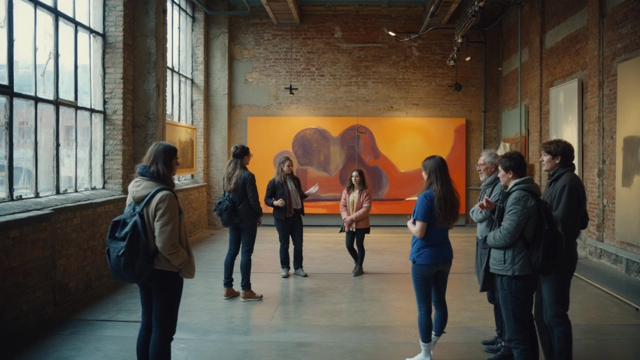
Modern art isn’t chaos. It runs on rules-just not the old ones about perfect perspective or polished portraits. If you’ve ever stood in front of a canvas of shapes and thought, “Okay, but what am I supposed to look for?”, you’re in the right place. I’ll unpack the core ideas that drive modern art, show you a simple method to read any piece, and give you a cheat sheet you can keep in your pocket (or your Notes app). I’m writing this from Vancouver, where the rain is great for museums, and even my dog, Simba, seems to pause at bold color fields. Fair warning: some principles contradict each other. That’s not a bug. That’s modernism.
- TL;DR: Modern art shifts from imitation to inquiry: artists test what art can be, not just what it can show.
- Core principles: autonomy of form, abstraction, material truth, fragmentation, process over polish, concept-first, everyday materials, viewer participation.
- Use a 5-step reading method: look, map formal choices, spot the rule being tested, link to context, check your response.
- Movements are toolkits, not boxes: Cubism = fragmentation; Bauhaus = design logic; Dada = anti-art; Abstract Expressionism = gesture.
- Cheat sheet + FAQ at the end: fast questions, fast answers, practical next steps you can use on your next gallery visit.
The Principles in Plain English
Modern art was born when artists started questioning the old job description of art: “copy nature beautifully.” Around 1900-1950, the job changed to “use form to think.” Critics and curators at the time said it clearly. In 1911, Wassily Kandinsky wrote that painting could act like music-non-representational, yet deeply expressive. In 1936, MoMA’s director Alfred H. Barr Jr. drew a map of modern movements that placed abstraction at the center. In 1960, critic Clement Greenberg argued that painting should show its own flatness rather than pretend to be a window. Whether you agree or not, these statements set up the ground rules.
Here are the eight modern art principles most people actually use when they make, show, or judge modernist work:
- 1) Autonomy of form: A painting can be “about” color, line, and shape-no story necessary. Think of Henri Matisse’s red rooms or Piet Mondrian’s grids. The form doesn’t illustrate a subject; form is the subject.
- 2) Abstraction: Reduce, simplify, or remove recognizable objects to reach essence. Kazimir Malevich’s black square isn’t a picture of something; it’s a stake in the ground: pure form. Abstraction can be slight (Picasso’s faces) or total (Rothko’s color fields).
- 3) Material truth: Let the material be itself-oil paint looks like paint, canvas stays flat, steel is steel. You see brushstrokes, drips, welds. The work doesn’t hide how it was made; it teaches you to notice it.
- 4) Fragmentation and multiple viewpoints: Objects and space are broken and reassembled (Cubism) or presented as time spread out (Futurism), reflecting how perception actually works-messy, layered, mobile.
- 5) Process over polish: The act of making matters as much as the finished look. Jackson Pollock’s drips encode movement. Paul Klee’s Bauhaus notes treat making like research, not decoration.
- 6) Concept-first thinking: Duchamp’s readymades (a bottle rack, a urinal) say: if the idea is strong, choosing can be as significant as crafting. Art is a choice framed by context.
- 7) Everyday materials and techniques: Collage, found objects, tape, industrial paint-modernists yank art off the pedestal and into real life (Picasso’s newspaper scraps; Kurt Schwitters’s bus tickets).
- 8) Viewer participation: Meaning isn’t delivered; it’s co-created. Ambiguity invites you to finish the work in your head. Optical art literally uses your visual system as part of the machinery.
These principles don’t replace “skill.” They redefine it. The skill is design, reduction, decision-making, and curiosity. You’re not out of the game if you don’t draw like the Old Masters-you’re playing a different sport.
Apply the Principles: A Step-by-Step Reading Method
You don’t need an art history degree to read modern art. Use this fast method next time you’re in a gallery or scrolling a museum feed. Time target: five minutes per work.
- Look before you think. 30-60 seconds of silent observation. Note the first three things that hit you: color vibe, dominant shape, scale. Don’t name objects yet; describe the look ("wide red bands," "hard edges," "scattered circles").
- Map the formal choices. Ask four questions: What’s the color system (limited vs. loud)? What shapes dominate (geometric vs. organic)? What’s the surface like (smooth, crusty, drippy)? How is space handled (flat, fractured, deep)?
- Spot the rule being tested. Which principle is the artist leaning on or challenging-abstraction, fragmentation, material truth, concept-first? Example: a canvas with visible staples, raw edges, and thick impasto = material truth and process.
- Link to context. A quick mental check: When and where was this made? What was happening in art then? 1910s Paris (Cubism), 1920s Germany (Bauhaus), 1950s New York (Abstract Expressionism). If you know the artist, recall one fact. If not, use wall text.
- Check your response. Notice your body: calm, tense, curious? Modernists pursued direct impact. Your reaction is data. If you’re bored, ask why-monotony can be the point.
Rules of thumb that save time:
- Flat and frontal, no depth: likely testing autonomy of form and material truth.
- Broken planes, overlapping angles: fragmentation/ multiple viewpoints → Cubist logic.
- Huge scale, fields of color: embodied mood → Abstract Expressionism/color field abstraction.
- Common objects presented “as art”: concept-first, Dada lineage, or later conceptual art.
- Industrial or modular feel: Bauhaus/design thinking-art meets architecture/manufacture.
Pitfalls to avoid:
- Don’t hunt for hidden pictures. Modern art usually isn’t a puzzle. It’s a proposition.
- Don’t measure by realism. Different yardstick. Use clarity of decisions, not lifelike rendering.
- Don’t assume “a child could do this.” Try to remake it. Matching the decisions is the hard part.
- Don’t ignore scale. A tiny Rothko print at home won’t hit like a wall-sized original in a quiet gallery.

Movement-by-Movement: What Each Principle Looks Like
Movements aren’t silos; they’re toolkits. Artists mix and match. Still, it helps to know the classic alignments so you can guess the principles on sight.
| Movement | Approx. dates | Core principles in play | Representative names / moments |
|---|---|---|---|
| Post-Impressionism | 1886-1905 | Color autonomy, structure, expressive form | Van Gogh, Gauguin, Cézanne |
| Fauvism | 1905-1910 | Color as subject, flatness, simplification | Matisse, Derain |
| Cubism | 1907-1914 | Fragmentation, multiple viewpoints, collage | Picasso, Braque; 1912 collage breakthrough |
| Futurism | 1909-1916 | Motion/time in form, dynamism | Balla, Boccioni |
| Dada | 1916-1924 | Concept-first, anti-art, readymades | Duchamp; 1917 Fountain submission |
| Suprematism/Constructivism | 1915-1925 | Pure abstraction, geometry, utilitarian design (Constructivism) | Malevich, Lissitzky, Rodchenko |
| Bauhaus | 1919-1933 | Material truth, design logic, integration with industry | Gropius, Klee, Albers; foundation courses |
| Surrealism | 1924-1940s | Automatism, dream logic, chance process | Dali, Miró, Ernst |
| Abstract Expressionism | 1943-1965 | Gesture/process, scale, material presence | Pollock, de Kooning, Rothko |
| Minimalism | 1960s-1970s | Reduction, industrial materials, viewer-perception | Judd, Andre |
| Op Art | 1960s | Optical effects, viewer participation | Bridget Riley, Victor Vasarely |
Anchor points for your mental map:
- 1913 Armory Show (New York): The shock event that introduced American audiences to European modernism. Headlines called it crazy; attendance was huge. Shock plus curiosity is the modernist ignition mix.
- 1936 MoMA chart: Alfred Barr’s diagram of modern art placed abstraction at the center with arrows branching to movements. It’s the cleanest official snapshot of the logic at the time.
- Greenberg’s flatness (1960): The argument wasn’t that illusion was bad, but that painting’s power grows when it plays to its strength: a flat surface carrying color and mark.
Examples you can picture quickly:
- Picasso, “Les Demoiselles d’Avignon” (1907): Bodies split into planes; space collapses; masks stare back. Principle: fragmentation, autonomy of form.
- Kandinsky’s improvisations (1910s): Swirls and blasts of color with no literal subject. Principle: abstraction as expression.
- Duchamp, “Fountain” (1917): A urinal turned, titled, and presented. Principle: concept-first; art as context switch.
- Rothko color fields (1950s): Soft rectangles, large scale, hovering edges. Principle: material truth, mood by pure color.
- Judd’s boxes (1960s): Industrial fabrication, serial repetition. Principle: reduction and viewer-space awareness.
If you’re in Vancouver, the local scene often blends these lineages with West Coast light and materials. A concrete-and-cedar installation in a rain-lit gallery checks the boxes for material truth and viewer participation without looking like a knockoff of New York 1950.
Cheat Sheet, FAQs, and What to Do Next
Here’s your pocket guide, plus answers to the questions people actually ask after a gallery visit, and a set of next steps depending on who you are-student, museum-goer, or someone who wants to make work.
Quick Cheat Sheet
- If it’s simplified and flat, ask: Is the artist prioritizing form over representation?
- If it’s broken and angular, ask: What happens when you see an object from many sides at once?
- If it looks “unfinished,” look for process: drips, edits, tape lines, raw canvas.
- If it uses everyday stuff, the message might be about choice and context (Dada/Conceptual).
- If it’s huge and quiet, give it time; it’s designed to work slowly on your senses.
Heuristics (fast rules of thumb):
- Principle = what’s being tested. Spot that first; the rest will make more sense.
- Meaning grows from decisions. Ask “Why this color/material/scale?” three times in a row. If the answers hang together, the work often does too.
- Good modern work is legible even without text. Wall labels help, but the decisions should register visually.
Mini-FAQ
- Is modern art the same as contemporary art? No. “Modern” usually refers to c. 1900-1960s (some say to the 1970s). “Contemporary” is what’s made now, often using modernist tools but with today’s issues, media, and politics. A 2025 installation using AI is contemporary, not modern.
- So what are the elements vs. principles? Elements are ingredients (color, line, shape, texture, space). Principles are how artists use them (balance, emphasis, rhythm) plus modernist add-ons (abstraction, autonomy, concept-first). In modern art, the recipe is the point.
- Why do some modern works look simple? Reduction is a strategy. Simpler look, harder decisions. Restraint and clarity take discipline-ask any designer.
- How do I know if it’s “good”? Coherence of decisions, freshness within its time, sensitivity to materials, and the strength of the proposal. Compare a weak monochrome to a strong one: edges, surface, color temperature, scale-the difference is night and day.
- Does intent matter? Yes, but so does what’s on the wall. Good modern art aligns intent, process, and result. If the idea is smart but the object is careless, it usually reads as thin.
Common Misconceptions
- “Modern art killed beauty.” It expanded it. Beauty can be a clean proportion, a fearless cut, a raw surface-think Noguchi’s stone or Agnes Martin’s lines.
- “It’s all subjective.” Taste is personal; judgment has criteria. Curators and artists argue using evidence: form, context, influence, craft.
- “Anyone can do it.” Anyone can start. Not everyone can decide this much this well.
Exercises (10-20 minutes each)
- Three-Thumbnail Test: Draw three tiny boxes. In each, solve the same visual problem with different principles: 1) flat color balance, 2) fractured space, 3) material emphasis (e.g., visible tape). You’ll feel how choices change the result.
- Label the Principle: Scroll a museum’s online collection and rapid-fire label the governing principle for 10 works: “fragment,” “reduce,” “material,” “concept.” You’ll speed up your eye.
- Reverse Engineer: Pick one piece you dislike. List five deliberate choices it makes. Often the “why” emerges and your stance softens or sharpens for reasons beyond “I don’t like it.”
Next Steps / Troubleshooting by Persona
- Museum-goer with limited time:
- Pick three works only. Apply the 5-step method. Take a phone note with three bullets per work.
- If a show feels random, find the dominant formal thread (color, geometry, scale). Ride that thread.
- Troubleshoot boredom: slow your eye (10 full breaths). Big works need time to “load.”
- Student writing a short paper:
- Thesis formula: “Artist X tests [principle] by [formal choice], which reflects [context] and affects viewers by [perceptual effect].”
- Cite solid anchors: Kandinsky 1911 (abstraction), Barr 1936 (map), Greenberg 1960 (flatness); quote briefly.
- Avoid plot summary. Describe decisions and their impact.
- Beginner artist:
- Pick one principle per small series. Make six studies testing just that. Change one variable at a time (color, scale, material).
- Photograph process. If the process is part of the work, show it.
- Troubleshoot “muddy” results: limit palette to 3 hues; pick a dominant shape family; simplify.
- Parent with a curious kid:
- Play “spot the decisions.” Ask: What’s the most important color? Where do you think the artist started?
- Give permission to dislike, but ask for a reason tied to a choice.
- Mirror modernist play: cut shapes from colored paper and arrange three versions in five minutes.
A quick reality check on sources
The claims about abstraction, flatness, and the modernist turn are traceable to primary documents: Kandinsky’s booklet “On the Spiritual in Art” (1911) lays out the case for non-objective painting; Alfred H. Barr Jr.’s 1936 MoMA chart literally diagrams modern art’s paths; Clement Greenberg’s 1960 essay “Modernist Painting” gives the flatness argument. Add in exhibition shock moments like the 1913 Armory Show, and you have the historical bones. Knowing this helps you see individual works as arguments in a long conversation, not just isolated oddities.
If you remember one thing when you’re standing in front of a tough piece, remember this: modern art is a lab. Every choice you can see is a test. Ask what hypothesis the artist is running-and then decide if the test works on you. Simba still prefers the big color fields. I do too, on rainy days.
