Painting Color & Palette Sales Advisor
Pick a color palette and describe your target buyer to get an instant sales-readiness score with practical tips.
Walk into any successful gallery or scroll through a thriving online art shop, and you’ll notice a pattern. The pieces that catch the eye-and stay in the buyer’s cart-often share a specific visual DNA. It isn’t always about technical skill, though that matters. It is frequently about color. Specifically, it is about how those colors interact with the viewer’s emotions and their existing home decor.
If you are an artist trying to figure out why your vibrant abstracts sit on the shelf while your muted portraits fly off it (or vice versa), you are not alone. Understanding which hues resonate with buyers is less about following a strict rulebook and more about understanding human behavior. Here is what the data and market trends suggest about the colors that actually move inventory.
The Psychology Behind the Purchase
Before we talk about specific shades, we need to talk about why people buy art. Most people do not buy art just because they like the subject matter. They buy it because they think it will make them feel a certain way in their space. This is where Color Psychology is the study of how hues influence human mood, behavior, and perception.
Buyers are subconsciously looking for emotional regulation. A busy professional might seek calm; a creative entrepreneur might seek energy. Your job as an artist is to match your palette to these subconscious needs. If you paint a chaotic, high-saturation red piece, you are targeting someone who wants stimulation. If you paint a soft, low-contrast blue, you are targeting someone who wants peace. Knowing which group is larger in your target market helps you decide what to produce next.
The Top-Selling Color Palettes
While taste is subjective, market data from major art platforms shows clear winners. These are the palettes that consistently generate the highest click-through rates and conversion numbers.
| Palette Category | Key Colors | Emotional Association | Best For |
|---|---|---|---|
| Muted Neutrals | Beige, Taupe, Soft Grey, Cream | Calm, Neutral, Timeless | Living Rooms, Offices, Minimalist Decor |
| Soft Pastels | Dusty Pink, Sage Green, Light Blue | Gentle, Welcoming, Modern | Bedrooms, Nurseries, Scandinavian Style |
| Earthy Tones | Ochre, Terracotta, Olive, Brown | Grounded, Organic, Warm | Kitchens, Boho Interiors, Rustic Spaces |
| High Contrast Bold | Cobalt Blue, Crimson, Black, White | Dramatic, Energetic, Statement | Foyers, Accent Walls, Modern Lofts |
Muted Neutrals are the quiet giants of the art market. They sell well because they are safe. A buyer can hang a beige and grey landscape above a sofa without worrying if it clashes with their throw pillows. This versatility makes neutral tones the easiest sell for beginners entering the market. However, because they are so common, competition is fierce. You need strong composition to stand out when your colors aren't doing all the heavy lifting.
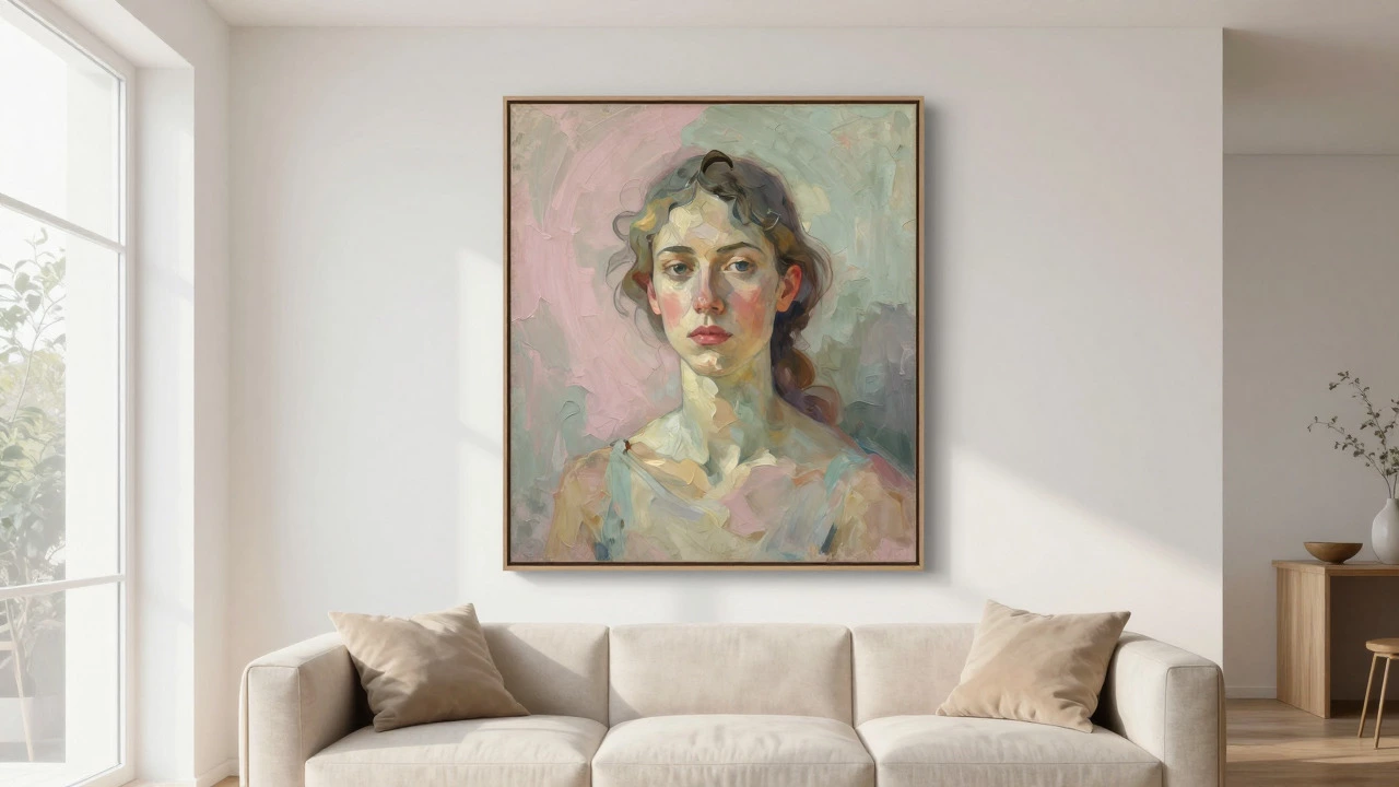
Soft Pastels have seen a massive surge in popularity over the last few years, driven by interior design trends favoring lightness and airiness. Dusty pink and sage green are particularly potent in Portrait Painting is a genre focusing on depicting the appearance, personality, or mood of a person. When you use pastels in portraits, the skin tones appear softer and more approachable. This works exceptionally well for family portraits or contemporary female portraiture, which remains a top-selling category on platforms like Etsy and Saatchi Art.
Why Portraits Dominate Specific Color Choices
Since we are looking at this through the lens of portrait painting, let’s get specific. Faces are complex. Skin tones vary wildly, and lighting changes everything. So, what colors actually help a portrait sell?
The background is your best friend. A detailed face with a chaotic, multi-colored background can be visually exhausting. Buyers often prefer portraits where the background simplifies the subject. This is why monochromatic backgrounds in deep blues, warm ochres, or cool greys are so effective. They push the focus entirely onto the eyes and expression.
Consider the "Golden Hour" effect. Many digital artists and oil painters mimic the warm, golden light of late afternoon. Using hues of amber, gold, and soft orange creates a nostalgic, intimate feeling. This type of portrait sells well because it feels personal. It looks like a memory rather than a document. If you are painting a client, ask them about their favorite time of day. Then, paint the lighting accordingly. That personal connection drives repeat business and referrals.

Matching Art to Interior Design Trends
Art doesn't exist in a vacuum. It hangs on walls. Therefore, your colors must play nicely with current interior design movements. In 2026, the dominant trends continue to blend comfort with sophistication.
- Scandinavian & Japandi: These styles favor light woods, white walls, and minimal clutter. Art in these spaces should feature large areas of negative space (white or light canvas) with delicate lines or soft watercolor washes. Heavy, dark oils often look out of place here unless used as a single, powerful focal point.
- Modern Farmhouse: Think exposed beams, shiplap, and cozy textiles. Earthy tones, botanical prints, and rustic landscapes thrive here. A portrait in this context might use warmer, sepia-like tones to match the wood elements in the room.
- Contemporary Minimalism: Clean lines, monochrome furniture, and bold accents. This is where high-contrast black and white photography or stark geometric abstractions shine. If you paint portraits for this demographic, keep the palette limited to two or three colors maximum.
A practical tip: Look at the photos of homes in popular real estate listings or Pinterest boards for your target demographic. What colors dominate the walls? What fabrics are being used? Your art should complement those existing elements, not fight them. If most of your potential buyers have white walls, bright yellow might pop too aggressively. A soft coral or a muted teal might integrate better.
Selling Online vs. In-Person
The medium matters. When selling online, screen calibration is a nightmare for both you and the buyer. What looks like a rich crimson on your monitor might look like a dull brick red on a customer's phone. This discrepancy leads to returns and bad reviews.
To mitigate this, rely on universal color truths. Dark colors tend to photograph darker than they look in person. Light colors tend to photograph brighter. If you are selling digitally, consider offering a slightly higher saturation version of your work for the website listing, knowing that it will likely render flatter on various screens. Alternatively, provide multiple photos of the physical piece under different lighting conditions. Natural daylight is the only honest judge of color.
In-person galleries offer a different dynamic. People touch the texture. They see the brushstrokes up close. Here, the actual pigment quality matters more. A metallic gold leaf or a glossy varnish catches the light in ways that a photo cannot capture. Use this to your advantage. If you use unique materials, highlight them in your description. "Hand-applied gold leaf accents" is a stronger selling point than just "gold details."

Common Mistakes That Kill Sales
Even with the right colors, you can sabotage your sales with poor execution. Here are the pitfalls to avoid:
- Over-Saturating Everything: If every part of the painting is loud, nothing stands out. Rest the eye. Use neutral zones to balance bold areas.
- Ignoring the Frame: The frame is part of the color story. A thick, bright red frame will clash with a subtle pastel portrait. Always show your work in a standard, neutral frame (like simple black or natural wood) in your listings unless the frame is custom-made for the piece.
- Trending Too Hard: Neon colors might be trendy for one season, but they age poorly. Classic combinations like navy and cream, or charcoal and rust, remain evergreen. Aim for timeless appeal first, trend second.
How to Test Your Own Palette
You don’t need to guess what works. You can test it yourself. Start by creating a small series of five portraits using the same subject but varying only the background color. Keep the lighting consistent. Post them on social media or your email list. Ask your audience directly: "Which one would you hang in your living room?"
Track the responses. Do people gravitate toward the calming blue? Or does the energetic orange get more likes? Over time, you will build a dataset of what resonates with your specific community. This feedback loop is invaluable. It moves you from guessing to knowing.
Also, pay attention to your own best sellers. Look back at your last ten completed pieces. Which ones sold fastest? Analyze their palettes. Did they share a common hue? Did they all have a similar level of contrast? Identifying your personal signature style within a market-friendly palette is the sweet spot for sustainable success.
Frequently Asked Questions
Do bright colors really sell better than dark colors?
Not necessarily. Bright colors attract attention but can be harder to place in a home. Dark colors often convey sophistication and drama. The key is balance. A bright accent against a dark background often performs better than a fully saturated piece because it offers visual relief.
What is the most popular color for portrait backgrounds?
Neutral tones like grey, beige, and soft blue are the most popular. They allow the viewer to focus on the subject's face and expression without distraction. Deep, solid colors like navy or forest green are also highly effective for creating a dramatic, moody atmosphere.
Should I match my art to my customers' wall colors?
Ideally, yes. If you know your primary market has white or light grey walls, stick to palettes that complement neutrals. If you are selling to a niche with bold interior designs, you have more freedom to use contrasting colors. Always consider the context in which the art will live.
Does the size of the painting affect color choice?
Yes. Large paintings need simpler color schemes to avoid overwhelming the space. Small paintings can handle more complex, detailed color interactions. A large, multi-colored abstract might feel chaotic, whereas a small one might feel intricate and beautiful.
Are neon colors good for long-term sales?
Neon colors are risky for long-term resale value. They tend to date quickly as trends shift. While they can sell well initially due to their novelty, they may become difficult to sell later. Stick to classic hues for pieces you want to hold for a long time or resell easily.