Mar 23, 2025
Is My Photography Fine Art? The Basics You Need to Know
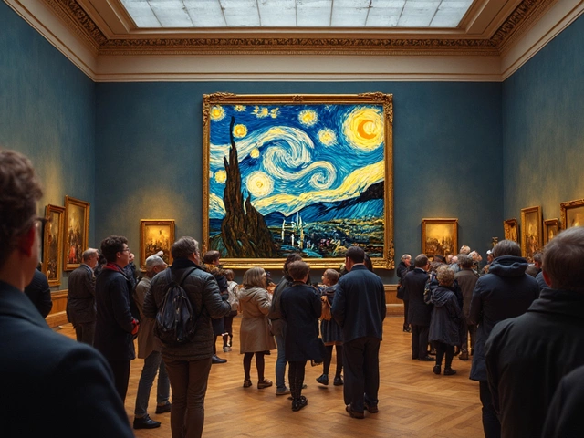
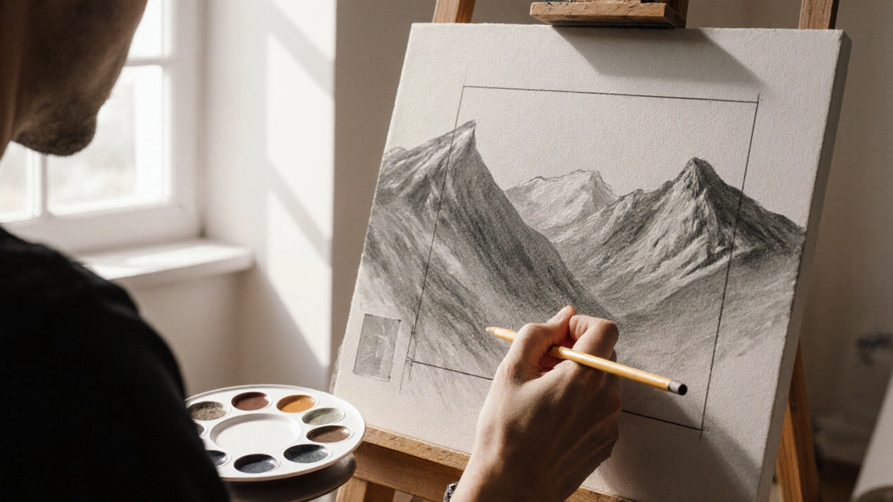
When working with Painting Depth, the technique of creating a convincing sense of three‑dimensional space on a flat canvas. Also called depth illusion, it lets viewers feel they are looking into a real scene rather than just at paint. Essential allies in this process are Composition and Color Theory, which shape how depth is read, while Perspective provides the geometric backbone. Understanding these relationships forms the foundation for any artist who wants to move beyond flat visuals.
Painting depth isn’t magic; it’s a series of deliberate choices. First, perspective dictates the rules of space – a single‑point line vanishing toward the horizon creates the illusion that objects recede. Next, value contrast from light to dark tells the eye which parts are near and which are far; darker tones push back, lighter tones pull forward. Atmospheric perspective adds a subtle blue‑green haze to distant elements, mimicking how the atmosphere softens colors with distance. Overlapping shapes is another quick cue – when one form sits on top of another, the mind instantly knows which is closer. Scale follows the same logic; a small figure feels farther than a larger one placed at the same eye level. Texture also plays a role: sharp, detailed brushwork signals proximity, while smoother, less defined areas suggest distance. Together, these tools let Composition guide the viewer’s journey through the picture plane, and Color Theory fine‑tunes the emotional weight of each depth cue. Artists who master these elements can create scenes that feel alive, where foreground foliage buzzes with detail and distant hills melt into a calm, barely‑there wash.
Common pitfalls include relying on a single trick, like only using size to suggest depth, or ignoring value shifts, which can leave a painting looking flat despite accurate perspective lines. The best approach is to layer several cues, testing each on a quick sketch before committing to the final piece. Practice with simple studies – a single tree, a street corner, or a still life – and experiment by pulling elements forward or back, noting how the eye reacts. As you build confidence, blend these fundamentals with personal style, whether you favor bold, saturated colors or soft, muted palettes. Below you’ll find a curated set of articles that dive deeper into each of these aspects, from step‑by‑step guides on atmospheric perspective to quick tips for using color contrast to boost depth. Keep reading to turn theory into habit and watch your canvases gain the three‑dimensional punch they deserve.
Discover practical tips to boost the visual impact of your landscape paintings, from composition rules and color palettes to texture, light, and storytelling.