Landscape Composition Calculator
Rule of Thirds
Place your main subject at the intersection points of a 3×3 grid to create natural visual balance.
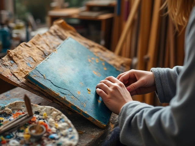
You’ve spent hours setting up your easel, mixing pigments, and sketching the outline of a mountain range or a misty shoreline, but the finished piece feels flat. It’s a common snag: a landscape that looks technically correct but lacks that spark that pulls viewers in. Below are practical ways to turn a plain scene into a painting that really sings, using compositional tricks, color hacks, texture tricks, and a dash of storytelling.
Key Takeaways- Apply dynamic composition rules (rule of thirds, golden ratio, or dynamic symmetry) to create stronger visual flow.
- Use limited but bold color palettes to set mood and focus attention.
- Introduce layers of texture with varied brushwork - from thin washes to impasto highlights.
- Play with light, atmospheric perspective, and scale to add depth and intrigue.
- Embed a subtle narrative or point of interest that invites the eye to linger.
What Makes a Landscape Painting Stand Out?
Before diving into techniques, let’s clarify the core entity we’re working with.
Landscape painting is a genre of art that represents natural scenery such as mountains, valleys, trees, rivers, and skies. It can be rendered in oil, acrylic, watercolor, or mixed media, and its goal is often to capture not just the visual details but the feeling of a place. The challenge isn’t just replicating what you see; it’s translating atmosphere, depth, and narrative onto a flat surface.
Composition: The Blueprint of Interest
Composition is the invisible scaffolding that guides the viewer’s eye. When you arrange elements thoughtfully, the painting feels alive.
Composition refers to the placement and relationship of visual elements within the frame determines rhythm, balance, and movement. Here are three tried‑and‑true composition frameworks you can experiment with:
- Rule of thirds: Divide the canvas into a 3×3 grid; place primary subjects along the lines or at intersections.
- Golden ratio: Use the 1:1.618 proportion to position focal points for a more natural, harmonious feel.
- Dynamic symmetry: A grid based on root‑mean‑square proportions that creates fluid, diagonal pathways.
Each method injects a subtle tension that keeps the eye moving.
| Rule | Key Ratio | Best For | Typical Use |
|---|---|---|---|
| Rule of Thirds | 1:3 | Beginners, quick sketches | Placing horizon, focal objects |
| Golden Ratio | d>1:1.618Portrait‑oriented scenes, subtle balance | Designing leading lines | |
| Dynamic Symmetry | Root‑mean‑square | Complex vistas, dramatic flow | Guiding viewer through layers |
Light, Atmosphere, and Mood
Light is the painter’s most powerful tool. The direction, quality, and color of light set the emotional tone.
Mood in a landscape painting describes the emotional atmosphere conveyed through color, light, and composition can range from tranquil sunrise to ominous storm. Experiment with these tactics:
- Golden hour glow: Capture warm, low‑angle sunlight to add depth and richness.
- Backlighting silhouettes: Darken foreground elements against a bright sky for drama.
- Cool twilight palette: Use blues and purples to evoke calm or melancholy.
Don’t be afraid to exaggerate shadows or highlights; a little drama can make a scene unforgettable.
Color Palette: Less Is More
Choosing a focused palette prevents the canvas from feeling chaotic. Pick 3‑5 dominant hues and use tints, shades, and neutrals to build variety.
Color palette is the set of colors selected for a painting, influencing harmony, contrast, and emotional impact can be based on the natural environment (earth tones for deserts) or on a conceptual choice (cool blues for serenity).
- Analogous scheme: Choose colors next to each other on the color wheel for a cohesive feel.
- Complementary accents: Add a pop of opposite hue (e.g., a red sunset against a teal sky) for visual punch.
- Limited palette challenge: Work with only three colors to force creative mixing and value contrast.
Test the palette on a small swatch before committing to the whole canvas.
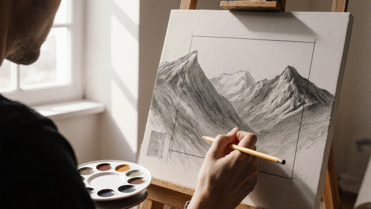
Depth Through Perspective and Scale
Even a flat canvas can suggest three‑dimensional space when you apply perspective cues.
Perspective refers to the technique of representing three‑dimensional objects on a two‑dimensional surface can be linear (vanishing points) or atmospheric (color/contrast fading with distance).
- Linear perspective: Place converging lines (road, river) toward a vanishing point to draw the eye inward.
- Atmospheric perspective: Lighten and desaturate distant hills to convey space.
- Scale contrast: Include a small, detailed element (a pine tree, a cabin) in the foreground to act as an anchor.
Layer these techniques; the combination creates a compelling sense of depth.
Texture & Brushwork: Making the Surface Speak
The texture you create with your brush can add tactile interest that makes viewers want to reach out.
Texture is the perceived surface quality of a painting, produced by brushstrokes, palette knife marks, or layering techniques can be smooth (wet‑on‑wet) or rough (impasto).
- Impasto highlights: Apply thick paint for sunlit rocks or foliage to catch light.
- Dry brush foliage: Use a light, dry brush to suggest leaves without detailing each one.
- Palette knife sky: Scrape broad, textured strokes for dramatic clouds.
Varying brush size and pressure across the canvas prevents monotony and adds a kinetic feel.
Storytelling: Adding a Point of Interest
Even a quiet meadow becomes more engaging when there’s a hint of narrative.
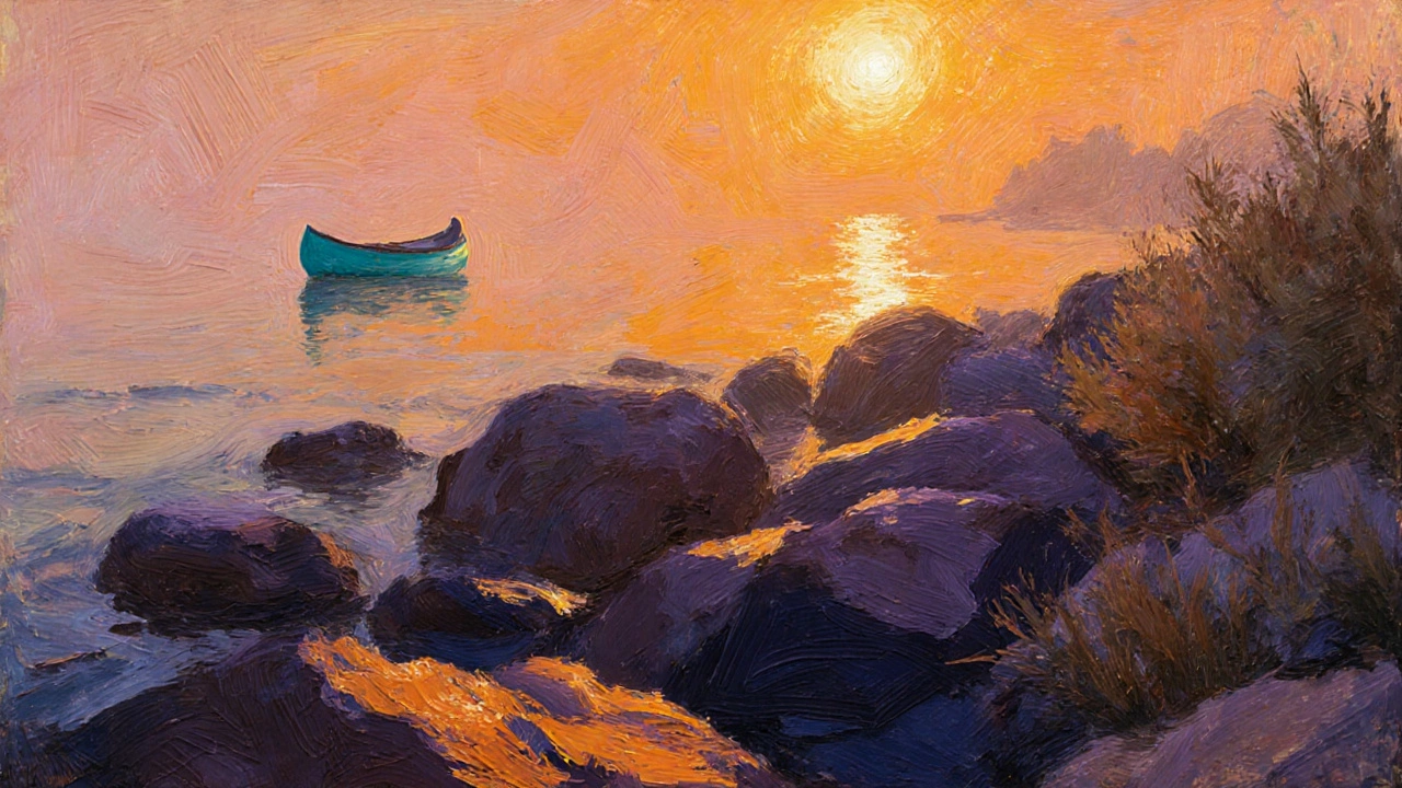
Introduce a small, purposeful element-a lone canoe, a weathered fence, or a wandering deer. This point of interest gives the viewer a reason to linger, turning a static scene into a story.
- Human element: A distant hiker adds scale and purpose.
- Animal presence: A perched bird draws the eye upward.
- Architectural touch: A rustic cabin frames the horizon.
Make sure the point of interest aligns with your compositional rule; it should sit on a focal intersection rather than floating randomly.
Quick Checklist for a More Interesting Landscape
- Choose a composition rule and place the main subject on a strong line or intersection.
- Decide the time of day; set light direction, quality, and color temperature.
- Select a limited color palette; add one complementary accent.
- Apply linear or atmospheric perspective to create depth.
- Vary brushwork: thin washes for sky, thick impasto for highlights.
- Insert a subtle narrative element that invites curiosity.
Putting It All Together - A Mini Case Study
Imagine you’re painting a coastal cliff at sunset. Here’s how to layer the techniques:
- Sketch the horizon using the rule of thirds, placing the cliff on the left vertical line.
- Choose a warm palette: burnt orange, muted purple, and deep navy. Add a splash of teal for a distant boat.
- Block in sky with a wet‑on‑wet blend; pull the light source low, creating a golden strip.
- Use atmospheric perspective on the far sea, lightening blues and reducing detail.
- Apply impasto orange highlights on the cliff edge to catch the sun.
- Add a small lighthouse silhouette near the cliff’s base as a point of interest.
The result is a scene that feels balanced, atmospheric, textured, and narratively inviting.
Frequently Asked Questions
How many colors should I use in a landscape painting?
A focused palette of three to five dominant colors works well. You can always add a complementary accent to create visual pop without overwhelming the composition.
Is the rule of thirds enough for an interesting composition?
The rule of thirds is a great starter, but experimenting with the golden ratio or dynamic symmetry can add extra tension and guide the eye more fluidly, especially in complex scenes.
How can I create depth without drawing precise perspective lines?
Use atmospheric perspective: lighten and desaturate distant elements, and layer warmer, more saturated colors in the foreground. Overlapping shapes also cue depth.
What brush techniques add texture without making the painting look messy?
Combine thin, smooth washes for sky or water with thicker impasto strokes for rocks and foliage. Dry‑brush techniques can suggest detail without heavy paint buildup.
Should I always include a figure or object for a story?
Not mandatory, but a small narrative element-like a cabin, a boat, or a lone tree-helps viewers connect emotionally and gives them a reason to explore the whole canvas.