Portrait Palette & Zone Guide
Click a facial zone to see the recommended dominant hues and temperature shifts based on professional portrait standards.
Zone Analysis
Select a zone to analyze color properties...
Zorn Palette Quick Reference
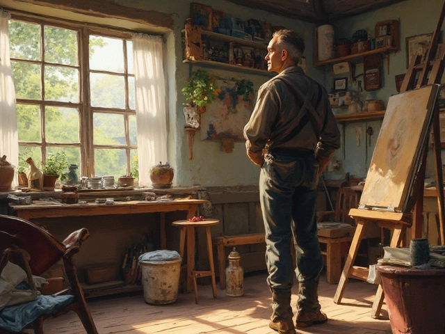
Most people start their painting journey by trying to capture a face, only to end up with something that looks like a flat, orange mask or a distorted caricature. The gap between an amateur sketch and a professional portrait isn't usually about "talent"-it's about understanding how light interacts with 3D forms and how colors actually work in the real world. If your portraits feel stiff or lifeless, you're likely fighting against a lack of structural knowledge or a fear of using dark shadows. To get that polished, gallery-ready look, you need to stop painting "eyes" and "noses" and start painting shapes of light and shadow.
Key Takeaways for Professional Portraits
- Prioritize structural accuracy and proportions before adding detail.
- Use a limited palette to avoid "muddy" skin tones.
- Focus on the transition between light and shadow (the terminator line).
- Avoid using pure white or pure black for shading skin.
- Layer your work from dark to light to build depth.
Mastering the Foundation and Proportions
You can spend fifty hours blending skin, but if the eyes are two inches too high, the portrait will never look professional. The first step is establishing a rock-solid foundation. Most beginners make the mistake of placing the eyes too high on the head. In reality, the eyes sit roughly halfway between the top of the skull and the chin.
When you're mapping out the face, use a method like the Loomis Method. Loomis Method is a systematic way of constructing the human head by starting with a sphere and slicing off the sides to create a flat plane for the ears and temples. This approach turns the head into a 3D object rather than a flat drawing. By defining the brow line and the center line of the face, you ensure that the features remain symmetrical even when the head is tilted.
Check your proportions by squinting. When you squint, you strip away the distracting details and see the large, dominant shapes. If the distance between the nose and the mouth feels off, it will be obvious in the simplified shapes. Fix these structural errors now, because they are nearly impossible to correct once you've started layering paint.
The Secret to Realistic Skin Tones
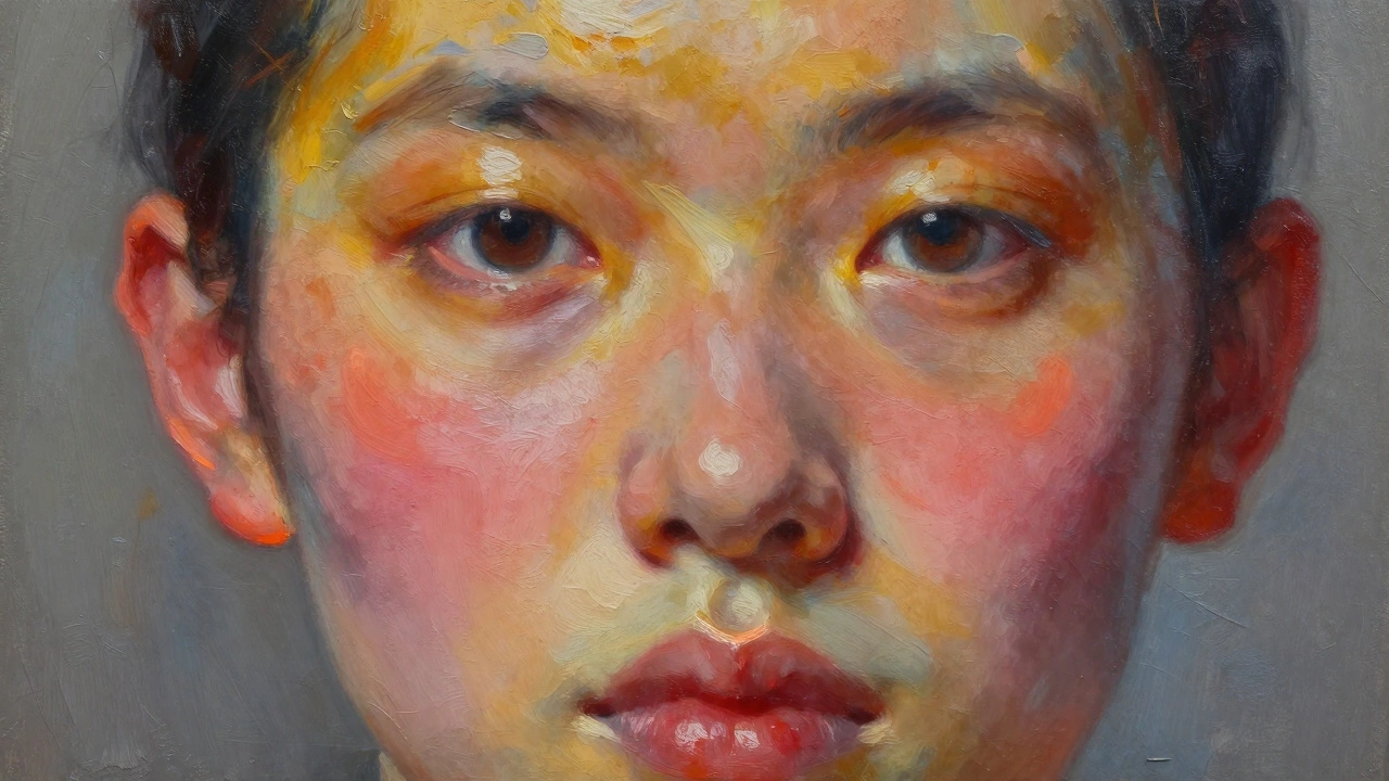
One of the biggest giveaways of an amateur portrait is the use of a single "flesh" color. Real skin is a mosaic of different hues. If you just mix white, red, and yellow, the result looks like plastic. To make portrait painting look professional, you have to embrace the temperature shifts across the face.
Think of the face in three temperature zones: cool, neutral, and warm. Generally, the forehead tends to be more yellow/golden, the mid-face (cheeks and nose) leans toward red/pink, and the lower face (chin and jaw) often has a bluish or greenish undertone, especially in men with stubble. This is known as the "Zorn Palette" approach. Zorn Palette is a limited color scheme consisting of Yellow Ochre, Cadmium Red, Ivory Black, and Titanium White. Using this restricted set prevents your colors from becoming chaotic and ensures a natural harmony across the canvas.
| Facial Zone | Dominant Hue | Typical Temperature |
|---|---|---|
| Forehead | Yellow/Gold | Warm |
| Cheeks & Nose | Red/Pink | Warm/Hot |
| Jaw & Lower Lip | Blue/Green/Grey | Cool |
Working with Light and the Terminator Line
Professional portraits have "weight." This comes from a clear understanding of the Value Scale, which is the range of lightness or darkness between the brightest highlight and the deepest shadow in a painting. If your painting looks flat, your values are too close together. You need deep shadows to make the highlights pop.
The most critical area of a portrait is the terminator line. This is the exact point where the light stops and the shadow begins. In professional work, this edge isn't just a blurry line; it's where the most saturated colors live. If you're painting a cheek, the transition from the lit area to the shadow often contains a thin strip of high-saturation orange or red. This is a result of sub-surface scattering, where light penetrates the skin and bounces around inside.
Avoid the temptation to use black for shadows. Black paint often kills the vibrancy of a portrait and makes it look "dirty." Instead, use a complementary color-like a deep burnt sienna mixed with ultramarine blue-to create a rich, chromatic dark. This keeps the skin looking alive and breathing, rather than like a statue.
The Process of Layering and Blending
If you are using Oil Painting, you have the advantage of slow drying times, which allows for seamless blending. However, the most professional results come from a structured layering process rather than just scrubbing the paint around.
- The Underpainting: Start with a monochrome version of the portrait (called a Grisaille). This allows you to solve all the value and lighting problems without worrying about color.
- The Blocking In: Apply the mid-tones. Use a large brush to lay down the general color of the skin across the face.
- Defining Shadows: Carve out the dark areas. Focus on the eye sockets, the side of the nose, and under the chin.
- The Highlights: Only add the brightest whites at the very end. These should be small, precise hits of light on the tip of the nose, the lower lip, and the moisture of the eye.
A common pitfall is over-blending. If you blend every single edge, the face looks like it's made of soap. To keep it looking professional, maintain some "hard edges." A hard edge occurs where two different values meet sharply-like the edge of the eyelid against the eyeball. This contrast between soft and hard edges is what creates a realistic, three-dimensional feel.
Avoiding Common Beginner Mistakes
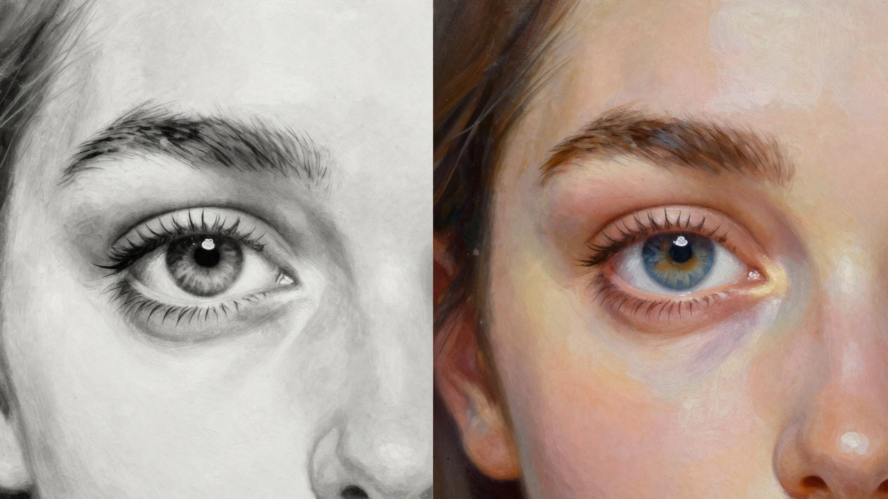
One of the fastest ways to ruin a portrait is by painting the eyes as perfect football shapes with a black dot in the middle. In reality, the eyelid usually covers the top of the iris. If you paint the entire circle of the iris, the person looks shocked or frightened. Soften the edges of the iris and ensure the pupil is slightly blended into the iris for a more natural look.
Another mistake is ignoring the background. A professional portrait doesn't just stop at the hair; it considers how the subject sits in the environment. If the background is too bright, it will compete with the face. If it's a flat, solid color, it can make the subject look like a cutout. Use a gradient or a complementary color to push the background away, which naturally pulls the viewer's eye toward the face.
Finally, stop using pure white for the "white of the eyes." The sclera is actually a sphere in shadow. It should be a pale grey or blue, with the actual white only appearing in the tiny specular highlight. Using pure white makes the eyes look like they are glowing, which is a hallmark of amateur work.
Why do my skin tones look grey or muddy?
Muddy colors usually happen because you're mixing too many complementary colors (like blue and orange) or using too much black. To fix this, limit your palette to 3-4 colors and avoid over-mixing on the palette. Let the colors sit side-by-side on the canvas rather than blending them into a single greyish mess.
How do I make the eyes look more alive?
The key is the specular highlight-a tiny, sharp dot of pure white paint that represents the light source. Place this highlight so it overlaps both the pupil and the iris. Also, remember to add a very slight reflection of light in the lower part of the iris, as the eye is a wet, reflective surface.
Should I use a reference photo or a live model?
While photos are convenient, they often flatten the image and distort values. A live model is the gold standard for professional growth because you can see the actual 3D form and how light wraps around the face. If you must use a photo, avoid "selfies" and use lighting with clear highlights and shadows (Chiaroscuro) to help you define the structure.
How do I know when a portrait is actually finished?
A portrait is finished when the focal point (usually the eyes) is the most detailed part and the edges soften as you move away from the center. If you find yourself endlessly tweaking the skin texture, step back five feet. If the overall value structure holds up and the likeness is there, stop. Overworking the paint often leads to a loss of freshness and vibrancy.
What brushes are best for professional portraiture?
Use a variety of sizes. Large flats are great for blocking in the initial shapes and backgrounds. Medium filberts are the workhorses for blending skin tones and shaping features. Small rounds or liners are reserved for the very end to add the finest details, like eyelashes or the thin line of the eyelid.
Next Steps for Improving Your Art
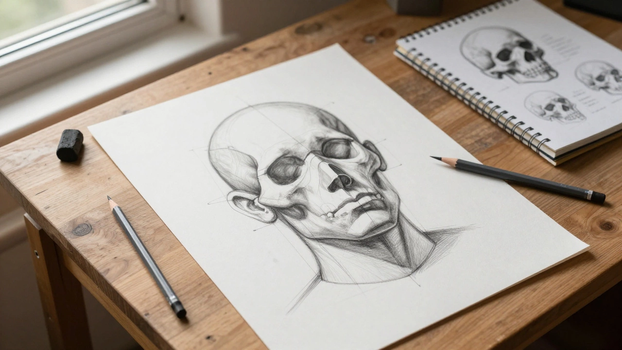
If you've mastered the basics of proportions and skin tones, the next step is studying Anatomy. Understanding the skull structure-where the cheekbones sit and how the jaw attaches-will allow you to paint from imagination rather than relying solely on references. Try doing "master copies," where you recreate a professional portrait by a great like Sargent or Velázquez to see how they handled edges and values.
For those struggling with stiffness, try painting the same person in three different moods: anger, joy, and exhaustion. This forces you to see how the muscles of the face shift and change the structural shapes, moving you away from a "formulaic" approach and toward a more organic, professional style.