Fine Art Photography Lighting Calculator
Key Recommendations: CRI 90+ for color accuracy, 2700K-3000K color temperature, 30-degree angle mounting.
Displaying fine art photography isn’t just about hanging a print on the wall. It’s about giving the image space to breathe, light to shine, and viewers to connect. Too often, stunning photographs get lost in cheap frames, bad lighting, or cluttered walls. The difference between a photo that’s seen and one that’s felt comes down to how it’s presented.
Start with the print quality
Before you even think about framing, the print itself must be museum-grade. Fine art photography demands archival materials. Use pigment-based inks on cotton rag paper-things like Hahnemühle Photo Rag or Canson Infinity Baryta. These papers hold detail better, resist fading for decades, and have a tactile weight that signals quality. Avoid glossy photo paper unless your style is deliberately commercial. Matte or fine art baryta finishes reduce glare and let the tones speak for themselves.
Print size matters too. A 16x20 inch print on a small wall feels timid. A 40x60 inch print in a large room feels commanding. Most gallery professionals recommend printing at least 24 inches along the longest side for serious display. If you’re showing in a home, go big enough that the image pulls you in from across the room. Don’t shrink your vision to fit the space-adjust the space to fit your vision.
Choose the right frame
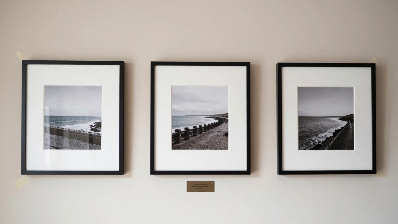
Frames for fine art photography should disappear. The goal isn’t to decorate the photo-it’s to protect it and let it dominate. Go with simple, narrow profiles: black aluminum, natural wood, or unvarnished metal. Avoid ornate gold or plastic frames. They date the work and distract from the subject.
Matting is optional but often essential. A white or off-white acid-free mat creates breathing room around the image, especially if the photo has dark tones. The mat should be at least 2 inches wide-wider if the print is large. Never use cardboard mats; they yellow and degrade over time. Use 100% cotton rag mats instead. And always use UV-filtering acrylic or glass. Sunlight, even indirect, bleeds color from prints over time. A good frame isn’t just a border-it’s a shield.
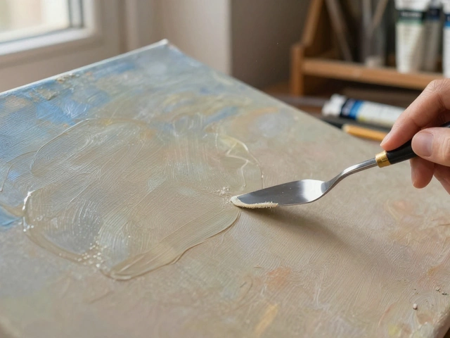
Lighting is non-negotiable
Lighting can make or break a fine art photograph. Natural light is beautiful, but it’s unpredictable. Direct sunlight will fade your print and create harsh reflections. North-facing windows (in the Northern Hemisphere) offer the most consistent, soft light. But even then, you’re at the mercy of weather and seasons.
For reliable results, use LED gallery lights. Look for fixtures with a CRI (Color Rendering Index) of 90 or higher. This means the light shows colors as they truly are. Aim for 2700K to 3000K color temperature-warm white, not cool blue. Mount the lights at a 30-degree angle to the wall. This minimizes glare and casts gentle shadows that add depth. Avoid overhead lighting. It flattens the image and turns your carefully crafted tones into a washed-out mess.
Dimmable lights are ideal. You can adjust brightness depending on the time of day or the mood you want to create. Some collectors even install motion sensors so the light turns on only when someone enters the room. It turns viewing into a ritual, not an afterthought.
Placement and wall selection
Where you hang the photo is as important as how you frame it. Eye level is the golden rule. The center of the image should be about 57 to 60 inches from the floor-that’s the average human eye height. Even if you’re hanging it above a sofa, don’t let the bottom of the frame sit more than 6 to 8 inches above the furniture. Otherwise, it feels disconnected.
Walls matter too. Avoid busy wallpaper or textured plaster. A smooth, neutral wall-white, warm gray, or soft beige-lets the photograph stand alone. Dark walls can work if the photo has strong highlights, but they require more light to compensate. Never hang a photo directly opposite a window unless you’re using blackout curtains. The contrast between bright light and dark image creates visual noise.
Consider the room’s function. A moody black-and-white landscape might feel overpowering in a child’s bedroom. A vibrant color portrait could clash with a minimalist kitchen. Think about emotional tone as much as visual harmony.
Grouping multiple pieces
When displaying more than one photograph, don’t just scatter them. Create intention. A gallery wall should feel curated, not chaotic. Start with your largest or most important piece as the anchor. Then build around it using consistent spacing-2 to 3 inches between frames is standard. Use painter’s tape on the wall to mock up arrangements before drilling a single hole.
Stick to one frame style across the group. Mixing black, wood, and metal frames creates visual noise. If you’re showing a series-say, five shots from the same location-keep them all the same size and orientation. Horizontal or vertical, but don’t mix. Even slight variations in scale break the rhythm.
For a more modern look, try floating panels. Instead of traditional frames, mount the prints directly onto aluminum or Dibond panels. This gives a clean, edge-to-edge look with no borders. It’s popular in contemporary galleries and works especially well with abstract or minimalist photography.
Protect your work
Fine art photography is an investment. Humidity, dust, and temperature swings can ruin prints over time. Avoid hanging photos in bathrooms, basements, or near heating vents. Ideal conditions: 40-50% humidity, 68-72°F, stable air flow. Use a hygrometer to monitor conditions if you’re serious about preservation.
For long-term storage, keep unframed prints in acid-free sleeves inside a flat file. Never roll them. Folding or creasing damages the emulsion layer. If you’re shipping or moving, use foam core boards and wrap in glassine paper. Don’t rely on bubble wrap alone-it can leave imprints.
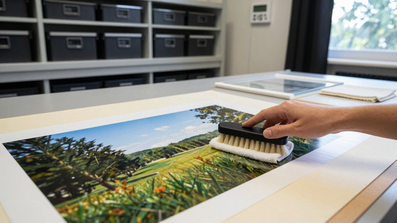
And never clean a print with glass cleaner or a dry cloth. Dust gently with a soft, clean brush-like a makeup brush or a microfiber brush designed for camera sensors. If the glass or acrylic is dirty, use a microfiber cloth slightly dampened with distilled water. Never spray liquid directly onto the surface.
Think like a curator
Displaying fine art photography isn’t about decoration. It’s about curation. Ask yourself: What story does this image tell? Who is it for? How do I want someone to feel when they see it?
Some collectors rotate pieces seasonally. A snowy mountain scene gets hung in winter; a coastal seascape comes out in summer. Others group work by theme-portraits together, abstracts together-creating mini-exhibitions in their homes. You don’t need a gallery to think like one.
Labeling is subtle but powerful. A small, discreet plaque with the title, year, and medium adds legitimacy. Use a fine-tip archival pen on acid-free cardstock. Don’t write directly on the wall. The label should be an afterthought-not a distraction.
At the end of the day, the best display is the one that makes you stop and look. If you walk past your own print every day without noticing it, something’s wrong. Adjust the lighting. Rehang it higher. Try a different frame. Fine art photography deserves more than a spot on the wall. It deserves a moment.
Can I display fine art photography without a frame?
Yes, but only if the print is mounted on a rigid, archival substrate like aluminum Dibond or acrylic. Unframed prints on paper will curl, warp, or get damaged over time. Floating mounts on panels give a clean, modern look and protect the edges. Never hang loose paper directly on the wall.
What’s the best way to hang heavy fine art prints?
For prints over 15 pounds, use D-rings and picture wire attached to the back of the frame. Then anchor the wire to wall hooks rated for at least twice the weight. Avoid adhesive strips-they fail under stress. For drywall, use toggle bolts or wall anchors. For plaster or brick, drill and use masonry anchors. Always test the hanging system with a similar weight before mounting your artwork.
Should I use UV glass or acrylic for framing?
Acrylic is lighter and less likely to shatter, making it safer for large prints or homes with kids. Glass offers superior clarity and is less prone to static. Both can be UV-filtering. Look for products labeled "UV 99%" or "museum-grade." Acrylic scratches more easily, so clean with a microfiber cloth only. For most home displays, UV acrylic is the practical choice.
How do I know if my print is archival?
Check the paper and ink specs. Archival prints use pigment-based inks (not dye-based) and cotton rag or alpha-cellulose paper. Reputable labs list these details on their website or invoice. If it says "giclée," that’s a good sign-it means inkjet printing on archival materials. Avoid prints labeled "photo paper" or "inkjet print" without material specs-they’re not meant to last.
Can I display fine art photography in a bright living room?
Yes, but you need to control the light. Use UV-filtering glazing, position the print away from direct sun, and install dimmable LED gallery lights. A 30-degree angled light from the side will enhance detail without glare. Avoid hanging directly opposite windows. If the room gets too bright, consider blackout shades or curtains you can draw during peak sunlight hours.