Abstract Color Harmony Visualizer
Select a color scheme to see how different hues interact on a canvas. This helps you predict visual weight and emotional impact before applying paint.
Visual Analysis
- Contrast: High
- Balance: Dynamic tension between opposites
- Tip: Use these colors next to each other to make shapes vibrate visually.
Staring at a blank canvas often feels like staring into the void. For many aspiring artists, the lack of a clear subject-a tree, a face, a landscape-creates a paralyzing sense of uncertainty. You might wonder, "What am I even supposed to paint?" This hesitation is normal. Abstract painting is a form of visual art that does not attempt to represent an accurate depiction of visual reality but instead uses shapes, colors, forms, and gestural marks to achieve its effect. Unlike realistic art, there is no single "right" way to execute it, which can be both liberating and terrifying.
The good news is that abstract art is less about technical perfection and more about emotional expression and decision-making. You don't need years of training to start creating compelling non-representational work. You just need a few basic tools, a willingness to experiment, and an understanding of how elements interact on a flat surface. Let’s break down exactly how to get started without getting overwhelmed.
Gather Your Essential Tools
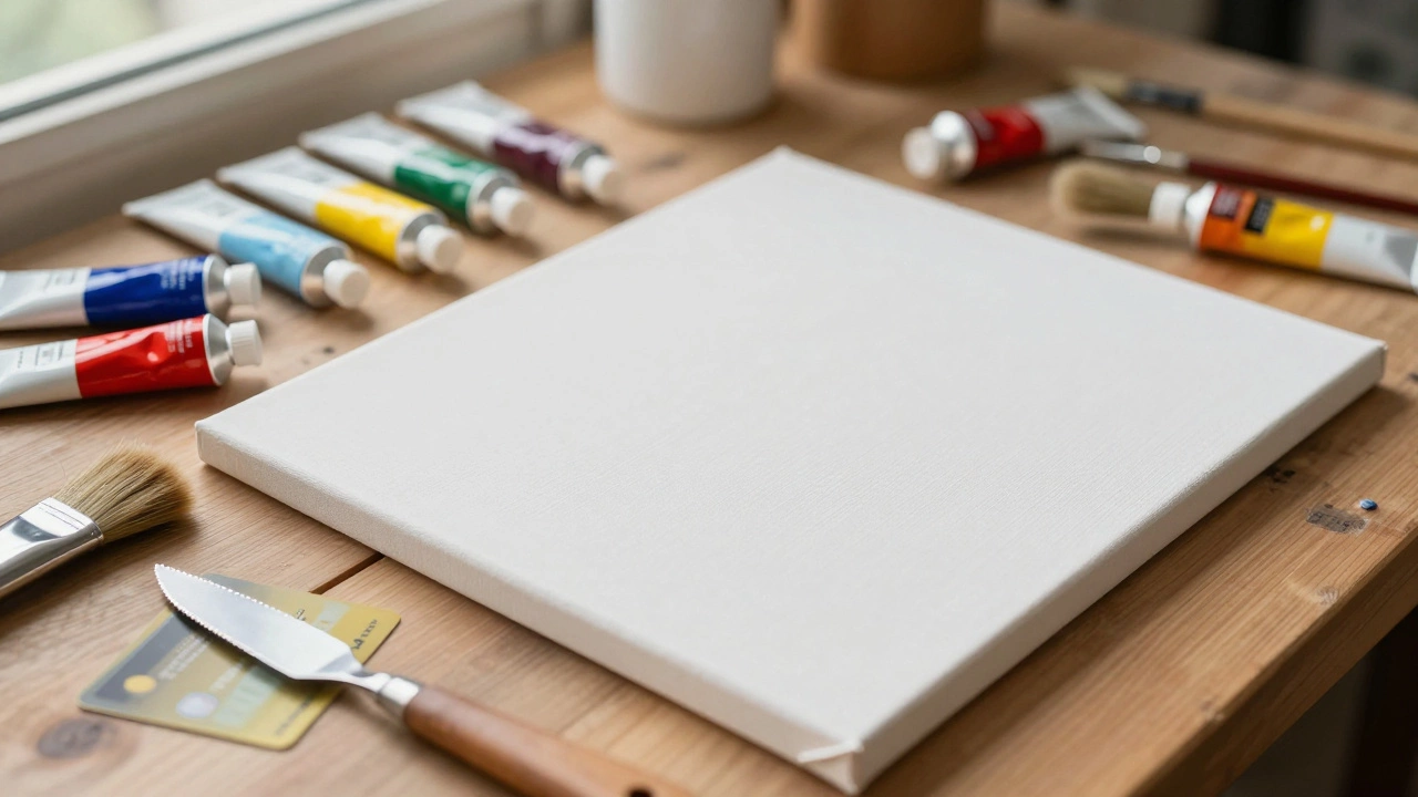
You do not need an expensive studio setup to begin. In fact, starting with affordable materials encourages you to take risks without fearing waste. Here is what you actually need:
- Cans or Panels: Start with pre-stretched canvas panels or cheap wooden boards. They are rigid, easy to handle, and cost significantly less than large canvases. If you prefer texture, buy unprimed canvas and apply gesso yourself.
- Paints: Acrylic paint is the best choice for beginners. It dries quickly, allowing you to layer colors rapidly, and it is water-soluble, making cleanup easy. Buy student-grade brands like Liquitex Basics or Winsor & Newton Cotrix. You only need primary colors (red, blue, yellow), white, black, and perhaps one earth tone to start.
- Brushes: Forget delicate detail brushes for now. Get a variety of stiff bristle brushes (flat and filbert shapes) in sizes ranging from 1 inch to 3 inches. These hold more paint and create bold, expressive strokes.
- Alternative Tools: Include palette knives, old credit cards, sponges, and even your hands. Abstract art thrives on unexpected textures, and these tools help you move beyond traditional brushwork.
Avoid buying huge sets of 48+ colors initially. It creates decision paralysis. Limiting your palette forces you to mix colors, which deepens your understanding of hue relationships and keeps your work cohesive.
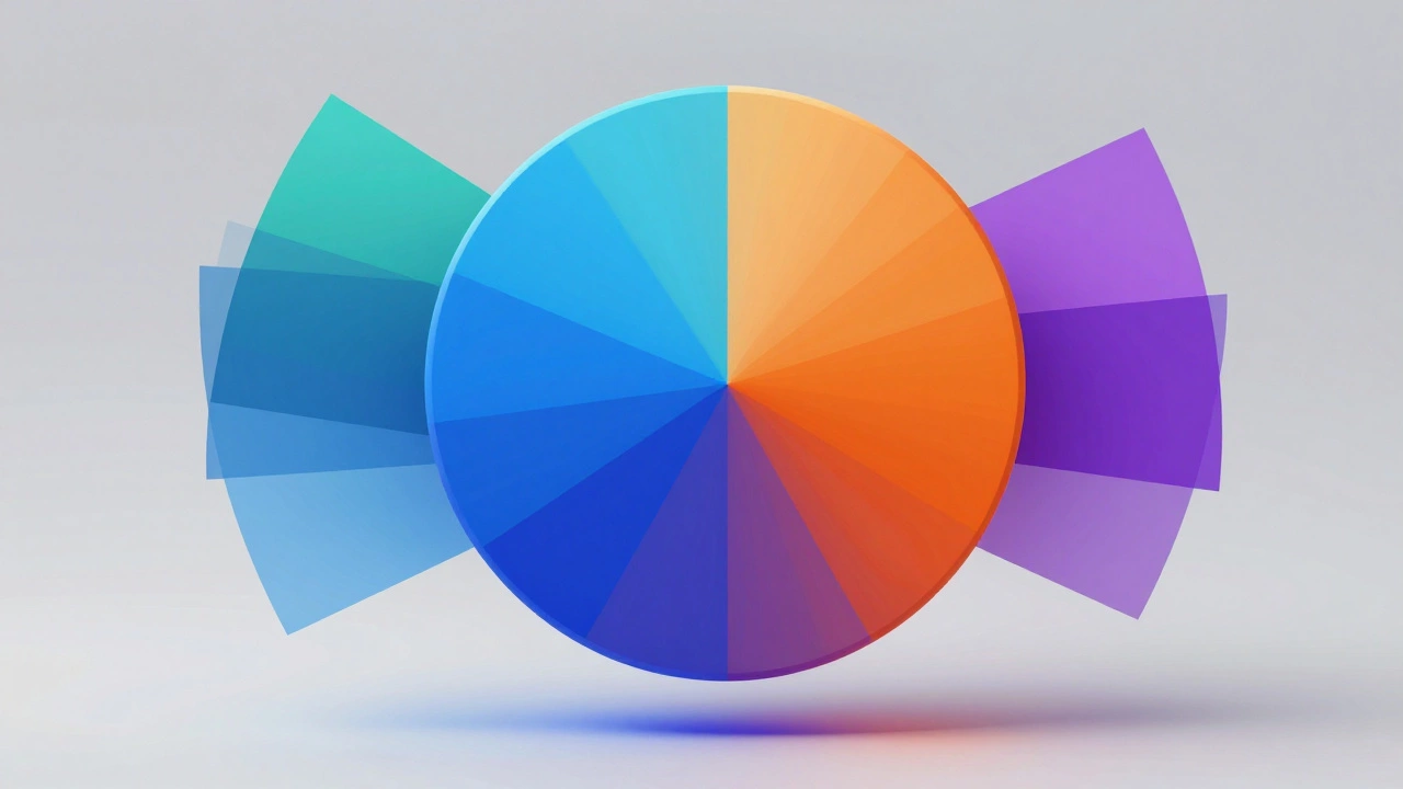
Understand Color Relationships
In abstract art, color is often the main character. Since you aren’t relying on recognizable objects to tell the story, the interaction between hues carries the emotional weight. Understanding basic color theory gives you control over this narrative.
Start by exploring contrast. Place complementary colors-those opposite each other on the color wheel, like blue and orange or red and green-next to each other. They vibrate visually, creating energy and movement. If you want a calming effect, use analogous colors, such as blue, teal, and purple, which sit next to each other on the wheel.
Consider value, which refers to how light or dark a color is. An abstract piece can fail if all the colors have similar values, resulting in a muddy appearance. Try mixing white into your darker pigments or adding black to your lighter ones to create depth. A simple exercise is to paint three swatches of the same hue but different values (light, medium, dark) and observe how they recede or advance in space.
| Scheme Type | Description | Emotional Impact |
|---|---|---|
| Monochromatic | Variations of a single hue | Calm, unified, subtle |
| Analogous | Colors adjacent on the wheel | Harmonious, natural flow |
| Complementary | Opposite colors on the wheel | High contrast, energetic |
| Triadic | Three colors evenly spaced | Balanced yet vibrant |
Experiment with these schemes before committing to a full canvas. Small studies help you predict how colors will behave when combined.
Explore Composition and Balance
Composition is the arrangement of visual elements within the frame. Without a focal point like a face or a building, balance becomes crucial. If one side of the painting feels too heavy with dark, dense colors, the viewer’s eye may feel unsettled. You can correct this by adding similar visual weight to the opposite side, either through color intensity or texture.
Use the concept of "visual weight." Darker colors, high saturation, and complex textures carry more weight than light, muted, or smooth areas. To test your composition, step back frequently. Squint your eyes to blur details; this helps you see the overall structure of light and dark shapes. If the image looks lopsided, adjust by adding or removing elements until it feels stable.
Another technique is the "golden ratio" or rule of thirds. Imagine dividing your canvas into nine equal parts. Placing key shapes or intersections along these lines often creates a more dynamic and engaging layout than centering everything. However, abstract art also benefits from breaking rules intentionally. Sometimes, off-center chaos creates a powerful sense of tension.
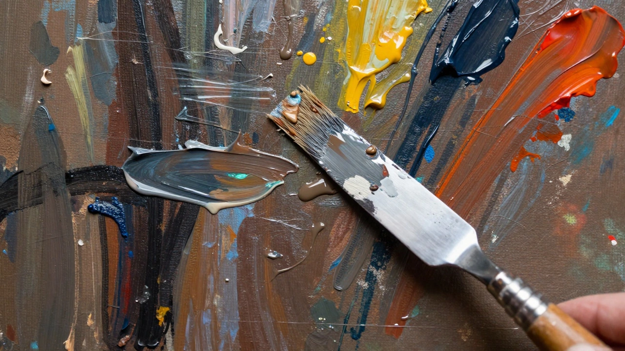
Techniques to Build Texture and Movement
Abstract painting is tactile. The physical application of paint contributes significantly to the final impact. Here are three foundational techniques to master:
- Layering: Apply thin washes of paint first to create a background atmosphere. Once dry, add thicker layers on top. Acrylics allow you to build up opaque forms over transparent glazes, creating depth that mimics light passing through surfaces.
- Scumbling: Use a dry brush with thick, opaque paint to drag lightly over a dried underlayer. This technique reveals bits of the color beneath, creating a rough, textured effect that adds age and complexity to the work.
- Dripping and Pouring: Dilute your paint with water or a pouring medium to create fluid runs. Tilt the canvas to guide the flow. This method introduces organic, unpredictable patterns that are difficult to replicate with brushes alone.
Don’t hesitate to scrape back wet paint with a palette knife. Removing paint is just as important as applying it. This process, known as subtractive painting, allows you to refine edges and create sharp contrasts against softer backgrounds.
Overcoming Creative Blocks
Every artist faces moments where the canvas seems resistant. When you feel stuck, shift your focus from outcome to process. Set a timer for 15 minutes and commit to making marks without judging them. Use random gestures, splatters, or rapid strokes. Often, the act of moving breaks the mental barrier.
If you’re unsure about a section, cover it. One of the greatest advantages of working on canvas is that it is forgiving. You can paint over mistakes entirely. Many celebrated abstract works, including those by Mark Rothko and Joan Mitchell, show evidence of extensive reworking. Embrace change as part of the dialogue between you and the painting.
Keep a sketchbook for small experiments. Test color combinations or compositional ideas on paper before transferring them to larger formats. This reduces pressure and allows you to iterate quickly. Remember, abstract art is not about capturing reality; it’s about translating feeling into form. Trust your instincts.
Do I need to know how to draw realistically to paint abstractly?
No, realistic drawing skills are not required for abstract painting. Abstract art focuses on color, shape, texture, and emotion rather than accurate representation. While understanding form can help, many successful abstract artists rely on intuition and experimentation instead of technical precision.
What type of paint is best for beginners in abstract art?
Acrylic paint is ideal for beginners because it dries quickly, allows for easy layering, and is water-soluble for simple cleanup. It offers versatility in texture, from thin washes to thick impasto, making it suitable for various abstract techniques.
How do I decide when an abstract painting is finished?
An abstract painting is finished when it achieves visual balance and conveys the intended emotion. Step back frequently to assess the overall composition. If adding more elements disrupts harmony or removes interest, stop. Trust your instinct that the piece feels complete and resolved.
Can I use household items as painting tools?
Yes, many abstract artists use unconventional tools like sponges, credit cards, rags, and even their hands. These items create unique textures and marks that brushes cannot replicate. Experiment with whatever is available to discover new effects.
Is it okay to paint over my previous work?
Absolutely. Painting over previous work is a common practice in abstract art. It allows you to explore new directions without starting from scratch. Just ensure the underlying layer is dry to prevent unwanted mixing or cracking.