Portrait Color Harmony Calculator
Settings
Visual Analysis
Artist's Tip:
Adjust your settings to see specific advice for your painting scenario.
| Element | Color Strategy |
|---|---|
| Highlights | ... |
| Shadows | ... |
| Eyes | ... |
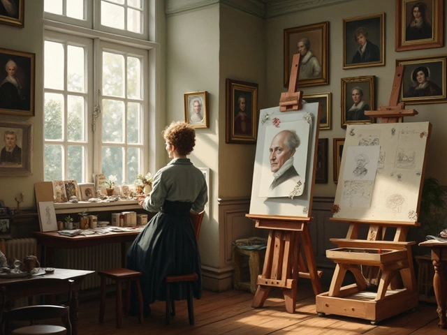
Have you ever painted a face that looked flat, muddy, or just... wrong? You mixed the flesh tone carefully. You got the anatomy right. But something is missing. The eyes don't pop. The cheeks don't glow. The background feels like it's fighting the subject instead of supporting them.
The culprit is usually color harmony. Specifically, the lack of complementary colors. In portrait painting, understanding how these opposite hues interact can transform a dull sketch into a vibrant, breathing character. It’s not magic; it’s physics and psychology working together on your canvas.
If you want your portraits to have depth, mood, and visual interest, you need to master the relationship between warm and cool tones. This guide breaks down exactly which colors work best for skin, backgrounds, and lighting, so you can stop guessing and start painting with confidence.
Understanding Complementary Colors in Art
To use complementary colors effectively, we first need to define what they are. On a standard color wheel, complementary colors sit directly opposite each other. Red pairs with green. Blue pairs with orange. Yellow pairs with purple.
When placed side by side, these colors create maximum contrast. They make each other look brighter and more intense. This phenomenon is called simultaneous contrast. Your brain tries to balance the visual input, so when you look at a red object against a green background, your eye perceives the red as redder and the green as greener.
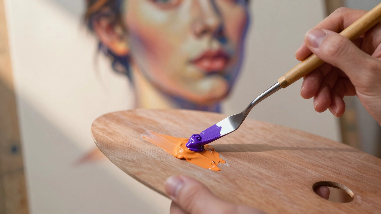
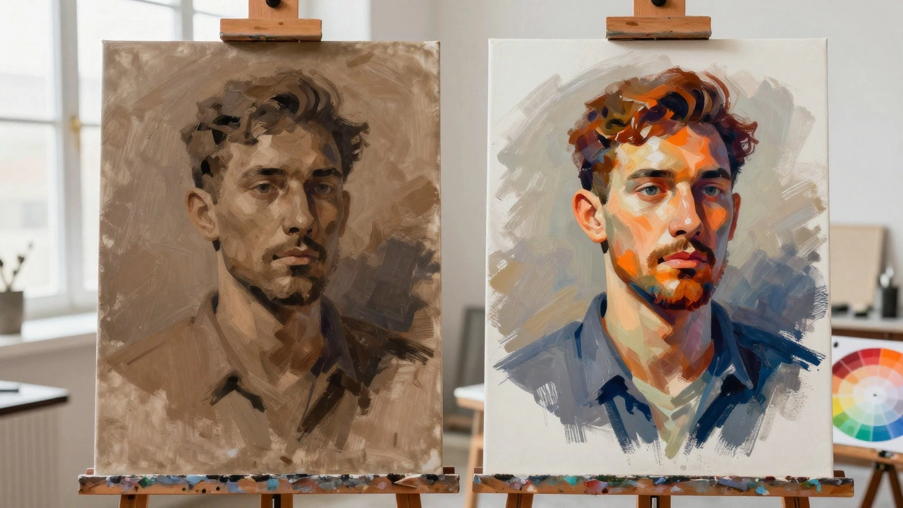
In portrait painting, we rarely use pure, saturated complements. Pure red next to pure green looks like a Christmas card, not a human being. Instead, we use modified complements. We adjust the value (lightness/darkness) and saturation (intensity) to create subtle shifts. A warm orange skin tone might be set off by a cool, desaturated blue-grey shadow. This creates depth without looking artificial.
The Warm vs. Cool Skin Tone Dynamic
Human skin is complex. It contains yellow, red, brown, pink, and even hints of green and blue depending on the lighting and blood flow. However, for the purpose of color theory, we generally categorize skin tones into two main groups: warm and cool.
- Warm Skin Tones: These lean towards yellow, orange, and gold. Think of Mediterranean or many Asian skin types. The undertones are rich in ochre and cadmium yellow.
- Cool Skin Tones: These lean towards pink, blue, and lavender. Common in Northern European or East Asian skin types. The undertones involve rose madder or alizarin crimson.
The key to realistic portraiture lies in the shadows. If your light source is warm (like sunlight), your shadows will naturally pick up the complementary cool tone. Conversely, if your light is cool (like overcast sky or fluorescent office light), your shadows will become warmer.
This is where the magic happens. If you paint a warm-skinned subject in sunlight, don't just darken the orange with black. That makes the skin look dirty. Instead, mix a tiny bit of blue or violet into your shadow mixture. The blue is the complement of the orange skin. Even in small amounts, it neutralizes the brightness while keeping the color alive. The result is a shadow that recedes visually, creating three-dimensional form.
Choosing Backgrounds That Enhance the Face
The background of a portrait isn't just filler space. It sets the stage and directs the viewer's eye. Using complementary colors here is one of the most powerful tools in your arsenal.
If your subject has warm skin (orange/yellow undertones), a cool blue or green background will make them stand out. The eye is drawn to the area of highest contrast. By placing the warm face against a cool backdrop, you create a natural focal point. The face literally pops forward from the canvas.
Consider the classic example of Vincent van Gogh’s self-portraits. He often used vibrant greens and blues in his hair and backgrounds to contrast with the warm oranges and yellows of his skin. This wasn't accidental; it was a deliberate application of color theory to create emotional intensity and visual separation.
However, balance is crucial. If the background is too saturated, it will compete with the face. You want the background to support, not steal the show. Desaturate your background color by adding its complement or grey. For example, if using a blue background for a warm face, add a touch of orange to the blue to mute it. This keeps the background interesting but subordinate.
| Skin Undertone | Ideal Background Hue | Effect on Viewer |
|---|---|---|
| Warm (Orange/Yellow) | Cool (Blue/Purple) | Creates depth; face advances |
| Cool (Pink/Blue) | Warm (Yellow/Green) | Adds warmth; prevents pallor |
| Neutral (Beige/Brown) | Muted Grey-Green or Grey-Blue | Subtle sophistication |

Lighting Scenarios and Color Shifts
Natural light changes throughout the day, and so do the complementary relationships in your painting. Understanding these shifts helps you capture the specific mood of a moment.
Golden Hour: During sunrise or sunset, the light is intensely warm (orange/red). The shadows cast by this light are deep blue or violet. If you are painting an outdoor portrait during this time, emphasize the blue-violet shadows on the side of the face away from the sun. This high-contrast warm/cool dynamic creates dramatic, romantic imagery.
Overcast Day: Cloudy skies act as a giant diffuser, providing soft, cool light. The shadows here are less distinct but tend to be slightly warmer than the highlights because the reflected light from the ground (often earth-toned) bounces back up. In this scenario, keep your highlights cool and gray-blue, and let your mid-tones and shadows retain a subtle warmth.
Indoor Tungsten Light: Standard household bulbs emit a warm, yellow-orange glow. Shadows under tungsten light are often bluish because of the ambient daylight coming through windows or the reflection off cool surfaces. If painting indoors, watch for those cool blue reflections in the crevices of the nose, ears, and neck folds.
Pitfalls to Avoid When Using Complements
While complementary colors are powerful, they can easily go wrong. Here are common mistakes artists make and how to fix them.
- Using Pure Pigments: Squeezing straight cadmium red and phthalo green onto the canvas creates a vibrating, painful effect. Always mix your complements. Break the colors down. Use burnt sienna instead of pure red, and sap green instead of pure green. Muted tones feel more organic and realistic.
- Ignoring Value: Color and value (lightness/darkness) are separate but related. You can have perfect complementary colors, but if the values are wrong, the form won't read. Always check your values in grayscale before applying color. The contrast should come from both hue and value differences.
- Over-saturating Shadows: Beginners often think shadows are just darker versions of the local color. They aren't. Shadows contain reflected light and atmospheric perspective. They are usually cooler and less saturated than highlights. Keep your shadows transparent and layered.
- Forgetting the Eyes: The eyes are the window to the soul, and they benefit greatly from complementary accents. If someone has blue eyes, a hint of warm orange or peach in the iris catchlights or surrounding skin can make them sparkle. For brown eyes, a touch of pale blue or lavender in the sclera (whites of the eyes) adds realism.
Practical Exercises for Mastery
Theory is useless without practice. Try these simple exercises to internalize how complementary colors work in portraiture.
The Two-Color Study: Pick a photo of a portrait. Squint until you only see two main masses: light and dark. Paint the lights using only warm colors (yellow, orange, red) and the darks using only cool colors (blue, green, purple). Don't worry about details. Focus on how the warm lights advance and the cool darks recede. This trains your eye to see temperature shifts rather than just black and white.
The Background Swap: Take an existing portrait painting. Scan it or photograph it. Digitally change the background to its complement. See how the perception of the face changes. Does it look healthier? More tired? More dramatic? This helps you understand the psychological impact of color choices.
Local Color vs. Reflected Light: Find a reference photo with strong colored clothing. Notice how the color of the shirt reflects onto the skin. A red shirt will cast a warm, reddish glow on the neck and chin. A blue jacket will cast a cool, bluish tint. Paint these reflected lights explicitly. They tie the subject into their environment and add richness to the skin tones.
Conclusion: Trust Your Eye
Complementary colors are a tool, not a rule. Nature doesn't always follow the color wheel perfectly. Sometimes a warm shadow looks better than a cool one, depending on the surrounding environment. Your goal is to observe, analyze, and then apply these principles to enhance the reality you are capturing.
Start by identifying the dominant temperature of your light source. Then, look for the opposite temperature in the shadows and background. Adjust the saturation to fit the mood. With practice, choosing complementary colors will become second nature, allowing you to focus on expression, emotion, and storytelling in your portraits.
What is the complementary color of skin tone?
There is no single complementary color for all skin tones because skin varies widely. However, most warm skin tones (orange/yellow undertones) have a complementary range of blue/purple. Most cool skin tones (pink/blue undertones) have a complementary range of yellow/green. Identify the dominant undertone of your subject to find the correct complement.
How do I make my portrait background not distract from the face?
Use complementary colors but lower the saturation of the background. If the face is warm and bright, make the background cool but muted (greyed down). Also, ensure the background has softer edges and less detail than the face. The eye is drawn to sharp contrasts and high saturation, so keep those attributes focused on the facial features.
Should I use black to darken skin tones?
Avoid using pure black for skin shadows. Black kills the vibrancy of the color and makes the skin look dead or bruised. Instead, darken your skin tone by adding its complementary color. For example, add a little blue or violet to an orange-based skin tone. This darkens the color while maintaining chromatic richness and transparency.
Why do my portraits look muddy?
Mudiness usually occurs when you mix too many colors together, especially complements, in equal parts. When you mix red and green thoroughly, you get brown. To avoid mud, keep your warm and cool areas distinct. Place them side-by-side for optical mixing rather than physically blending them on the palette. Also, ensure you have clear value distinctions between lights and darks.
Do complementary colors work in digital art?
Yes, the principles of color theory apply equally to digital painting programs like Photoshop, Procreate, or Clip Studio Paint. In fact, digital tools allow you to experiment with complementary adjustments quickly using layer blend modes (like "Color" or "Overlay") to test different temperature balances before committing to your final brushstrokes.