May 11, 2025
Street Art: What Is It and Why Does It Matter?
When you think of Van Gogh colors, the vivid yellows, deep blues, and swirling greens that defined Vincent van Gogh’s most famous works, you’re not just seeing paint—you’re seeing emotion made visible. Van Gogh didn’t just mix pigments; he used color to scream, to whisper, to feel. His palette wasn’t chosen for realism—it was chosen for truth. He saw the world differently, and he painted what he felt: the heat of a sunflower field, the loneliness of a starry night, the trembling energy of a cypress tree. These aren’t just artistic choices—they’re emotional maps.
What made his colors so powerful? He used complementary colors, pairs like blue and orange or yellow and violet that heighten each other when placed side by side to make his scenes vibrate. He layered thick strokes of pure pigment, letting the brushwork itself carry feeling. His famous yellow phase, a period where he saturated canvases with cadmium yellow and chrome yellow to capture light and hope, wasn’t just a trend—it was a declaration. Even today, artists studying his work learn that color doesn’t need to match reality to feel real. The way he mixed cobalt blue with white to create the sky in The Starry Night isn’t about accuracy—it’s about motion, mystery, and mood.
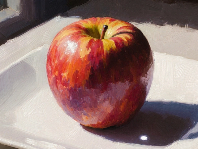
Modern painters still chase his formula. You’ll see his influence in how beginners choose their first oil palette, how digital artists set saturation levels, and how landscape painters avoid flat skies. His colors teach you to paint what you feel, not just what you see. The posts below show you exactly how his techniques live on—from simple oil painting exercises that start with just three colors, to how to build a palette that carries emotion like Van Gogh did. Whether you’re painting a single apple or a whole field of wheat, his colors are still the loudest teachers in the room.
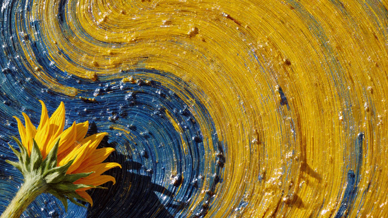
Vincent Van Gogh most often used yellow and blue in his oil paintings to express emotion, light, and depth. These colors defined his most famous works, from Sunflowers to The Starry Night.