May 13, 2025
Should Modern Art Be Considered Real Art?
When exploring color psychology, the study of how colors influence emotions, behavior, and perception. Also known as chromatic psychology, it helps artists, designers, and marketers predict audience response.
The foundation of any color‑driven project lies in color theory, the principles governing hue, saturation, and value. By mastering hue relationships, creators can craft palettes that feel warm, cool, tense, or calming. Color psychology then interprets those palettes, turning a simple blue sky into a feeling of serenity or a stark red into urgency. Digital artists, for example, use these rules to make thumbnails that grab clicks or prints that sell online.
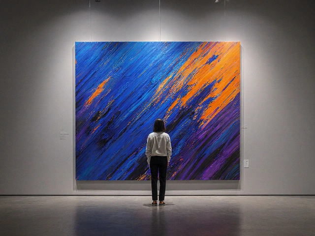
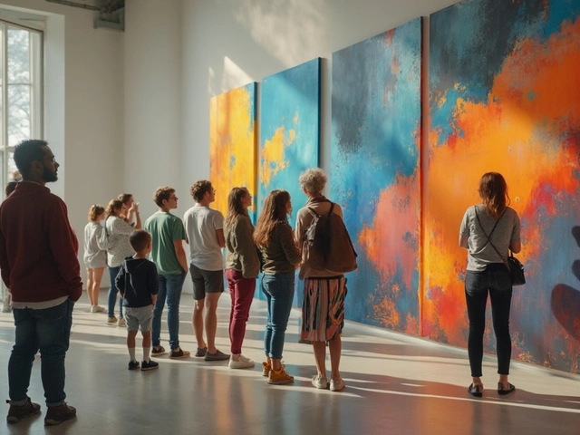
Once the technical side is clear, visual emotion, the feelings evoked by visual cues such as color and shape takes over. A muted palette can suggest nostalgia, while high‑contrast colors spark excitement. Abstract painters often lean on this link, letting color alone tell a story without recognizable forms. Likewise, hyperrealist portraitists pick skin tones that convey personality, not just accuracy. The emotional charge behind each hue is what makes art memorable.
But emotion needs structure. art composition, the arrangement of visual elements to create balance and focus determines where color hits the eye first. Landscape painters combine foreground greens with sunrise pinks to guide viewers into depth, while figure‑in‑landscape pieces use contrasting colors to highlight the human element. Modern art principles echo this idea: balance, rhythm, and emphasis all rely on strategic color placement. Even sculptors think in color terms, choosing material finishes that complement surrounding light.
All these concepts converge when creators aim to earn a living. Whether you’re minting NFTs, selling prints, or teaching workshops, applying color psychology can boost engagement and conversion rates. Knowing which shades trigger curiosity or trust lets you design a portfolio that stands out on social feeds, select exhibition lighting that showcases texture, or price a piece based on perceived value. Those practical shortcuts are woven through many of our featured articles, from digital art monetization tips to landscape painting guides.
Below you’ll find a curated collection of posts that dive deeper into how color psychology shapes digital art, landscape scenes, abstract rules, modern art principles, and more. Explore practical examples, step‑by‑step guides, and real‑world case studies to help you apply these ideas in your own creative journey.
Rap music has a vibrant and diverse culture, each hue telling a story as bold and impactful as the beats. This article explores the colors that have become synonymous with rap, examining how they reflect the genre's essence. From iconic album covers to artist branding, discover the visual language that colors rap music. We delve into the psychological impact of these colors and how they influence listener perception. Get ready to see rap through the lens of color, unlocking new dimensions of appreciation.