Abstract Art Quality Evaluator
Stop asking "What does this represent?" and start asking "Does this work?" Use the sliders below to rate a piece of abstract art based on the key principles outlined in our practical guide.
Overall Assessment
Detailed Breakdown
You’re standing in a gallery or scrolling through an online marketplace, staring at a canvas that looks like someone sneezed paint onto it. Or maybe it’s just three black squares on a white background. You feel a knot of anxiety forming in your stomach because you’re terrified of looking stupid if you say, "I don't get it." But here is the secret nobody tells you: there is no single "right" way to see abstract art. It isn’t about decoding a hidden message like a crossword puzzle. It’s about assessing whether the artist made deliberate choices that work together to create something visually compelling or emotionally resonant.
So, how do you actually tell if a piece is "good"? You stop asking "What does this represent?" and start asking "Does this work?" That shift changes everything. Instead of hunting for recognizable objects-a tree, a face, a building-you evaluate the raw ingredients of the painting itself. Think of it less like reading a book and more like listening to jazz. You aren’t checking if the saxophone sounds like a duck; you’re checking if the notes fit together, if the rhythm holds up, and if the performance makes you feel something.
The Composition Test: Does It Hold Your Eye?
Good abstract art isn’t random chaos. Even when it looks messy, there is structure underneath. The first thing to check is composition. This is the arrangement of elements within the frame. Ask yourself: where does my eye go first? Does it stay there, or does it wander off the edge of the canvas?
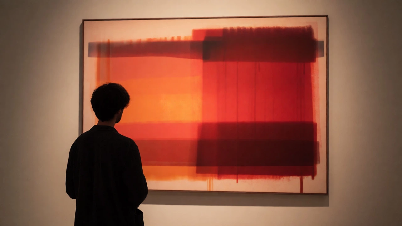
In strong pieces, your eye travels around the image in a satisfying loop. Artists use lines, shapes, and colors to guide you. If you look at a Rothko color field painting, for example, the soft edges of the rectangles pull your gaze gently between two zones of color. There’s tension but also balance. If you look at a bad copy, the eye slides right off the side because the weight isn’t distributed correctly. It feels lopsided or dead in the center.
- Balance: Is the visual weight evenly distributed? A heavy dark blob on one side needs something equally strong on the other to keep the piece from tipping over.
- Movement: Do the lines lead your eye somewhere interesting, or do they trap it in a boring corner?
- Focal Point: Even without a clear subject, is there an area of highest contrast or intensity that anchors the view?
Color Harmony: Why Some Palettes Hurt and Others Heal
Color is arguably the most powerful tool in abstraction. Without recognizable forms, color carries the entire emotional load. But good use of color isn’t just about picking pretty hues. It’s about relationships. How do the colors interact?
Look for harmony or intentional dissonance. Harmonious colors sit comfortably next to each other-think analogous colors (neighbors on the color wheel) creating a calm mood. Dissonant colors clash, creating energy or anxiety. Both can be "good" if done on purpose. What’s bad is accidental mud. If the colors look dirty or muddy without intent, the artist likely didn’t understand how pigments mix or how light affects perception.
A common pitfall is over-saturation. Beginners often think bright equals bold. But professional artists know that subtlety creates depth. Look for layers. Can you see hints of under-painting peeking through? Does the blue look flat, or does it have warmth and coolness mixed in? Flat, uniform blocks of color rarely hold attention as long as textured, layered applications.
| Attribute | Signs of Skill | Signs of Amateurish Work |
|---|---|---|
| Depth | Layered glazes, visible texture, variation in tone | Flat, uniform application, no dimension |
| Harmony | Colors support each other, intentional contrast | Clashing colors with no logical connection |
| Temperature | Mix of warm and cool tones to create space | All same temperature, feeling static |

Technique and Materiality: The Hand Behind the Brush
Here is where experience matters. You need to look closely. Step up to the canvas (or zoom in on the screen). What did the artist actually do? Did they scrape the paint? Did they drip it? Did they use a palette knife or a fine brush?
Good abstract art respects its materials. Oil paint behaves differently than acrylic. Acrylic dries fast and stays plastic-like; oil dries slowly and allows for blending. If an artist tries to make acrylic look like oil but fails, you’ll see hard edges where blends should be soft. Conversely, if they want sharp geometric precision, sloppy edges reveal a lack of control.
Consider the concept of "happy accidents." Many great abstract works rely on chance-spilled ink, splattered watercolor. But there’s a difference between a controlled accident and a mistake. A skilled artist manipulates chance. They might throw paint, but then they step back, assess, and adjust. They add details to resolve the chaos. An amateur throws paint and hopes for the best. Look for evidence of decision-making. Are there areas where the artist stopped working? Knowing when to stop is harder than knowing when to start.
Emotional Resonance: Does It Make You Feel Anything?
This is the subjective part, but it’s not entirely random. Good art communicates. It doesn’t have to make you happy. It can make you uncomfortable, confused, or even angry. But it shouldn’t leave you completely indifferent.
Try this exercise: stare at the piece for ten seconds. Then look away. What was the dominant feeling? Was it chaotic energy? Calm solitude? Aggressive noise? If you felt nothing, the piece might be technically proficient but spiritually empty. It’s like a song played perfectly but with no soul. On the other hand, if you feel a strong reaction-even a negative one-the art is doing its job. It’s provoking a response.
Context matters here too. If you’re viewing a piece in a sterile hospital waiting room, you might prefer calming blues and greens. In a high-energy nightclub, you might want jagged reds and blacks. Judge the art against its intended environment. A screaming red abstract might be "bad" in a library but perfect in a gym.

Originality and Voice: Have You Seen This Before?
Abstract art has been around for over a century. We’ve seen Pollock’s drips, Mondrian’s grids, and Kline’s black slashes. So, how do you spot derivative work? Derivative art copies the style without understanding the intent. It’s mimicking the look rather than the logic.
Ask yourself: does this feel fresh? Has the artist added their own twist? Maybe they took the classic drip technique but used metallic powders instead of liquid paint. Maybe they kept the geometric grid but distorted the perspective. Originality isn’t always about inventing something never seen before; it’s about combining known elements in a new way.
Be wary of trends. Right now, minimalism and large-scale monochromes are popular. Just because it’s trendy doesn’t mean it’s good. Look for a unique voice. Does the artist seem to be exploring a personal idea, or are they just copying what sells? Authenticity shines through. You can often sense when an artist is passionate about their process versus when they are just producing inventory.
Practical Checklist for Buyers and Viewers
If you’re trying to decide whether to buy a piece or simply appreciate it, run through this quick mental checklist. It helps separate hype from substance.
- Check the Edges: Paint spills over the sides? That’s normal. But are the edges clean or ragged? Ragged edges suggest haste.
- Look for Repetition: Is the same pattern repeated endlessly without variation? That can signal laziness.
- Test the Scale: Small sketches often translate poorly to large canvases. If a tiny sketch looks great but the large version feels empty, the artist didn’t understand scaling.
- Read the Artist Statement: Don’t take it as gospel, but see if their explanation matches what you see. If they talk about "cosmic voids" but the painting looks like a spilled coffee cup, trust your eyes over their words.
Remember, your opinion is valid. You don’t need an art degree to enjoy abstract art. You just need to engage with it actively. Stop looking for pictures of things. Start looking for feelings, structures, and skills. Once you shift your focus, the confusion fades, and the appreciation begins.
Is all abstract art supposed to be confusing?
No. While some abstract art is intentionally challenging or obscure, much of it aims to evoke simple emotions like calm, joy, or energy. If a piece confuses you, it might just mean you haven't found the angle that connects with you yet, or it might be poor communication by the artist. Good abstract art usually offers multiple entry points for interpretation.
Can I tell if abstract art is expensive just by looking at it?
Not reliably. Price is determined by many factors beyond visual quality, including the artist's reputation, exhibition history, size, and medium. A small drawing by a famous artist can cost more than a large, technically superior painting by an unknown student. Visual cues like material quality and complexity help estimate value, but they don't guarantee market price.
Why do some abstract paintings look like children's drawings?
Many adult artists study childlike simplicity to break free from rigid academic rules. However, there is a difference between naive execution and sophisticated simplification. Sophisticated work shows control over line weight, spacing, and color balance, even if it looks simple. Children's drawings often lack this underlying structural intentionality.
Does digital abstract art count as "real" art?
Yes. Digital tools allow for different kinds of experimentation with light, layering, and non-destructive editing. The principles of composition, color theory, and emotional impact remain the same. Whether created with pixels or pigment, the criteria for judging quality-balance, harmony, originality-apply equally to both mediums.
What if I hate a piece of abstract art everyone else loves?
That's perfectly fine. Taste is personal. Art criticism often discusses technical merit, which is objective, but enjoyment is subjective. You can acknowledge that a piece is technically well-made while still finding it unappealing to your personal aesthetic. Trust your instinct; you don't have to like every critically acclaimed work.