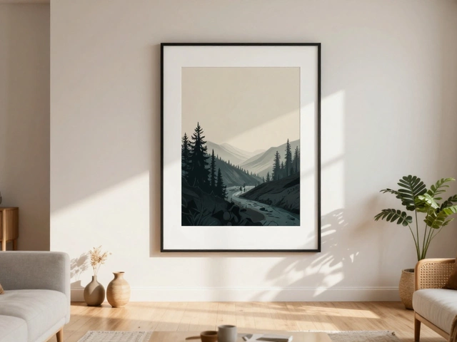
Painting a realistic landscape doesn’t mean copying a photo. It means capturing the feeling of light, space, and atmosphere - the way wind moves through grass, how shadows pool under trees, or how distant mountains fade into the haze. Many beginners think realism is about details: every leaf, every rock, every blade of grass. But realism in painting is about illusion. It’s about what your eye believes it sees, not what your brush actually puts down.
Start with the Big Shapes, Not the Details
Before you touch a brush to canvas, look at your reference photo or scene and squint your eyes. What do you see? Not trees, not rocks, not fences - you see shapes. Dark shapes, light shapes, and mid-tone shapes. A realistic landscape begins with these big masses. If you get the values right - how light or dark each area is - the rest will follow.
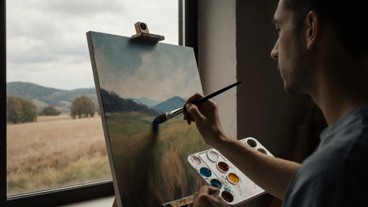
For example, a forest at midday isn’t just green. It’s a cluster of dark green shapes in the foreground, medium green in the middle ground, and almost gray-green in the distance. The sky isn’t just blue - it’s lighter near the horizon, cooler near the top, and often tinged with pale yellow or pink near the sun. Paint those shapes first, with broad brushes. Don’t worry about edges yet. Let them blur. Real landscapes don’t have sharp lines unless they’re man-made.
Use Atmospheric Perspective to Create Depth
One of the biggest mistakes in landscape painting is making everything look equally sharp and colorful. In real life, the farther away something is, the less detail you see. Colors lose saturation. Edges soften. Contrast drops. This is called atmospheric perspective.
Here’s how to use it:
- Foreground: Use rich, saturated colors. High contrast. Sharp edges. Think: deep greens, burnt sienna, ultramarine shadows.
- Middle ground: Colors are less intense. Mix in a touch of gray or blue. Edges are slightly blurred.
- Background: Colors are cool, muted, and light. Often just a wash of blue-gray or pale lavender. Avoid any strong darks here.
This isn’t just theory. It’s how your eyes work. If you paint a mountain range with the same intensity as the trees in front of it, your painting will look flat - like a cardboard cutout. But if you mute the mountains, they’ll suddenly pop into the distance.
Light Is Your Best Tool
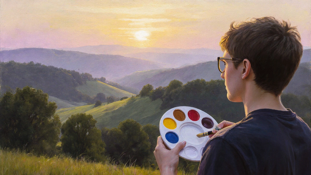
Realism in landscape painting lives and dies by light. The time of day changes everything. Morning light is cool and long. Midday light is harsh and flat. Sunset light is warm and dramatic. Pick a time and stick to it.
Study how light hits different surfaces:
- Water reflects the sky, but also picks up the color of the land nearby - a green meadow makes ripples look slightly green.
- Leaves don’t just reflect green. They have highlights where the sun hits them, and dark undersides where shadow pools.
- Clouds aren’t white. They’re pale gray, blue, or even pink, depending on the light.
Don’t paint what you think a tree looks like. Paint what you see. If the sun is low, a tree trunk might be lit on one side and cast a long, soft shadow across the grass. That shadow isn’t black. It’s dark blue-gray, maybe tinged with purple from the cool air.
Color Isn’t What You Think
Most people assume landscapes are made of earth tones: browns, greens, yellows. But realistic landscapes use a much wider palette - even in the most natural scenes.
Look closely at a green field. You’ll see:
- Yellow ochre where the sun hits
- Ultramarine blue in the shadows
- Raw umber mixed with a touch of crimson for depth
- A hint of violet where the grass meets the dirt
Don’t use tube green straight from the tube. Mix your own. Start with yellow and blue, then add a touch of red to mute it. That’s how nature works - no color is pure. Even snow has color. In shadow, it’s blue. In sunlight, it’s warm white or pale yellow.
Keep a small palette. Use just five or six colors: titanium white, cadmium yellow, burnt sienna, ultramarine blue, and alizarin crimson. You can mix everything else from those. It keeps your colors harmonious and prevents muddy tones.
Texture Comes from Brushwork, Not Details
Realism isn’t about painting every single leaf. It’s about suggesting texture with the right brushstroke.
Use different tools for different effects:
- A flat brush dragged sideways makes grass.
- A dry brush with very little paint creates rough bark.
- A fan brush lightly dabbed builds distant foliage.
- A palette knife adds thick, broken texture to rocks or cliffs.
Let some areas be loose. Let others be tight. A realistic painting has rhythm. If every part is equally detailed, it feels exhausting to look at. Your eye needs places to rest - soft edges, blurred skies, quiet shadows.
Paint from Life When You Can
Photos lie. They flatten depth. They over-saturate color. They freeze motion. A photo of a sunset might show a red sky, but your eyes saw the slow shift from gold to rose to lavender over 20 minutes.
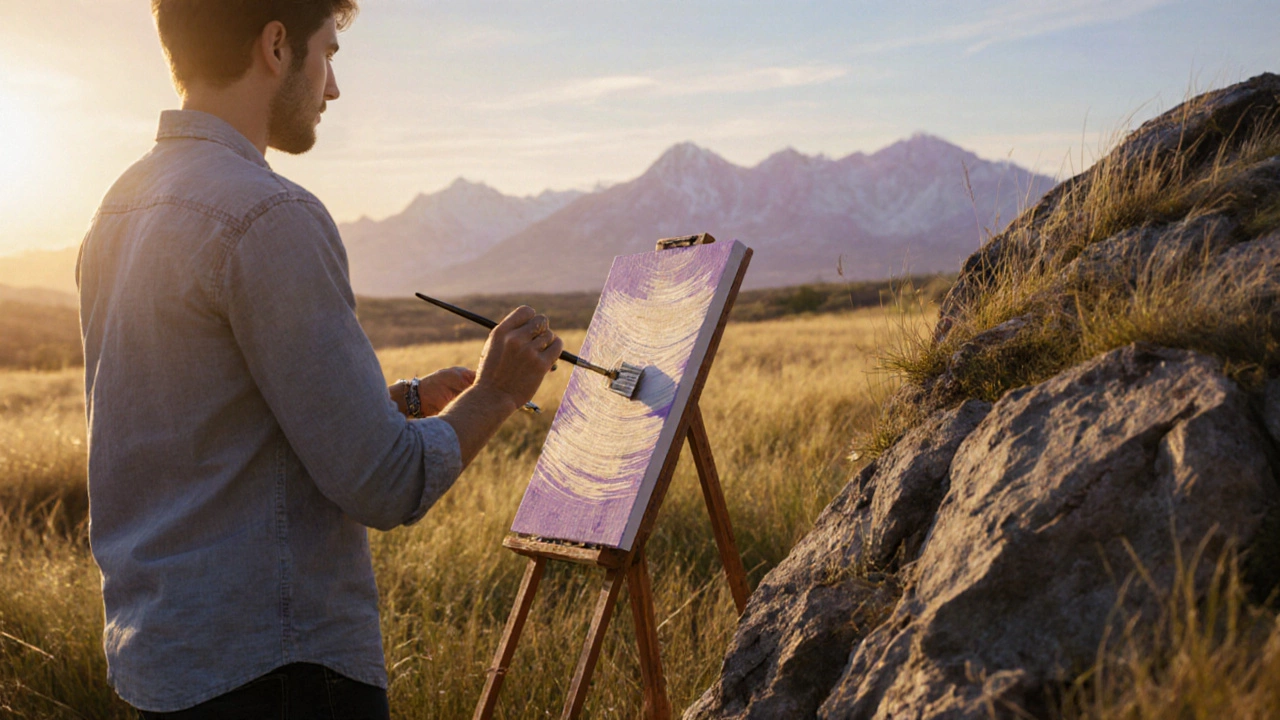
Set up an easel outside. Even for 30 minutes. Sketch the big shapes. Note the light. Feel the wind. Record the temperature - cold air makes shadows bluer. Hot air makes them softer. These are the things photos can’t capture.
If you can’t paint outside, use multiple references. Combine a photo of the sky with one of the trees and another of the ground. Don’t rely on one image. Your painting will be more alive if it’s built from observation, not just copied.
Paint the Space Between Things
One of the most overlooked parts of a landscape is the air. Not the sky - the space between the trees, the gap between the hill and the cloud, the breath between the grass and the path.
This is where many paintings fail. Artists focus so hard on the objects that they forget the air holds them together. Paint the gaps. Let the background show through. Use thin glazes of transparent color to create depth. A light wash of blue over dried green can make a field feel like it’s receding into the distance.
Think of your painting like a stage. The trees, rocks, and rivers are the actors. But the air is the lighting designer. Without it, nothing looks real.
Patience Over Perfection
Realistic landscape painting isn’t about speed. It’s about layers. Let each layer dry before adding the next. Glazing - thin, transparent layers of color - builds richness without muddying the paint. It takes time. A single painting might need three or four sessions over a week.
Don’t rush to finish. Step back often. Look at your painting in dim light. If the values still read clearly, you’re on track. If everything looks flat, you’ve lost the contrast.
And don’t be afraid to paint over mistakes. Realism isn’t about being perfect. It’s about being honest. A slightly wobbly line that feels true is better than a perfectly straight one that looks stiff.
Common Mistakes to Avoid
- Painting everything in focus: Real vision has depth. Blur the background.
- Using too much black: Shadows aren’t black. Use dark blue, purple, or deep green.
- Ignoring the horizon line: It should be level. A crooked horizon makes the whole painting feel off-balance.
- Overworking the foreground: Too much detail in front makes the background feel distant - not because of space, but because it’s visually crowded.
- Using only tube colors: Mix your own. Tube greens look artificial. Tube browns look dead.
What You Need to Start
You don’t need expensive gear. Here’s a simple setup:
- Canvas or panel: 8x10 inches or 11x14 inches - small enough to finish in a day.
- Brushes: One flat, one round, one filbert. No need for 20 brushes.
- Paints: Titanium white, cadmium yellow, burnt sienna, ultramarine blue, alizarin crimson.
- Medium: Linseed oil or odorless mineral spirits - just enough to thin paint, not drown it.
- Reference: A photo you took yourself, or a real view out your window.
That’s it. No fancy filters. No apps. Just you, your eyes, and your brush.
Practice Routine for Progress
Here’s a simple weekly plan:
- Monday: Paint a simple sky and horizon. Focus only on value - light to dark.
- Wednesday: Paint a single tree. Focus on how light hits it. No background.
- Friday: Paint a small landscape from life or a photo. Use only three colors.
- Sunday: Review your week’s work. Which one felt most real? Why?
After a month, you’ll start seeing the world differently. You’ll notice how light changes on a hillside at 4 p.m. You’ll see the blue in a shadow you never noticed before. That’s when you know you’re not just painting - you’re seeing.
Can I paint a realistic landscape with watercolor?
Yes, but it’s harder than oil or acrylic because watercolor is transparent and hard to correct. To make it work, plan your light areas first - leave the paper white for highlights. Build layers slowly. Start with the sky, then the distance, then the middle ground, and finally the foreground. Use a dry brush for texture on rocks or grass. Watercolor realism relies on precision and patience - mistakes are harder to fix.
Do I need to know drawing to paint realistic landscapes?
You don’t need to be a draftsperson, but you do need to understand basic shapes and proportions. If you can sketch a hill as a simple curve, a tree as a rounded mass, and a river as a winding ribbon, you’re good enough. Drawing helps you place things correctly, but painting is about color and light. Focus on those first. You can improve your drawing later.
How long does it take to paint a realistic landscape?
It depends on size and detail. A small 8x10 inch painting might take 3-6 hours over two sessions. A larger 16x20 inch piece with lots of texture can take 10-20 hours. The key isn’t speed - it’s layering. Let each layer dry. Wait. Look. Adjust. Rushing leads to muddy colors and flat depth.
What’s the best time of day to paint landscapes outdoors?
Early morning or late afternoon - known as the golden hours. The light is low, long, and warm. Shadows are strong and colorful, not just dark. The colors in the landscape are richer. Midday light is flat and harsh, making it harder to see depth and tone. If you’re painting from a photo, try to pick one taken during golden hour.
Why do my landscape paintings look flat?
Flatness usually comes from three things: not enough contrast between light and dark, using the same color intensity throughout, or ignoring atmospheric perspective. Check your values. Are your shadows truly dark? Are your highlights bright enough? Is the background lighter and cooler than the foreground? If not, your painting will feel like a paper cutout. Add depth by muting the colors in the distance and increasing contrast in the front.