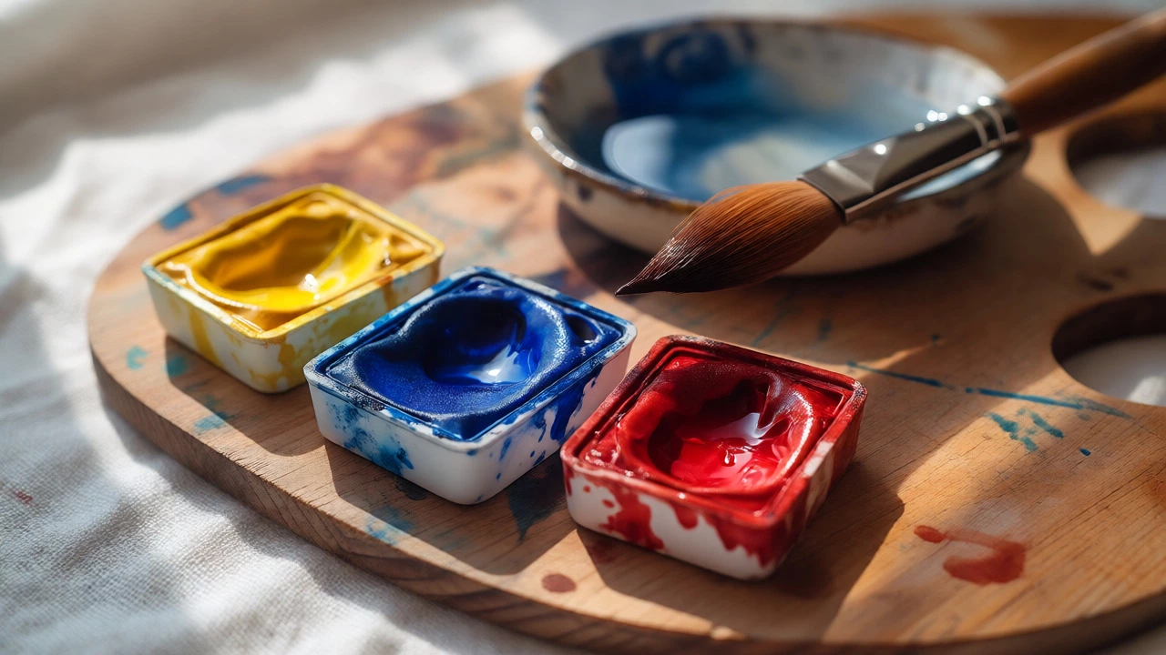
Watercolor Palette Builder & Mixer
Select up to 6 colors from the recommended starter list below to build your palette. Then, choose two colors to see how they might interact based on their warm/cool bias.
Mixing Simulator
Select two colors from your built palette to visualize a potential mix. Note that real-world results depend on water ratio, paper texture, and specific brand pigments.
Select two colors above to see mixing notes.
Your Current Palette Selection
Staring at a wall of 48 half-pans in an art supply store can feel like trying to pick a single flavor from an ice cream shop with too many options. You want to paint, but the sheer volume of choices freezes you up. Here is the truth that experienced painters often forget to mention: you do not need all those tubes. In fact, starting with too many colors is one of the fastest ways to muddy your work and lose your motivation.
The magic of watercolor a painting technique using water-soluble pigments suspended in a gum arabic binder lies in its transparency and the way light passes through the pigment to bounce off the white paper. When you limit your palette, you force yourself to understand how pigments interact. You learn that mixing two specific blues creates a vibrant purple, while mixing a different blue with red might result in a dull brown. This constraint is not a limitation; it is a teacher.
The Power of Three: Building Your Primary Triad
If you only buy three tubes of paint, make them primaries. But not just any primaries. You need a split-primary setup to ensure you can mix clean secondaries (greens, oranges, purples) and neutrals. This approach relies on understanding Color Theory the logic behind color mixing and the relationships between hues on the color wheel.
For a beginner, the most forgiving and versatile combination includes:
- Cadmium Yellow Light A warm, opaque-leaning yellow that mixes brilliantly with cool reds. It is bright, persistent, and doesn't stain your brushes as aggressively as some other yellows.
- Ultramarine Blue A deep, slightly granulating blue that leans toward violet. This is your workhorse. It mixes beautifully with Cadmium Yellow to create rich greens and with Alizarin Crimson to make deep violets.
- Alizarin Crimson A transparent, staining red that leans toward pink/violet. Be careful with this one-it stains everything-but it allows for delicate glazes and vibrant purples when mixed with Ultramarine.
Why these three? Because they cover the entire color wheel reasonably well. With just these, you can paint a sunset, a forest, or a portrait shadow. The key is learning their personalities. Ultramarine is heavy and settles into paper texture (granulation), giving landscapes depth. Alizarin is light and floats, perfect for skin tones or flower petals. Cadmium Yellow is bold and covers ground quickly.
Adding Earth Tones for Realism
Once you are comfortable mixing your primaries, add earth tones. These are pre-mixed neutrals that save time and prevent the "muddy mess" that happens when beginners try to mix black or grey from scratch. Earth tones also bring warmth and realism to landscapes and figures.
Add Yellow Ochre An ancient, stable earth pigment known for its durability and warm, golden hue to your kit. Unlike Cadmium Yellow, which is electric and modern, Yellow Ochre is subtle and natural. It is essential for tree trunks, rocks, and dry grasses. If you try to mix green for a pine tree using only Ultramarine and Cadmium Yellow, it will look neon and artificial. Add a touch of Yellow Ochre, and suddenly it looks like a real forest.
Next, grab Burnt Sienna A reddish-brown earth pigment used widely for skin tones and landscape shadows. This is arguably the most useful single tube in a landscape painter's box. Mix it with Ultramarine Blue, and you get a soft, atmospheric grey-blue for distant mountains or stormy skies. Mix it with a tiny bit of Alizarin Crimson, and you have a realistic shadow for human skin. It bridges the gap between warm and cool effortlessly.
The Convenience Factor: Pre-Mixed Neutrals
Purists will tell you to mix everything yourself. They are right about the learning aspect, but wrong about efficiency. Sometimes you just want to paint without calculating ratios. That is where convenience colors come in. These are not "cheats"; they are tools designed by chemists to solve specific problems.
Consider adding Sap Green A traditional transparent green made from indigo and yellow lake, though modern versions vary. While you can mix green from blue and yellow, Sap Green has a specific luminosity that is hard to replicate quickly. Modern synthetic Sap Greens are often more stable than the historic versions, which could fade over time. Check the label for "lightfastness" ratings-look for ASTM I or II for archival quality.
Another game-changer is Payne’s Grey A dark, cool grey-blue pigment ideal for atmospheric effects and shadows. It is not true black. True black in watercolor can kill the vibrancy of a piece because it is so dense. Payne’s Grey is translucent. You can layer it over other colors to darken them without losing the underlying hue completely. Use it for rain, fog, or the deepest shadows in a cityscape.
Avoiding the Beginner Traps
There are certain colors that lure beginners in but rarely earn their keep in a small palette. Avoid buying large tubes of Titanium White A common opaque white pigment, though rarely used in traditional transparent watercolor unless you plan to use gouache techniques. Traditional watercolor relies on the white of the paper for highlights. Adding white makes the paint opaque, turning it into something closer to gouache or acrylic. It mutes the transparency that defines the medium.
Also, be wary of "pre-mixed" pastels like baby blue or bubblegum pink. They are fun for quick sketches, but they limit your range. If you rely on them, you never learn how to create a custom sky color that matches the specific mood of your reference photo. Start with pigments, then graduate to convenience mixes once you understand why they exist.
| Color Name | Type | Primary Use | Mixing Behavior |
|---|---|---|---|
| Cadmium Yellow Light | Warm Primary | Sunlight, bright flowers | Mixes cleanly with cool reds/blues |
| Ultramarine Blue | Cool Primary | Shadows, skies, deep greens | Granulates; mixes well with warm yellows |
| Alizarin Crimson | Cool Primary | Petals, skin blush, violets | Staining; transparent glazes |
| Yellow Ochre | Earth Tone | Trees, rocks, dried grass | Naturalistic; reduces artificiality |
| Burnt Sienna | Earth Tone | Shadows, wood, skin tones | Creates neutral greys with Ultramarine |
| Payne’s Grey | Convenience Neutral | Atmosphere, rain, dark shadows | Translucent darkening agent |
Quality Matters More Than Quantity
You might be tempted to buy a cheap student-grade set with 12 colors. Resist the urge. Six tubes of professional-grade paint are infinitely better than twelve tubes of student-grade paint. Why? Pigment load. Student paints often contain fillers like chalk or dextrin to bulk up the tube. These fillers dilute the color intensity and can cause uneven washes. Professional paints use pure pigment, meaning a little goes a long way, and the colors stay vibrant after drying.
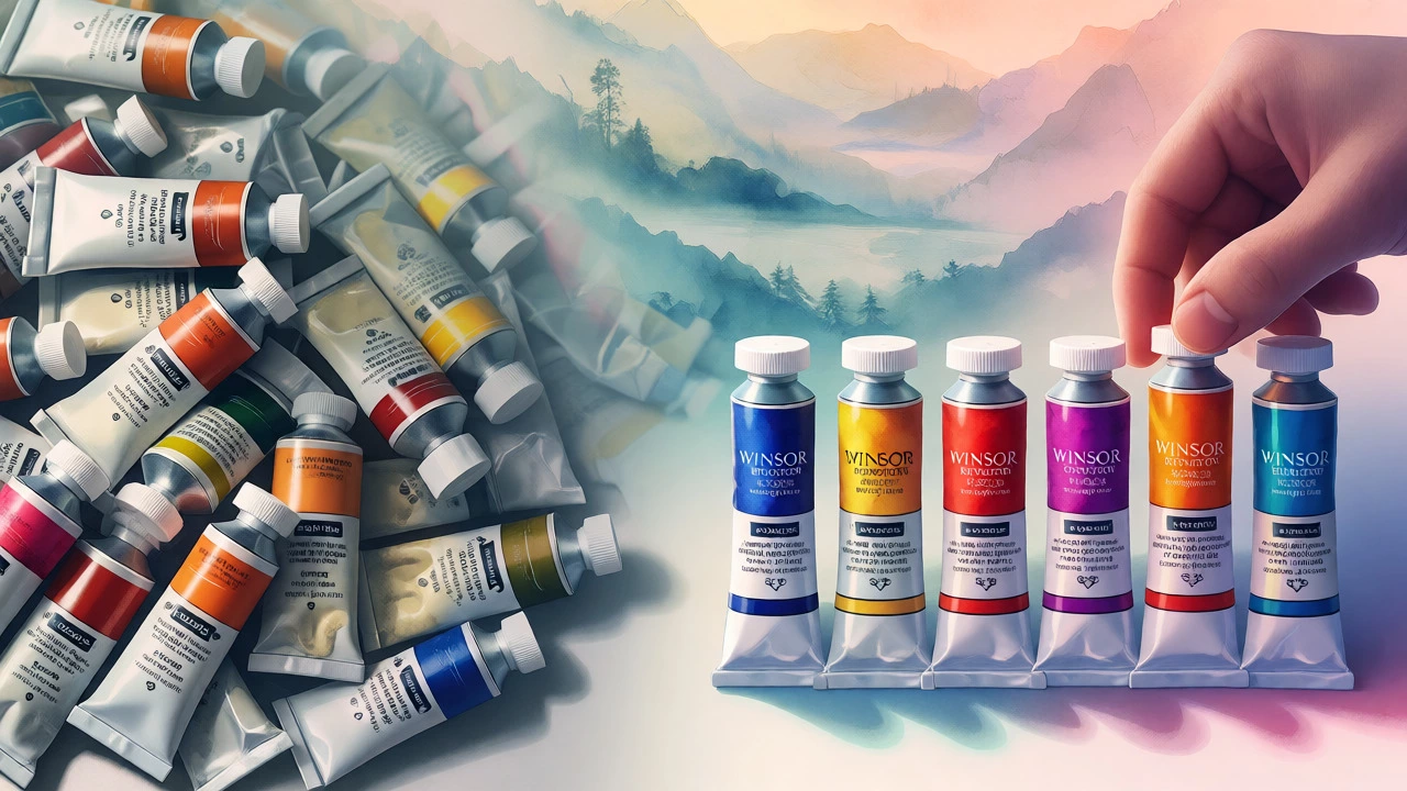
Look for brands like Winsor & Newton Artist’s Watercolour, Daniel Smith Extra Fine Watercolors, or Schmincke Horadam. These are industry standards. If budget is tight, start with five half-tubes of artist grade rather than a full pan set of student grade. The difference in handling and color clarity will accelerate your learning curve significantly.
How to Test Your New Palette
Don’t just squeeze the tubes onto your palette and start painting a masterpiece. Spend an hour doing exercises. Create a color wheel using only your three primaries. See how close you can get to a true orange, green, and violet. Then, take Burnt Sienna and Ultramarine and mix a gradient from dark to light. Notice how the colors shift as you add water. This tactile familiarity is crucial. You need to know intuitively that a drop of Alizarin will turn your green teal, not just read it in a book.
Keep a swatch card next to your workspace. Label each color with its name and a sample of its wet and dry appearance. Watercolors often dry lighter than they appear wet. Having a reference prevents surprises mid-painting.
Frequently Asked Questions
Do I really need six colors, or can I start with three?
You absolutely can start with three: Cadmium Yellow Light, Ultramarine Blue, and Alizarin Crimson. This triad allows you to mix a wide range of colors. However, adding Yellow Ochre and Burnt Sienna later helps achieve more naturalistic results faster, especially for landscapes and portraits.
Is Titanium White necessary for watercolor?
No, not for traditional transparent watercolor. Highlights are created by leaving the paper white. Titanium White is opaque and turns your medium into gouache if used heavily. Keep it out of your palette until you specifically want to experiment with opaque techniques.
What is the difference between student and artist grade paint?
Artist grade uses pure pigment, offering higher saturation, better lightfastness, and predictable mixing behavior. Student grade contains fillers to lower costs, resulting in weaker colors and less control. For serious practice, artist grade provides a much clearer feedback loop.
Can I use liquid watercolors instead of pans?
Yes, liquid watercolors are convenient and great for loose styles or illustration. However, pans offer more control for detailed work and are easier to transport. Many artists prefer pans for their predictability and longevity per tube.
Which brand is best for beginners?
Winsor & Newton Cotman line is a popular student choice, but their Artist’s line is worth the investment. Daniel Smith offers excellent unique pigments but can be pricey. For a balance of cost and quality, look for Holbein Artists’ Water Color or Van Gogh by Royal Talens.