Feb 25, 2025
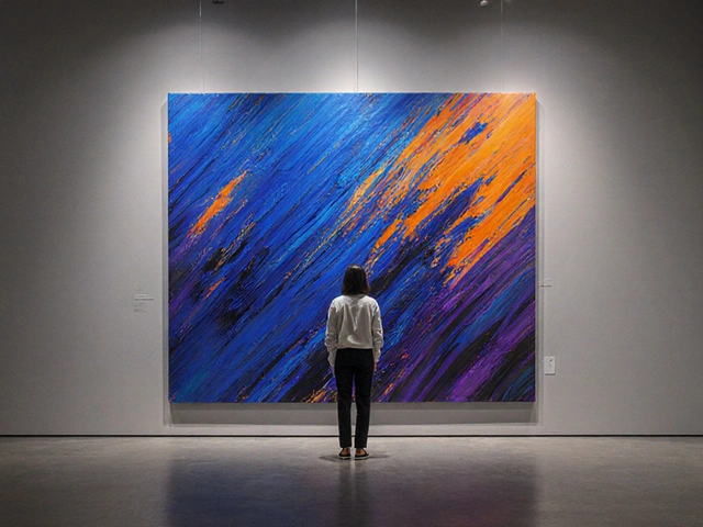
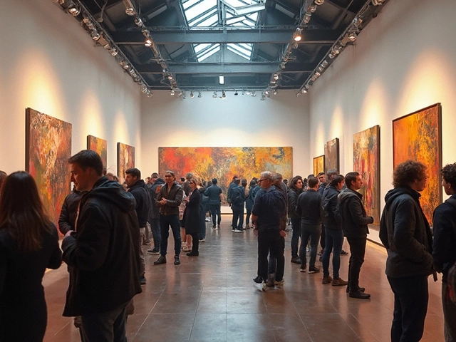
What Happens During an Art Exhibition?
When you look at a Van Gogh sky or a Rembrandt face, you’re not just seeing paint—you’re seeing famous artist color choices, the deliberate, often radical decisions painters made about which pigments to mix, which to avoid, and how to make light feel real. These choices weren’t random. They were rooted in science, tradition, and sometimes sheer stubbornness. Artists didn’t just pick colors because they looked nice. They picked them because they worked—because they made a face feel alive, a field feel distant, or a shadow feel deep.
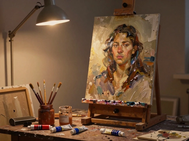
Take portrait painting color, the specific mix of pigments artists used to capture human skin under different lights. Most beginners think skin is just beige or peach. But the old masters? They used earth tones, raw umber, cadmium red, and even hints of green to make skin look like it had blood beneath it. You’ll find this in posts like Best Color Choices for Portrait Painting, where real palettes are broken down—not theory, but what’s on actual brushes. Same goes for oil painting color, how artists built layers using slow-drying oils to blend light and shadow without muddying. Linseed oil wasn’t just a medium—it was a tool to control how colors changed over time. Olive oil? Don’t even think about it. That’s a trap beginners fall into, and it’s why posts like Olive Oil vs Linseed Oil exist.
And it’s not just about what’s on the palette—it’s about what’s left out. Monet didn’t use black for shadows. Turner avoided bright blues in his fog. These aren’t accidents. They’re decisions made after years of trial, observation, and sometimes failure. That’s why the collection below isn’t just a list of posts. It’s a map. You’ll find how famous artist color choices connect to landscape depth, why some artists used only three colors, and how modern painters still copy these tricks—even if they don’t know it. Whether you’re painting a single apple or a whole coastline, the color decisions of the past are still guiding your hand. Let’s see what they were thinking.
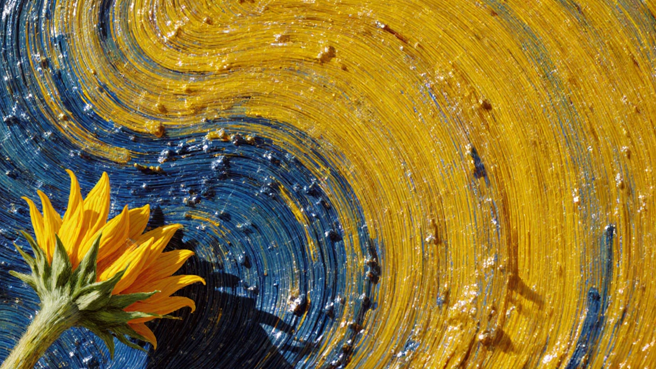
Vincent Van Gogh most often used yellow and blue in his oil paintings to express emotion, light, and depth. These colors defined his most famous works, from Sunflowers to The Starry Night.