Jan 26, 2025
Master the Art of Judging: Understanding Modern Art
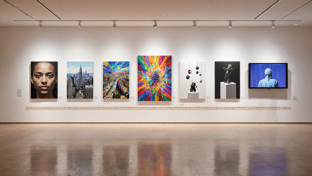
When working with art style comparison, the process of evaluating and contrasting visual approaches across painting, sculpture, and digital media. Also known as style analysis, it guides artists, curators, and students toward smarter creative decisions.
Why compare styles at all? Portrait painting and abstract art sit on opposite ends of the visual spectrum—one relies on recognizable subjects, the other on emotion and form. By putting them side by side, you uncover how composition, color, and narrative shift between realism and expression. This contrast also shines a light on landscape painting, where natural scenery meets human presence. Each style brings its own set of rules, tools, and audience expectations.
Portrait painting hinges on anatomy, lighting, and the classic rule of thirds. Artists often start with a skin‑tone palette, then layer warm and cool hues to sculpt facial features. Understanding these steps helps you see why a portrait feels intimate versus a generic headshot. The composition’s anchor points—eyes, nose, mouth—are placed deliberately to guide the viewer’s eye, a trait you won’t find in most abstract works.
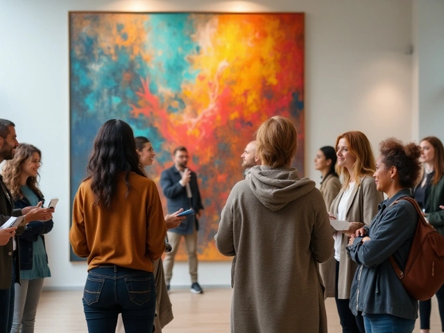
Moving to abstract art, the conversation flips. Here, hidden guidelines like balance, rhythm, and color interaction replace literal representation. Artists use color theory to evoke mood, layering shapes that suggest movement without depicting any object. The “rules” are less about where a nose sits and more about how contrasting hues create tension or harmony. Recognizing these invisible structures lets you compare abstract pieces to more literal styles and spot the underlying design logic.
When you turn to landscape painting, the scene expands. Depth is built through atmospheric perspective, value shifts, and strategic placement of foreground elements. Adding figures—people, animals, or vehicles—introduces a narrative layer that bridges portrait and landscape. The decision to include or exclude human presence dramatically changes the viewer’s emotional connection, making landscape a perfect case study for style contrast.
All three styles intersect with modern art principles such as minimalism, conceptual focus, and mixed‑media experimentation. These principles act like a common language, allowing artists to borrow composition tricks from portraiture, abstraction’s color daring, and landscape’s sense of space. By mapping these cross‑influences, your art style comparison becomes a roadmap rather than a simple side‑by‑side checklist.
Ready to start your own comparison? Begin with a clear objective: are you choosing a style for a commission, curating a gallery, or expanding your personal practice? Then gather visual references for each style, note key attributes—composition, color palette, subject treatment—and score them against your goal. Tools like a simple spreadsheet or a sketchbook matrix keep observations organized. Finally, test your findings by creating mini‑studies that blend elements from each style; this hands‑on experiment will confirm which approach works best for you.
Below you’ll find a curated selection of articles that dive deeper into each of these areas—portrait composition tricks, hidden rules of abstract art, tips for making landscapes pop, and broader modern art concepts. Use them as a toolbox to sharpen your own art style comparison skills and make informed creative choices.
Explore which modern art styles are truly the toughest, why they pose big challenges, and get practical tips to master the hardest art style in today’s art world.