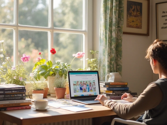
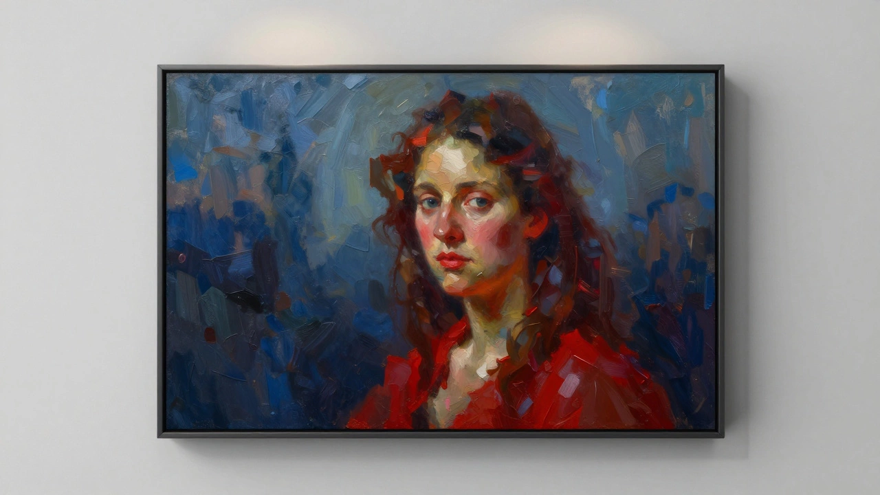
Ever stare at a photograph and wonder how to turn it into a painterly masterpiece? You're not alone. With today's tools, transforming flat images into vibrant digital paintings is easier than ever-but skipping key steps leads to frustrating results. This guide walks you through exactly what works, what doesn't, and why certain choices matter.
Pick Your Digital Canvas: Software & Tools
Digital Painting Software isn't one-size-fits-all. Beginners often start with free options like Krita, while pros swear by Adobe Photoshop or Procreate. Consider your workflow:
- Krita (free): Great for traditional painters; brush engine mimics watercolor/oil textures
- Photoshop (paid): Industry standard with advanced layer controls; ideal for commercial projects
- Procreate (iPad-only): Intuitive for quick iterations; built-in animation tools
Hardware matters too. A Wacom Intuos tablet costs around $80 and offers pressure sensitivity crucial for realistic strokes. Skip cheap touchscreens-they lack tilt recognition needed for natural brush dynamics.
Prepare Your Base Image
Before painting, your source image needs prep work. Scan physical photos at 300 DPI minimum using a flatbed scanner. If working with digital files, check resolution in Adobe Bridge or Lightroom. Low-res images below 72 PPI will pixelate when scaled. Here's what to fix first:
- Crop distractions: Remove unwanted edges using the Crop Tool in Lightroom
- Fix exposure: Adjust Shadows/Highlights sliders until details pop
- Color profile: Convert sRGB to ProPhoto RGB for wider color range
Skip this step and your painting will inherit flaws from the original photo-no amount of brushwork fixes poor fundamentals.
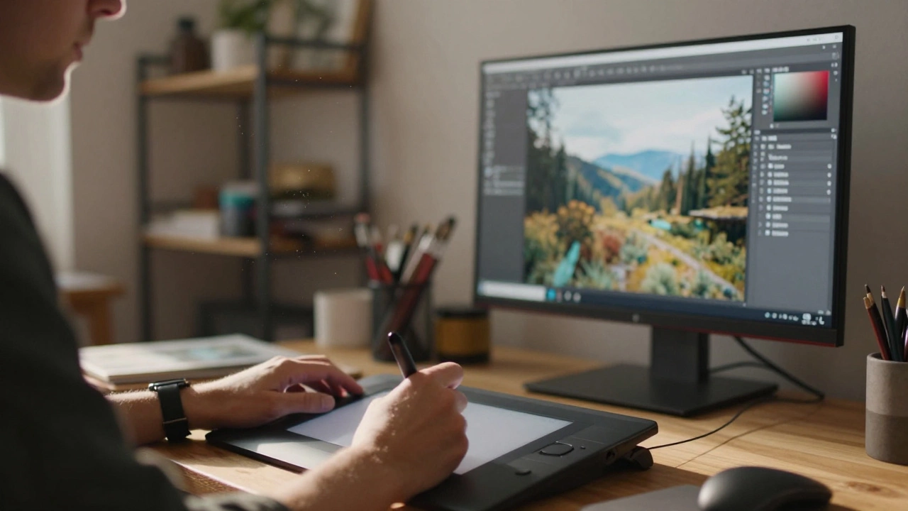
The Core Conversion Process
Image to digital painting conversion relies on three pillars: tonal blocking, texture application, and selective detailing. Here's the proven sequence:
Step 1: Tonal Foundation
Create a new layer and fill it with average midtones (use Alt+Delete in Photoshop). Set opacity to 40%. This neutral base prevents harsh contrasts later. Trace major shapes with a hard-edged brush-focus on big masses, not details. Think of it as building a skeleton before adding muscles.
Step 2: Texture Injection
Switch to textured brushes like Krita's 'Gouache' preset or Procreate's 'Dry Oil'. Lower flow to 15% and sample colors directly from reference photos. Build depth gradually: soft shadows first, then harder highlights. Remember-the goal is suggestion, not photorealism.
Step 3: Strategic Detailing
Only add fine details after completing 70% of values. Use small brushes (size 5px max) sparingly. Over-detailing kills painterly illusion. Focus detail where light naturally draws attention: eyes, fabric folds near light sources.
Mastering Blend Modes & Layers
Layers and blend modes solve problems manual brushing can't. Try these combos:
| Technique | Best For | Tip |
|---|---|---|
| Multiply + 30% | Shadows | Paint darks in grayscale, then tint |
| Overlay + Color Dodge | Glows | Add warmth to highlights |
| Linear Burn Clipping Mask | Intensifying colors | Apply selectively on skin tones |
Avoid stacking 20+ layers-it slows performance and creates muddy mixes. Group related elements logically (e.g., "background", "skin tones"). Name every layer; future-you will thank you.
Export Strategies That Don't Ruin Work
Your masterpiece deserves smart delivery. Always save masters as layered PSB/TIFF files at 16-bit depth. Flattened exports lose editing potential. For web use:
- JPG: Best quality setting (85%) + progressive loading
- PNG-24: When transparency needed (logos/icons)
- WebP: Modern alternative with superior compression
Print-ready? Convert to CMYK via Acrobat Distiller. Test print at actual size first-online previews mislead color representation.
Common Pitfalls & Fixes
Newcomers hit predictable roadblocks. Anticipate these issues:
- Muddy colors: Desaturate background layers by 20% before foreground work
- Flat composition: Add atmospheric perspective-cool blues recede, warm reds advance
- Stiff lines: Enable jitter settings in brush dynamics for organic variation
When stuck, zoom out completely. Fresh eyes spot balance issues invisible during close-up work.
Can I convert scanned pencil sketches?
Yes. Increase contrast in pre-processing to define line weights clearly. Use Liquify tool gently to correct warped scans before painting over.
My tablet lagging during paint sessions?
Reduce canvas history states (Edit > Preferences > Performance). Disable GPU acceleration temporarily if overheating occurs.
Should I match exact photo colors?
No. Interpretive palettes enhance mood. Sample core hues from photo, then exaggerate saturation for emotional impact.