Portrait Background Contrast Simulator
Adjust the settings below to see how background choices impact the visibility and mood of your subject.
Select a background to begin analysis.
You’ve spent hours getting the eyes right. The skin tones are blending beautifully, and the expression captures exactly who your subject is. Then you step back, squint at the canvas, and something feels off. The face looks flat. Or worse, it disappears into a chaotic mess of colors behind it. This is almost always a background problem.
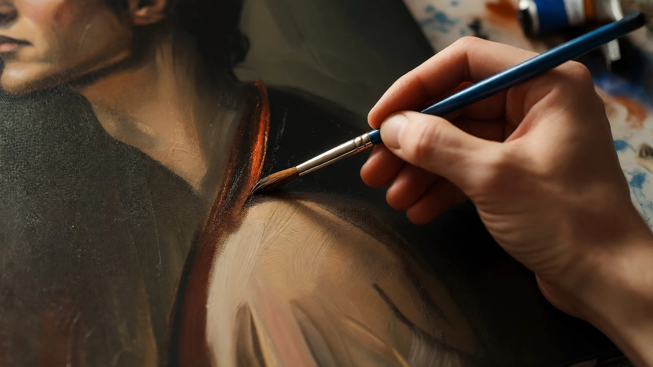
Most beginners treat the background as an afterthought-just "something" to fill the empty space around the head. But in portrait painting, the background isn't just filler; it's the stage that dictates how the viewer sees the subject. It controls depth, mood, and focus. If you get it wrong, even a masterpiece face will look like a sticker pasted onto a wall.
The Core Job: Why Backgrounds Matter More Than You Think
Before we pick colors, let’s talk about what the background actually does. It has three main jobs:
- Separation: It creates visual distance between the subject and the picture plane, making the person feel three-dimensional.
- Mood Setting: A dark, moody background tells a different story than a bright, airy one.
- Focus Control: It guides the eye to the most important parts of the face, usually the eyes.
If your background competes with the face, the painting fails. If it supports the face, the painting sings. It’s that simple.
Color Theory Basics for Portraits
You don’t need a degree in physics to pick good colors, but you do need to understand contrast. The biggest mistake artists make is using a background color that is too similar in value (lightness/darkness) to the subject’s skin tone.
Think about value contrast. If your subject has pale skin and light hair, a white or cream background might swallow them up. You’d lose the edge of their silhouette. Conversely, if your subject has deep brown skin, a black background can cause the same issue unless you have strong rim lighting to separate them.
| Subject Skin Tone | Recommended Background Value | Why It Works |
|---|---|---|
| Light/Fair | Medium to Dark | Creates strong separation; makes skin glow against darkness. |
| Medium/Olive | Dark or Complementary Cool | Prevents muddiness; cool blues/greens pop against warm skin. |
| Deep/Dark | Medium to Light or High-Contrast Dark | Requires careful edge control; light backgrounds highlight features clearly. |
This table isn't a hard rule, but it’s a solid starting point. Notice how complementary colors play a role here? Warm skin tones often look vibrant against cool backgrounds (like slate blue or muted green), while cooler skin tones can pop against warm earth tones (like burnt sienna or ochre).
Avoiding the "Muddy Middle"
Here’s a trap many painters fall into: they mix the background color directly from the palette used for the skin. Suddenly, the background has pink, yellow, and red hues identical to the cheeks and nose. When these colors sit next to each other without enough contrast, they vibrate unpleasantly or blend into a muddy gray blob.
To fix this, try mixing your background separately. Use fewer pigments. Often, a simple mix of ultramarine blue and burnt umber creates a rich, neutral shadow that recedes visually. It doesn’t fight for attention. It sits quietly behind the subject, letting the complex mixtures of the face shine.
Also, consider saturation. Highly saturated backgrounds draw the eye away from the face. Unless you’re going for a specific pop-art effect, keep the background desaturated. Add a touch of its complement to dull it down. A duller background pushes forward less, creating natural depth.
Texture vs. Smoothness: Choosing Your Surface Treatment
Once you’ve picked the color, you have to decide how to apply it. Should the background be smooth and blended, or rough and textured?
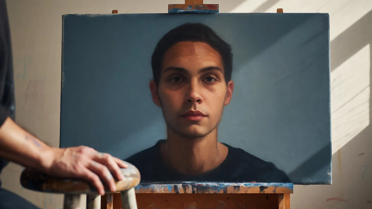
Smooth Blends: Ideal for classical realism or when you want the subject to feel hyper-realistic and detached from time. Think of Renaissance portraits where the background is a soft, indistinct haze. This technique forces all attention onto the crisp details of the face.
Visible Brushstrokes: Great for expressive, contemporary portraits. Loose, gestural strokes in the background add energy and movement. They suggest environment without defining it. This works well for oil paints because the paint holds its shape. If you use watercolors, wet-on-wet techniques can create organic, flowing backgrounds that feel dreamlike.
Pro tip: Keep the area immediately surrounding the head cleaner and more refined. Let the texture get looser and more abstract as you move toward the edges of the canvas. This frames the face naturally.
Lighting Consistency is Non-Negotiable
You can pick the perfect color, but if the lighting doesn’t match, the illusion breaks. If your subject is lit by a warm window light from the left, your background needs to reflect that logic.
Does the background cast a shadow? Is there a gradient indicating a light source? Even in abstract backgrounds, subtle shifts in value that align with the subject’s lighting scheme help integrate the two elements. For example, if the light hits the left side of the face, the background on the left might be slightly lighter or warmer than the right side. These tiny cues trick the brain into seeing a cohesive scene rather than two separate objects.
Practical Experimentation: The Thumbnail Sketch Method
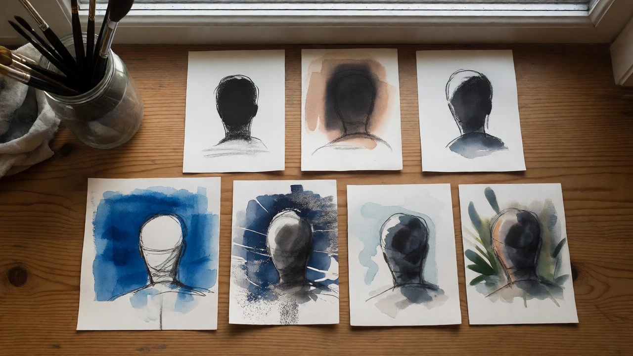
Don’t commit to a big canvas immediately. Try thumbnail sketches first. Grab some cheap paper and small amounts of paint. Paint five tiny versions of your portrait layout, changing only the background each time.
- Option 1: Solid dark neutral.
- Option 2: Gradient from dark to light.
- Option 3: Complementary color block.
- Option 4: Textured abstract wash.
- Option 5: Environmental hint (e.g., blurred foliage).
Step back and look at all five. Which one makes the face stand out the most? Which one feels boring? Which one feels chaotic? This process saves you hours of scraping paint off a large canvas later.
Common Pitfalls to Avoid
- The Halo Effect: Leaving a thin, unblended line of raw canvas or base coat around the subject’s edge. Blend those edges carefully so the transition is seamless.
- Over-detailing: Adding trees, windows, or furniture in the background that compete with the face. If it’s not critical to the narrative, blur it out.
- Ignoring Temperature: Using a cold blue background for a warm-lit subject without adjusting the skin tones to reflect ambient bounce light. Skin picks up color from its surroundings!
Remember, the best background is the one you barely notice until you realize why the portrait works so well. It should serve the subject, not steal the show.
Should I paint the background before or after the face?
It depends on your style. Many realists paint the background first to establish values and prevent halo effects. However, if you’re worried about ruining the face, you can paint the face first and carefully tuck the background in around it. A hybrid approach-blocking in both loosely, then refining-is often safest for beginners.
What is the easiest background color for beginners?
A muted, medium-value neutral like a mix of Ultramarine Blue and Burnt Umber. It’s versatile, easy to adjust lighter or darker, and provides good contrast for most skin tones without being distracting.
Can I use a patterned background?
Yes, but be careful. Patterns attract the eye. If you use stripes or florals, ensure they are low contrast and desaturated so they don’t compete with the facial features. Often, suggesting a pattern through loose brushwork is better than painting every detail.
How do I make a white background look interesting?
Pure white is rarely pure. Add subtle grays, creams, or pale blues to create variation. Ensure the edges of the subject are crisp and clean. A white background requires excellent edge control to avoid looking like a cutout.
Does the medium matter for background choice?
Yes. Oils allow for rich blending and layering, making smooth gradients easy. Watercolors rely on transparency and wet-on-wet techniques, favoring softer, more atmospheric backgrounds. Acrylics dry fast, so blending requires retarders or quick work, favoring more graphic or blocked-in backgrounds.