Art Principles Quiz
Art Principles Knowledge Check
Test your understanding of the 7 principles of art with these questions. Choose the correct answer for each question.
Question 1
Which principle creates visual interest by showing differences between elements?
Question 2
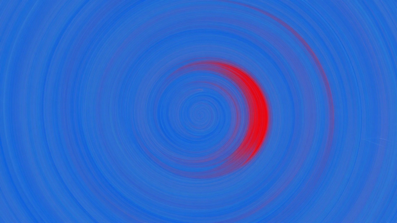
What principle is demonstrated when an artist uses a single red square in a pattern of blue squares?
Question 3
Which principle is demonstrated when a winding river in a landscape guides your eye from foreground to background?
Question 4
What principle creates a sense of harmony and connection between all elements in a composition?
Your Results
Score: 0/4
The principles of art aren’t just rules you learn in a classroom-they’re the hidden structure behind every painting, sculpture, or digital piece that makes you stop and look. Whether you’re picking up a brush for the first time or trying to understand why a mural grabs your attention, these seven principles are what make art feel alive. They’re not about being perfect. They’re about how things are arranged to create feeling, movement, and meaning.
Balance: Making Things Feel Stable
Balance in art isn’t about symmetry. You don’t need identical shapes on both sides to make a piece feel grounded. Think of a painting with a large dark tree on the left and three small birds on the right. The birds don’t weigh much visually, but their placement balances the tree’s heaviness. That’s asymmetrical balance-and it’s everywhere in modern art.
Radial balance, like the spokes of a wheel, pulls your eye toward the center. Think of a mandala or a sunburst painting. Symmetrical balance, where both sides mirror each other, feels calm and formal. You see it in Renaissance portraits or temple murals. But too much symmetry can feel stiff. Most artists mix these types to keep things dynamic.
Contrast: Making Things Stand Out
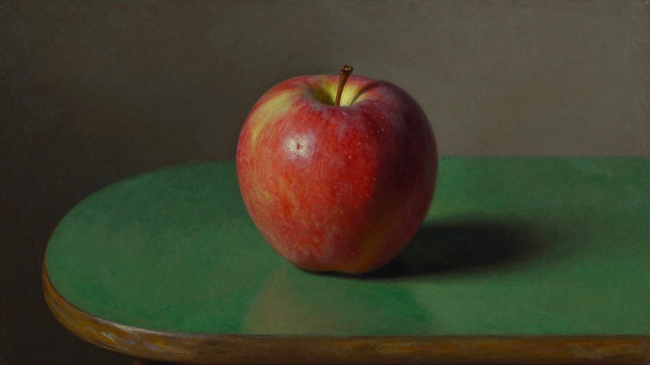
Contrast is what makes your eyes snap to a focal point. It’s the difference between light and dark, rough and smooth, warm and cool. A red apple on a green table? That’s color contrast. A single white line cutting through a black field? That’s value contrast. Contrast doesn’t just add interest-it guides your gaze.
In photography, high contrast images feel bold and dramatic. In watercolor, low contrast creates soft moods. Artists use contrast to show emotion. A face half in shadow, half in light? That’s not just lighting-it’s tension. Without contrast, everything blends together and nothing stands out.
Emphasis: Where You’re Supposed to Look
Every strong piece of art has a center of attention. That’s emphasis. It’s the part of the work that shouts, “Look here.” You don’t need to paint a giant arrow pointing to it. Artists use contrast, color, size, or isolation to make one thing pull all the attention.
Think of Van Gogh’s Starry Night. The swirling sky dominates, but the small village below feels quiet and still. The contrast in movement and scale creates emphasis. Or look at a portrait where the eyes are the sharpest detail while the background blurs. That’s intentional. If everything is emphasized, nothing is.
Movement: Leading the Eye Through the Art
Movement isn’t about motion. It’s about how your eye travels across the piece. Lines, shapes, and colors can create paths for your gaze. A winding river in a landscape pulls your eye from the foreground to the horizon. Diagonal lines feel energetic. Curved lines feel gentle. Repeating patterns can create rhythm, like waves or footsteps.
In abstract art, movement is often the whole point. Jackson Pollock’s drip paintings don’t show motion-they make you feel like you’re following a trail of paint. Even a still life can have movement: the curve of a vase, the angle of a spoon, the way shadows fall. Movement turns a flat image into a journey.
Pattern and Repetition: Creating Rhythm
Repeating shapes, colors, or lines creates rhythm. It’s the visual equivalent of music. A row of identical windows in a building, a repeated floral motif on fabric, or the same brushstroke used over and over-all these build rhythm. It makes the piece feel organized and predictable in a comforting way.
But too much repetition becomes boring. That’s why artists vary it slightly. A pattern with a single broken element catches your eye. Think of a quilt with one red square in a sea of blue. That small change creates interest. Pattern doesn’t have to be obvious. It can be in the spacing of trees, the texture of skin, or the rhythm of brushstrokes.
Proportion: Getting the Size Right
Proportion is about relationships in size. How big is the head compared to the body? Is the mountain taller than the house? When proportions feel off, it creates tension-or humor. Think of cartoon characters with huge heads and tiny bodies. That’s exaggerated proportion for effect.
Classical art followed strict proportions. The ancient Greeks used the golden ratio to find what felt naturally pleasing. But modern artists break those rules on purpose. A portrait with a giant hand? That’s not a mistake-it’s a statement. Proportion isn’t about realism. It’s about meaning. A child drawn larger than adults can show innocence overpowering authority.
Unity and Variety: The Tightrope Walk
Unity is what holds everything together. It’s the feeling that all parts belong. Variety keeps it from being dull. Too much unity? The piece feels flat, like a wallpaper pattern. Too much variety? It looks messy, like a child’s crayon drawing.
Good art walks this line. A painting might use the same color palette throughout (unity), but vary brushstroke thickness and texture (variety). A sculpture might repeat a shape in different orientations. The key is connection. When elements relate to each other-through color, shape, or theme-they feel like a single idea, not a collection of parts.
Unity is why a room with matching curtains, pillows, and a rug feels calm. Variety is why you notice the one blue pillow that breaks the pattern. Art works the same way.
Why These Seven Matter
These seven principles aren’t a checklist. You don’t need to check off each one to make good art. But when you understand them, you start seeing art differently. You notice how a photographer uses contrast to highlight emotion. How a mural uses movement to tell a story. How a ceramicist uses proportion to make a simple bowl feel powerful.
Art workshops often start with these principles because they’re the foundation. You don’t need to master every technique to begin. You just need to understand how things are put together. That’s what separates someone who copies a picture from someone who creates something that makes you feel something.
Try this: pick a painting you like. Ask yourself: Where’s the balance? What draws your eye first? How does the artist lead you around the piece? You’ll start seeing art like a language-and suddenly, it speaks louder.
Are the 7 principles of art the same as the 7 elements of art?
No. The seven elements of art are the building blocks: line, shape, form, color, value, texture, and space. These are the materials you work with. The seven principles of art-balance, contrast, emphasis, movement, pattern, proportion, and unity-are how you arrange those materials. Think of elements as ingredients and principles as the recipe.
Do I need to follow all seven principles in every artwork?
Not at all. Many powerful artworks break one or more principles on purpose. A chaotic abstract piece might ignore balance. A minimalist sculpture might drop pattern entirely. The principles are tools, not rules. Knowing them lets you decide when to use them-and when to ignore them for effect.
Can digital art use the same principles as traditional art?
Absolutely. Whether you’re painting with oil or using a tablet, the principles stay the same. Digital tools might make it easier to adjust contrast or duplicate patterns, but the way your eye responds to balance, movement, or emphasis doesn’t change. The medium changes how you apply them, not why they work.
How do I practice these principles as a beginner?
Start by copying simple compositions. Take a photo and redraw it focusing only on one principle-say, contrast. Then try another, like movement. Use black and white sketches to focus on value. Try arranging three objects on a table and photograph them from different angles to see how balance changes. Small, focused exercises build real understanding faster than trying to paint a masterpiece.
Why do some modern artworks seem to break all the rules?
Because they’re not trying to be beautiful-they’re trying to make you think. Artists like Picasso or Frida Kahlo used distorted proportions and jarring contrasts to express emotion, not to follow tradition. The principles still apply, but they’re used differently. A broken rule can be more powerful than a perfect one if it serves the idea behind the work.